
Do you follow best UI practices for delete buttons?
Accidentally deleting important data can be a disaster for your users and your support team. A poorly placed or unclear destructive action can result in irreversible mistakes, lost data, and frustrated users.
These actions need to be carefully designed with strong visual cues, clear labels, and proper safeguards.
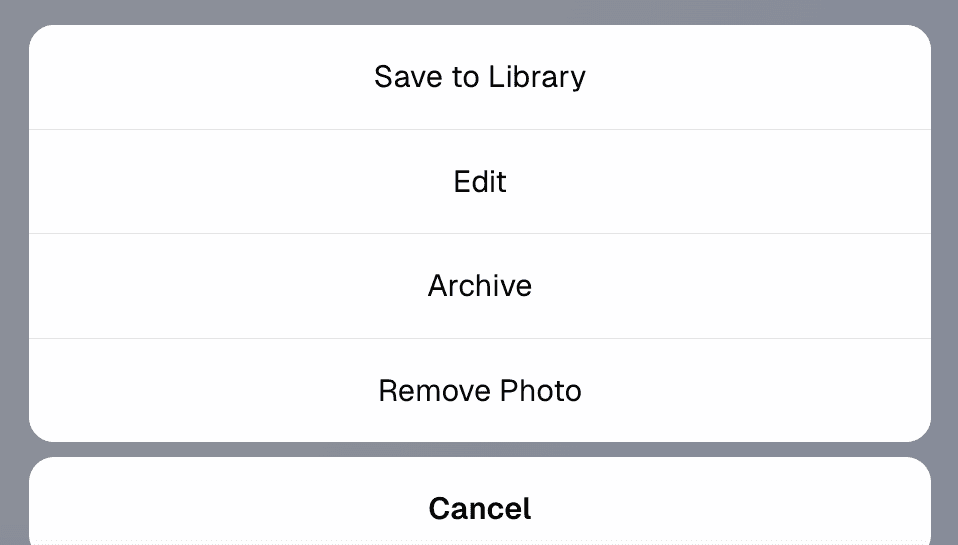
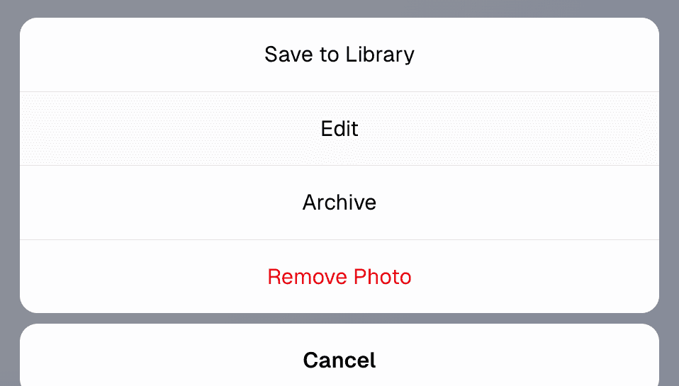
Use red for danger consistently
Delete buttons should always stand out with a red color. This is a well-established visual convention that immediately signals danger to users.
- Use red only for destructive actions (not warnings or generic alerts)
- Avoid using red buttons for neutral or positive actions
Note: If red is your branding primary color, you may use red for positive or neutral actions, as long as:
- The context clearly communicates a positive intent (e.g., “Submit”, “Continue”, “Book now”)
- Consistency is maintained across all UI elements
- Ensure destructive actions are visually differentiated through contrast and hierarchy. E.g. A different tone of red and an appropriate icon
Use the right icon in the right position
Icons make buttons faster to recognize and reduce ambiguity. A trash can icon next to the label reinforces the nature of the action.
- Always use the trash can (
🗑️) or appropriate destructive icon - Place the icon to the left of the button label
- Avoid ambiguous or abstract icons (E.g. Broom icon (
🧹) is used for “clear all” or “clean up", not "delete". Cross icon (❌) means “cancel” or "wrong", not "delete")
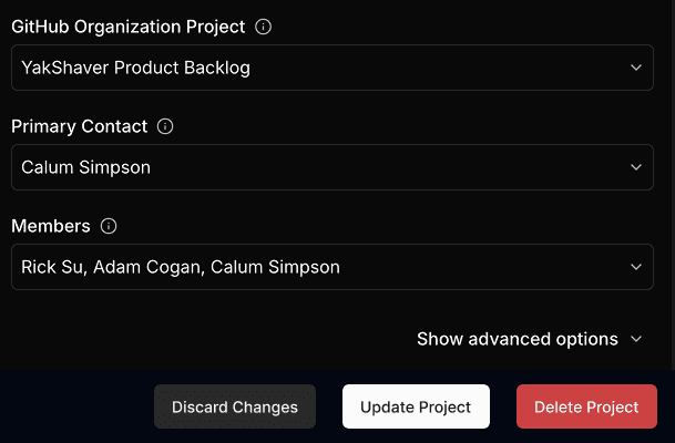
Position delete buttons with care
Placing a delete button next to a primary action (e.g. "Save" or "Confirm") is dangerous. Users may misclick due to proximity.
- Place delete buttons away from primary actions
- Use space or visual separation between them
- Make destructive buttons less prominent (except when the primary purpose is deletion)
Ask for confirmation when necessary
Not every destructive action needs a popup, but if the data is important or irreversible, you should ask the user to confirm.
Use confirmations when:
- Deleting data that can’t be recovered (e.g. a database record or user profile)
- The user might not realize the consequences
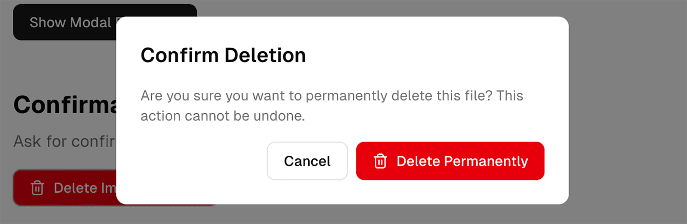
Tip: Avoid overusing confirmations as they lead to alert fatigue.
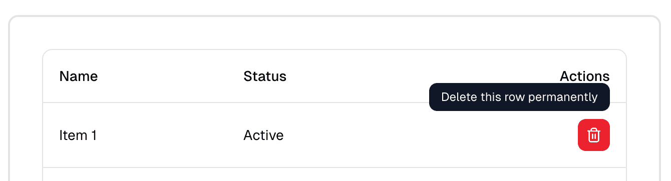
Use tooltips
Sometimes you might have a UI with limited space that doesn’t allow text labels.
For icon-only delete buttons (for example, a red trash icon in a table row), always provide a tooltip on hover or focus.
Ensure accessibility and keyboard navigation
Don't rely solely on color to convey meaning — red may be hard to distinguish for users with color blindness.
- Include a label, not just an icon
- Make sure buttons can be navigated and triggered via keyboard
- Support screen readers with
aria-label="Delete project"or similar
Summary of best practices
| Element | Best practice |
|---|---|
| Color | Use red for delete buttons |
| Label | Always include a text label (e.g. "Delete", "Remove") |
| Icon | Use a trash can or similar, to the left of label |
| Placement | Isolate from primary/positive actions |
| Confirmation | Use when deletion is permanent or high-risk |
| Accessibility | Don't rely on color; support keyboard and screen readers |
For more guidance on destructive actions in UI design:
- NNG: Confirmation Dialogs Can Prevent User Errors — If Not Overused
- Microsoft Design: Commanding Destructive Actions
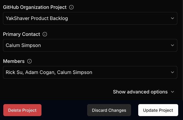
Bug reports examples
Check out how SSW manages UI bugs across our many products and teams using YakShaver. Smarter workflows. Fewer distractions.

