Rules to Better Accessibility - 2 Rules
Ensure your projects meet accessibility standards with these important rules focusing on WCAG compliance and color contrast, essential for creating inclusive digital experiences.
The internet has become a part of daily life, but not everyone uses it in the same way. Web Content Accessibility Guidelines (WCAG) are a set of formal standards aimed to address this problem.
Accessibility isn't just about compliance - it's about improving the usability of your product for everyone. Whilst essential for people with permanent sensory, motor, or cognitive impairments, it also improves the experience for users with temporary or situational limitations.
Making your website accessible ensures equal access, better usability, and improved SEO.
Video: The Internet's Accessibility Problem - and How to Fix It (13 min)An overview of WCAG standards
The Web Content Accessibility Guidelines are international standards developed by the WW3C's Web Accessibility Initiative (WAI). They define how to make web content more accessible to people with disabilities.
These guidelines are constantly reviewed and updated to make the web a more accessible place. Each version release has its own focus, and moves with evolving technologies. The current latest set of guidelines is the WCAG 2.2, released in December 2024.
The 4 principles (POUR)
WCAG consists of 4 high-level principles. Each principle is broken down into a number of sub-criteria.
1. Perceivable
Information must be presented in a way users can perceive:
- Text Alternatives (1.1): Provide text alternatives for non-text content
- Time-based Media (1.2): Provide alternatives and captions for multimedia and time-based content
- Adaptable (1.3): Present content in different ways without losing information or structure
- Distinguishable (1.4): Making it easier for users to see and hear content, including separating foreground from background (E.g Color contrast - Do you meet color contrast requirements for accessibility?)
2. Operable
User Interface components and navigation must be operable:
- Keyboard Accessible (2.1): Ensure all functionality can be operated via a keyboard
- Enough Time (2.2): Provide users enough time to read and complete tasks
- Seizures and Physical Reactions (2.3): Do not design content that is known to cause seizures or physical discomfort
- Navigable (2.4): Create a navigable and intuitive user interface
- Input Modalities (2.5): Ensure compatibility with input methods beyond just a keyboard
3. Understandable
Information and the operation of the user interface must be understandable:
- Readable (3.1): Make content readable and understandable
- Predictable (3.2): Create a consistent and predictable user interfaces
- Input Assistance (3.3): Help users avoid and correct errors
4. Robust
Content must be robust enough that it can be interpreted by a wide variety of user agents, including assistive technologies:
- Compatible (4.1): Optimize compatibility with current and future technologies
WCAG accessibility example
Suppose we want to create a simple button on our site.
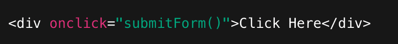
Figure: Bad example - Lacks accessibility This fails numerous guidelines:
- Criteria 2.1.1: Not operable by keyboard
- Criteria 4.2.1: No accessible role/ name (for screen readers)
- Criteria 1.3.1: Using div for a button breaks semantic structure
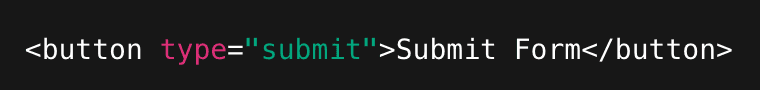
Figure: Good example - Correct accessibility Improving on the previous example, this button passes:
- Criteria 2.1.1: Keyboard focus and activation are built-in
- Criteria 4.1.2: The button role and label are exposed to assistive tech
- Criteria 1.3.1: Correct semantic element conveys structure and purpose
Conformance Levels
WCAG defines three levels of conformance to these guidelines: A, AA, and AAA. They stack - meaning each higher level includes all requirements of the one below it.
- Level A is a must-have
- Level AA is a should-have (common target)
- Level AAA represents maximized accessibility
How can you improve accessibility?
Role Actions Designers - Use accessible colour palettes and check contrast ratios (4.5:1 minimum for body text)
- Ensure font sizes are readable
- Clearly indicate focus states
- Design with text alternatives in mindDevelopers - Write semantic HTML (e.g., <button>not<div>for buttons)
- Use ARIA only when necessary
- Ensure full keyboard navigation
- Maintain logical tab orderTesters - Run automated checks (axe, Lighthouse)
- Test with keyboard only
- Test with a screen reader (NVDA, VoiceOver)
- Verify form error handlingTools for testing accessibility
Lighthouse
Lighthouse is an automated auditing tool by Google that runs inside Chrome Devtools to check a website's performance, accessibility, best practices, and SEO. It's automated accessibility checks are based on WCAG, and it uses rules from axe-core.
It is best used for performance and accessibility review before release. Although it only covers ~20-30% of accessibiltiy checks because many need manual testing.
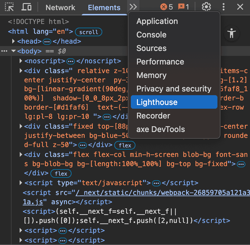
Figure: Lighthouse in DevTools axe DevTools
Similarly, axe DevTools is a browser extension and testing toolkit powered by axe-core, using the same accessibility engine used in Lighthouse. It is used to find and fix accessibility issues during development. However, unlike lighthouse, it allows guided and manual testing for things automation can't fully check (e.g., meaningful ink text, focus order, screen reader experience).
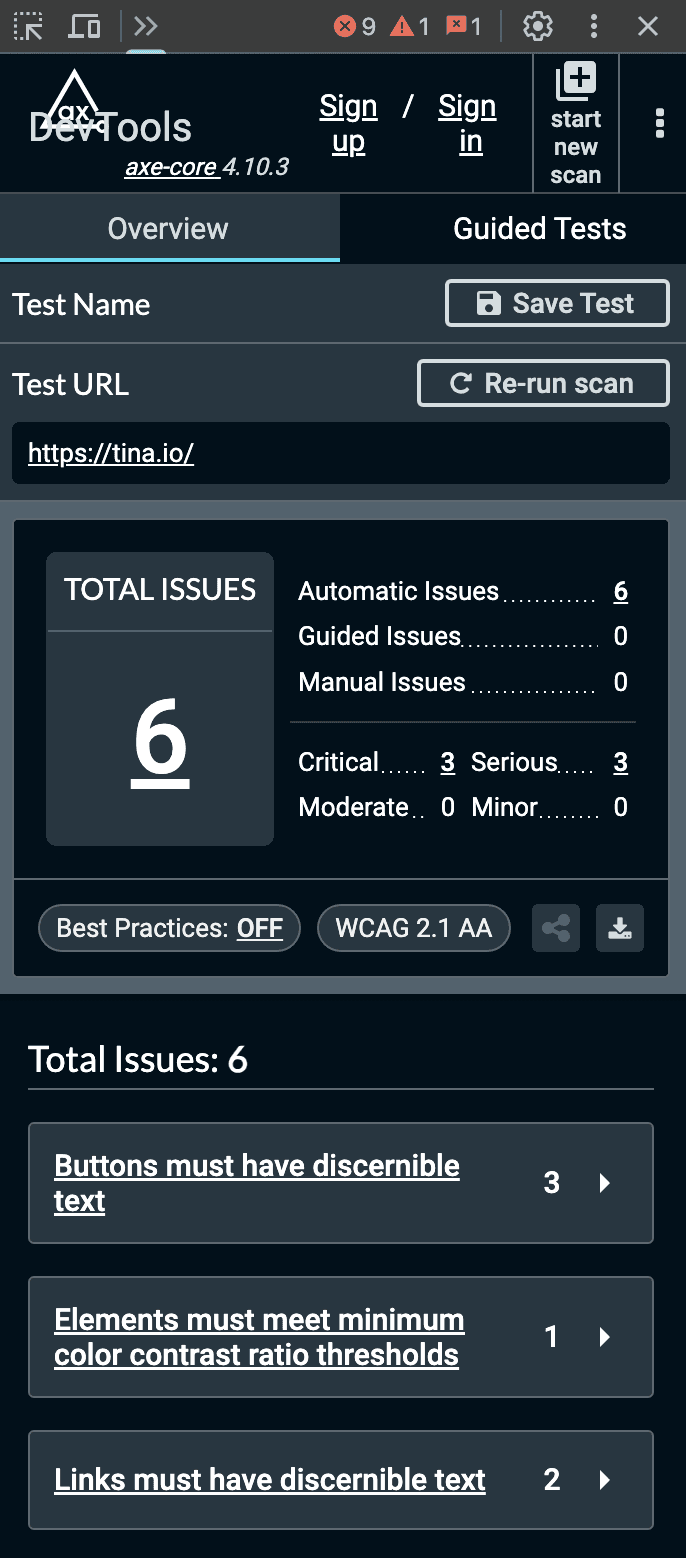
Figure: axe DevTools Example Key terms
The following are some key concepts that can help make WCAG easier to understand.
- WCAG versioning - The guidelines are updated at irregular intervals so it's important to be clear which version you're referencing. E.g. WCAG 2.2.
- Success criteria - Each WCAG principle contains sub-categories which themselves contain specific success criteria. This means when you reference a success criterion it will have a number like "2.4.1: Bypass Blocks"
- WAI-ARIA (Web Accessibility Initiative - Accessible Rich Internet Applications) - A specification of semantic requirements for assistive technologies like screen readers
WCAG criterion 1.4.3: Contrast (Level AA) recommends text, images of text, and graphics (e.g. icons) have a contrast ratio of at least 4.5:1. Always check your colors and make your content readable regardless of a user’s ability or circumstance.
Contrast checkers
Most automated accessibility checkers or browser plugins will check color contrast.However, try to avoid contrast issues from being flagged altogether!Use dedicated color checkers to determine acceptable color combinations before implementation.Always keep in mind that opacity and font weight affect contrast too.
Recommended tools include:
- WhoCanUse – Highly detailed, includes color blindness, sunlight, and low vision checks
- Adobe Color – A vs AA vs AAA compliance checks, import colors from a file, color blindness tools
- Coolors – Simple, easy to use tool for beginners

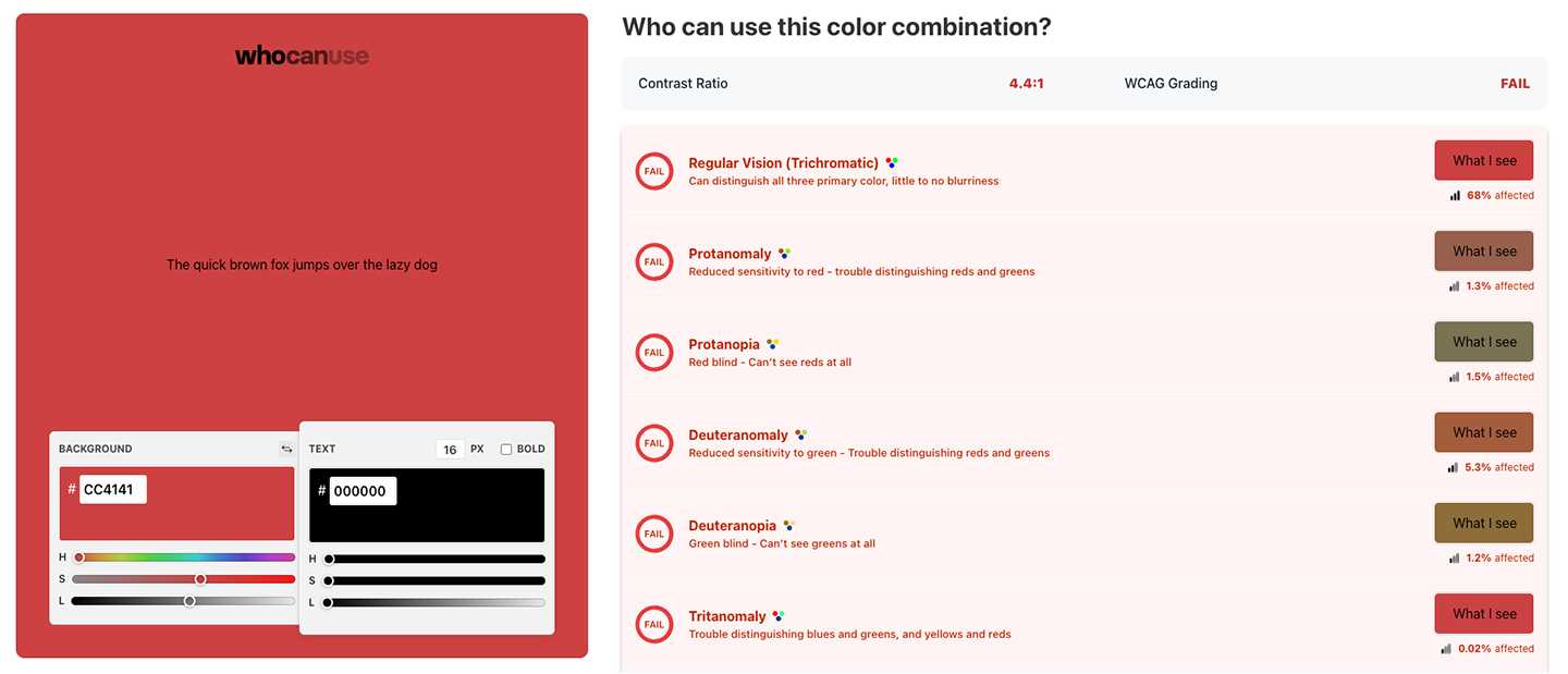
Figure: Bad example – Black text on SSW Red fails contrast checks 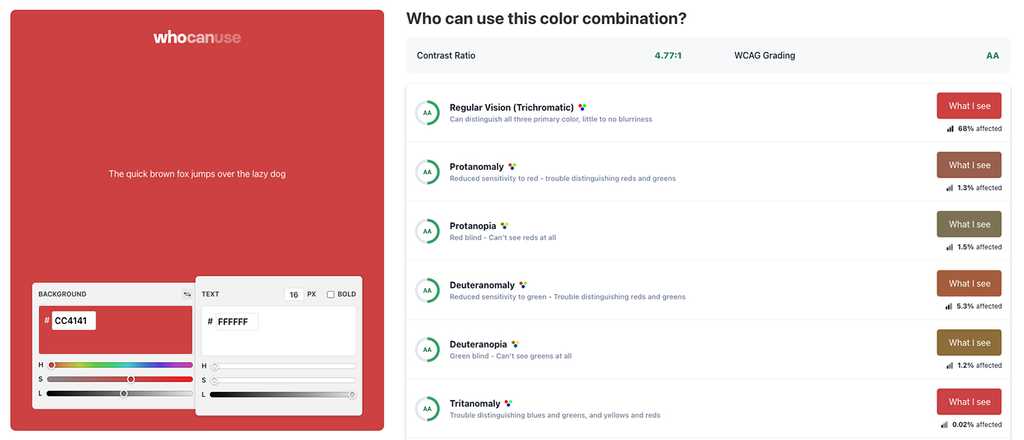
Figure: Good example – White text on SSW Red passes contrast checks Notable exceptions
There are few acceptable exceptions to the contrast criteria, including:
- Incidental text (disabled, inactive, hidden, or purely decorative)
- Logos (Text included in a logo or brand name)
- Large-scale text (which only needs to meet a contrast ratio of 3:1)
Even in these circumstances it’s good practice to make your text as readable as possible.