Shipping a high-risk feature without testing it with users is a gamble. If your update affects sign-up flows, checkout processes, or dashboards, you can’t afford to guess. Usability issues that slip through can cost you revenue, reputation, and rework time.
Even experienced designers and developers miss things. The only way to validate an interface is to observe real users attempting real tasks.
Catch usability issues before they reach production
Improve clarity in copy, layout, and task flow
Understand user behavior, expectations, and intent
Validate key design decisions with confidence
Even a small round of usability tests can surface critical blockers before they impact real users.
What features should always be tested?
Prioritize usability testing when a feature is:
Critical to business outcomes (e.g. sign-up, checkout, dashboards)
Expensive or time-consuming to change after release
Related to onboarding or first-time experiences
Brand new or involves complex flows
Shared by multiple user roles or departments
When in doubt, test it. It’s always cheaper than fixing issues after the fact.
Video: Usability Testing 101 (2 min)
How to run a quick usability test
Usability testing doesn’t require a lab or a research degree. Anyone on the team can run a simple test with these three elements:
Element
What it is
Facilitator
A neutral observer. They give instructions, avoid leading, and prompt users to think aloud.
Tasks
Realistic scenarios such as: “Find the report for Q2 and download it.” Task phrasing matters. Don’t guide or prime.
Participant
A real or representative user. Ask them to narrate their actions and thoughts as they go.
Tip from NN/g:5 users is enough for a qualitative test. This reveals around 80–85% of the most common usability issues.
Remote or in-person?
Either works. Choose what suits your access to users:
In-person – Office, lab, or meeting room
Remote (moderated) – Over Zoom or Teams with screensharing
Remote (unmoderated) – Use tools like Maze or UserTesting to capture session recordings
You don’t need fancy tools. Sometimes, all you need is a few users and a fresh perspective.
Example
You’ve redesigned the onboarding flow for your app. Before launch, you run usability tests with 5 new users. On screen 2, all participants misinterpret the CTA and hesitate. You tweak the language and spacing before release.
Figure: Good example – You fixed a usability blocker before it impacted users
You launch a major dashboard redesign without testing. Support tickets flood in. Users are confused by ambiguous icon labels and can’t find the filters.
Figure: Bad example – Avoidable UX issues caused friction and hurt trust
Bonus tip: Test before the code
You don’t have to wait for development. Early testing with wireframes or clickable prototypes can reveal the same usability issues at a fraction of the cost.
Try a 3-day usability sprint:
Day 1 – Write tasks and prep the prototype.
Day 2 – Test with 5 users.
Day 3 – Analyze findings and make improvements.
Shipping a high-risk feature without testing it with users is a gamble. If your update affects sign-up flows, checkout processes, or dashboards, you can’t afford to guess. Usability issues that slip through can cost you revenue, reputation, and rework time.
Even experienced designers and developers miss things. The only way to validate an interface is to observe real users attempting real tasks.
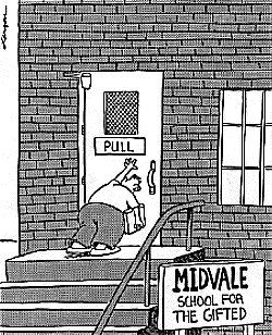
The corner stone of good user interface design is that if your users need instructions, you haven't done a good job. Of course with particularly complex applications there will be exceptions to this rule, but all developers should aim to make your interface as self-evident as possible.
There are no surprises
There is no need to use help
No excuse for RTFM (read the freaking manual)
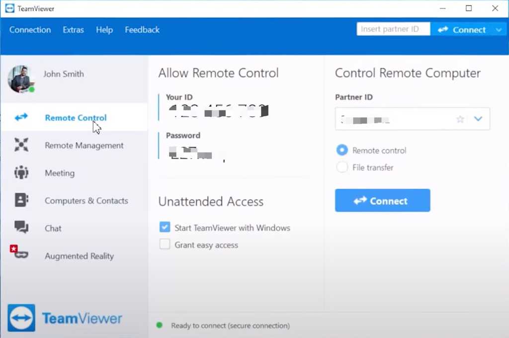
Figure: A good interface does not need instructions!
Figure: Good example - Teamviewer's interface requires very little explanation
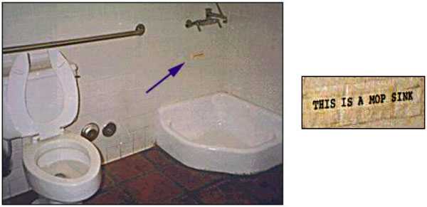
Figure: Good example - See the fly? (an example of excellent usability) Dutch manufacturers realized that a fly painted on the urinal became a "target" for men using the facility. And the fly is positioned in precisely the right place for minimal spillage or splash back. Clever people those Dutch!
The corner stone of good user interface design is that if your users need instructions, you haven't done a good job. Of course with particularly complex applications there will be exceptions to this rule, but all developers should aim to make your interface as self-evident as possible.
Accidentally deleting important data can be a disaster for your users and your support team. A poorly placed or unclear destructive action can result in irreversible mistakes, lost data, and frustrated users.
These actions need to be carefully designed with strong visual cues, clear labels, and proper safeguards.
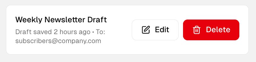
Use red for danger consistently
Delete buttons should always stand out with a red color. This is a well-established visual convention that immediately signals danger to users.
Use red only for destructive actions (not warnings or generic alerts)
Avoid using red buttons for neutral or positive actions
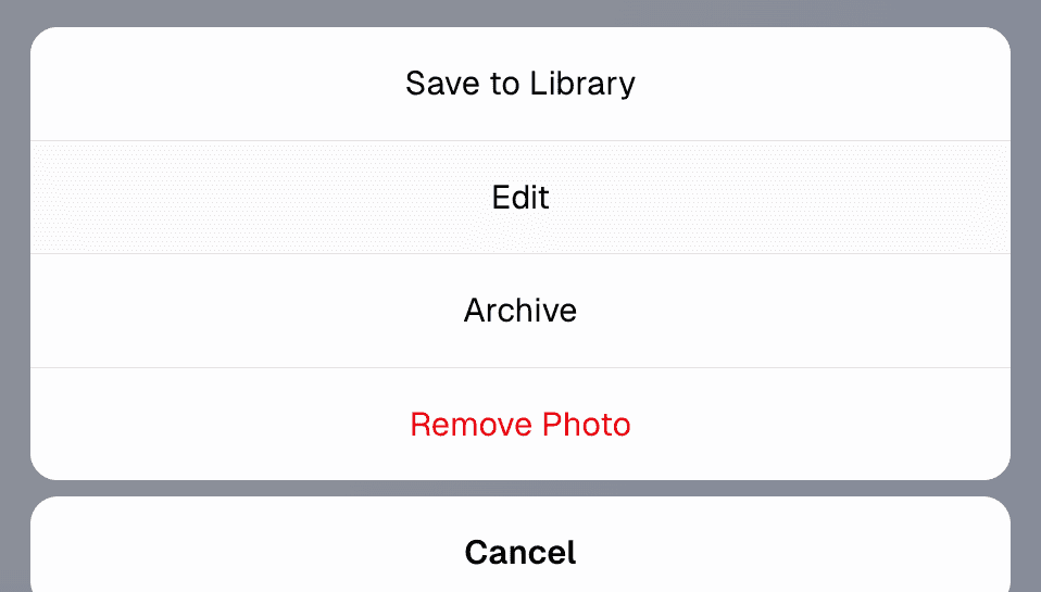
Figure: Bad example - Wrong color for a delete button
Figure: Good example - Red is the right color for a delete button
Note: If red is your branding primary color, you may use red for positive or neutral actions, as long as:
The context clearly communicates a positive intent (e.g., “Submit”, “Continue”, “Book now”)
Consistency is maintained across all UI elements
Ensure destructive actions are visually differentiated through contrast and hierarchy. E.g. A different tone of red and an appropriate icon
Use the right icon in the right position
Icons make buttons faster to recognize and reduce ambiguity. A trash can icon next to the label reinforces the nature of the action.
Always use the trash can (🗑️) or appropriate destructive icon
Place the icon to the left of the button label
Avoid ambiguous or abstract icons (E.g. Broom icon (🧹) is used for “clear all” or “clean up", not "delete". Cross icon (❌) means “cancel” or "wrong", not "delete")
Figure: Bad example - Cross icon usually means "Cancel" and should be avoided for permanent deletion. The button is also missing a text label
Figure: Good example - Button has a Trash/Bin icon positioned to the left of the text labe
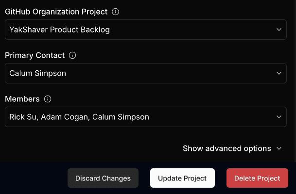
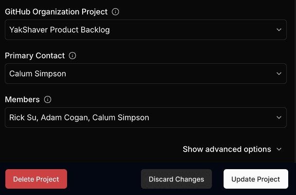
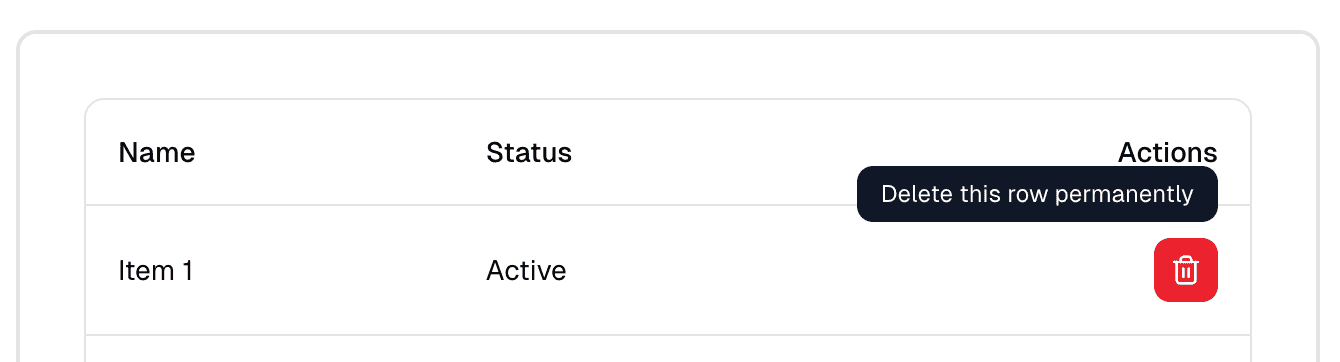
Position delete buttons with care
Placing a delete button next to a primary action (e.g. "Save" or "Confirm") is dangerous. Users may misclick due to proximity.
Place delete buttons away from primary actions
Use space or visual separation between them
Make destructive buttons less prominent (except when the primary purpose is deletion)
Figure: Bad example - "Delete" and "Save" are too close together, which can lead to accidental clicks
Figure: Good example - "Delete" button in red, with the right icon, and visually isolated from safe actions
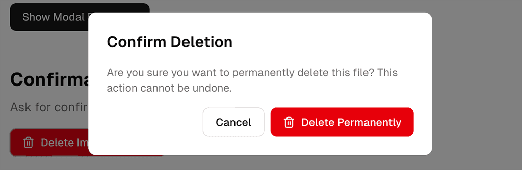
Ask for confirmation when necessary
Not every destructive action needs a popup, but if the data is important or irreversible, you should ask the user to confirm.
Use confirmations when:
Deleting data that can’t be recovered (e.g. a database record or user profile)
The user might not realize the consequences
Figure: Good example - Confirming a deletion
Tip: Avoid overusing confirmations as they lead to alert fatigue.
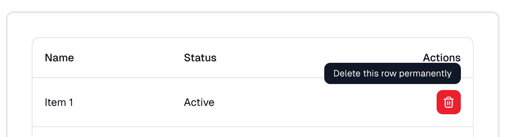
Use tooltips
Sometimes you might have a UI with limited space that doesn’t allow text labels.
For icon-only delete buttons (for example, a red trash icon in a table row), always provide a tooltip on hover or focus.
Figure: Good example - Tooltip gives clarity to an icon-only delete button
Ensure accessibility and keyboard navigation
Don't rely solely on color to convey meaning — red may be hard to distinguish for users with color blindness.
Include a label, not just an icon
Make sure buttons can be navigated and triggered via keyboard
Support screen readers with aria-label="Delete project" or similar
Summary of best practices
Element
Best practice
Color
Use red for delete buttons
Label
Always include a text label (e.g. "Delete", "Remove")
Icon
Use a trash can or similar, to the left of label
Placement
Isolate from primary/positive actions
Confirmation
Use when deletion is permanent or high-risk
Accessibility
Don't rely on color; support keyboard and screen readers
For more guidance on destructive actions in UI design:
Accidentally deleting important data can be a disaster for your users and your support team. A poorly placed or unclear destructive action can result in irreversible mistakes, lost data, and frustrated users.
These actions need to be carefully designed with strong visual cues, clear labels, and proper safeguards.
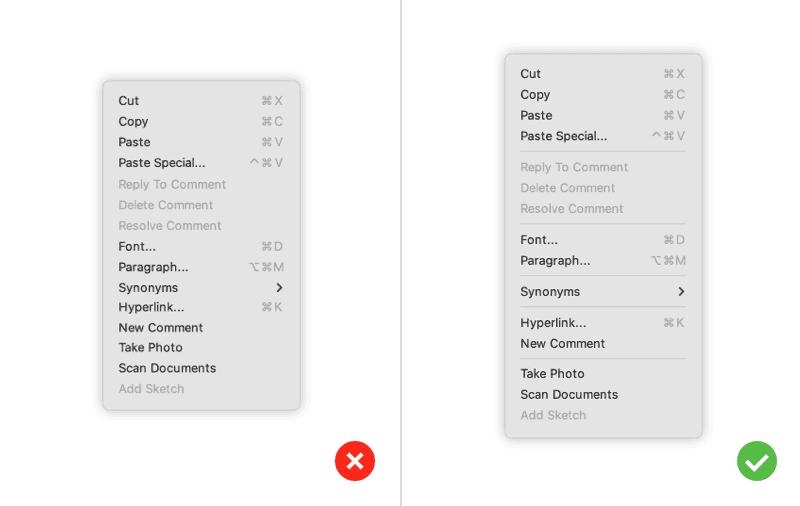
Thinking about UI, the objective is to create clean interfaces by minimizing clutter. You do that by removing noise. One of the most common ways to avoid noise is the removal or de-emphasis of labels whenever possible.
Figure: Bad example - Unnecessary labels
Figure: Good example - Users can easily understand the information without the unnecessary labels
Thinking about UI, the objective is to create clean interfaces by minimizing clutter. You do that by removing noise. One of the most common ways to avoid noise is the removal or de-emphasis of labels whenever possible.
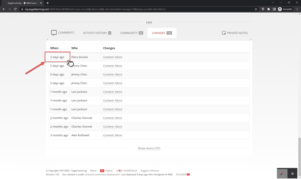
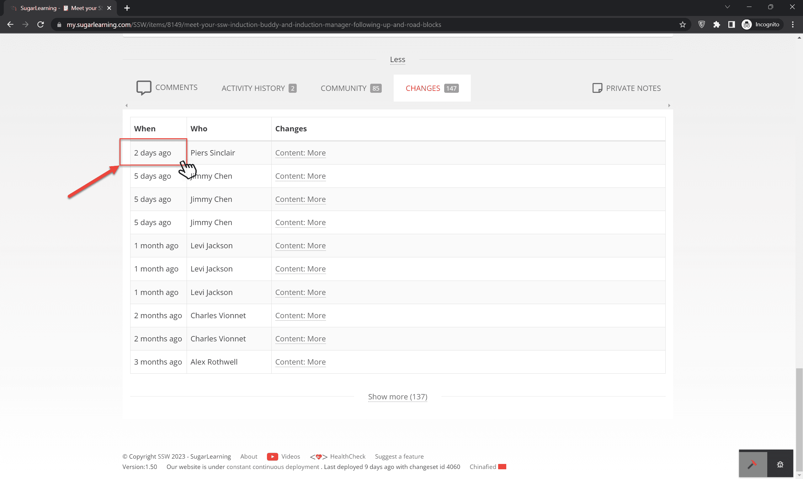
Displaying the date and time of change as a tooltip when users hover over the time of change can be an effective approach for interfaces with limited space or when providing both pieces of information together could lead to confusion.
Tooltips allow users to access additional information about the context of the date and time of change without cluttering the main interface.
Figure: Bad example – Cannot find date or time in tooltip on hover
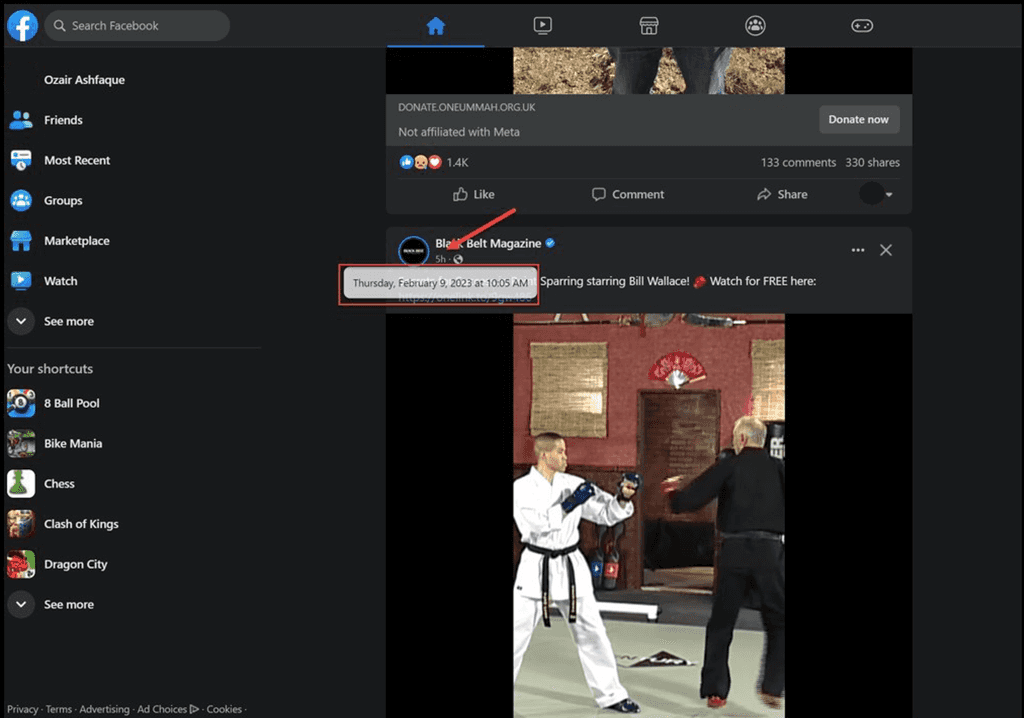
Figure: Good example – On hover, Facebook shows the date and time
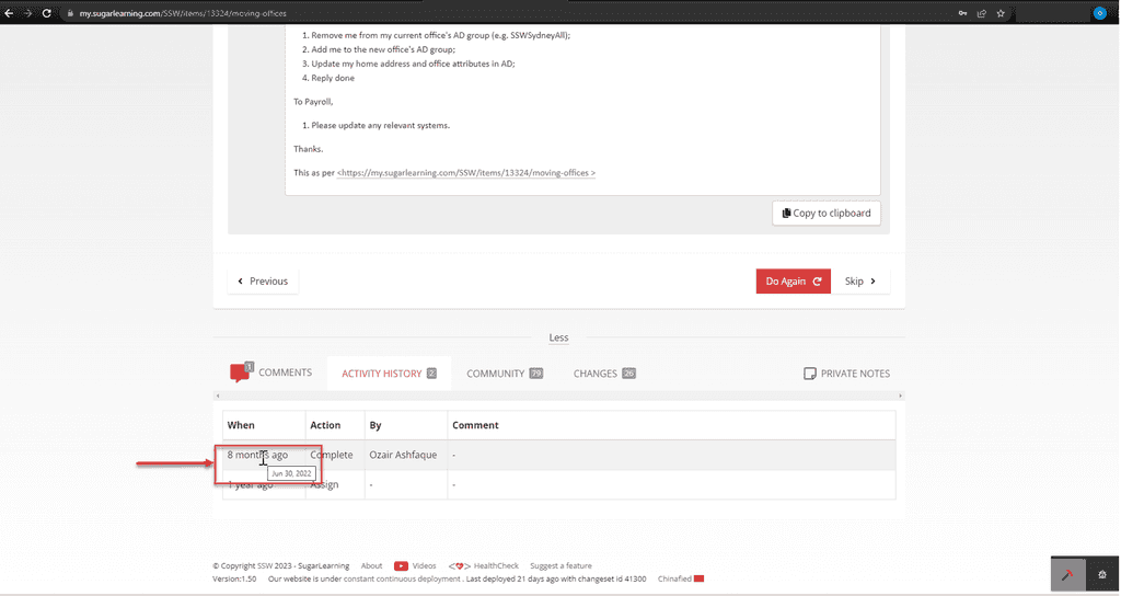
Figure: Good example – Date change on hover over time of change for sugarlearning item
Displaying the date and time of change as a tooltip when users hover over the time of change can be an effective approach for interfaces with limited space or when providing both pieces of information together could lead to confusion.
Tooltips allow users to access additional information about the context of the date and time of change without cluttering the main interface.
People may not pay attention to some important words in your interface. Adding a simple and clear icon beside the words will make the difference.
For emails and web content, using an simple emoji is an easy and friendly way to achieve the same result 🙂.
Using icons
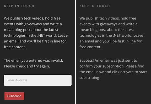
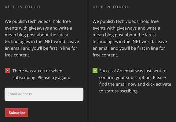
Figure: Bad example - No icons to indicate the status
Figure: Good example - Green tick and red cross help the user to know what's going on
Using emojis
I join a lot of Sprint Reviews, and there is a consistent problem I see among Scrum teams. The PBIs have limited or missing information. Usually, this is due to unclear requirements...
Figure: Bad example - No emojis to enforce the meaning
I join a lot of Sprint Reviews, and there is a consistent problem I see among Scrum teams. The PBIs have limited or missing information 😥. Usually, this is due to unclear requirements...
Figure: Good example - The emoji gives extra focus on what is important
When there are key words that you want people to notice, you can add a spot of color on the important word for emphasis.
You should make parts of the text different colors just like you’d highlight or boldface parts of a sentence. The duo colored text will help emphasize your message.
Use colors from your branding/design system when you do this.
Figure: The TV signage has the important words in red
Use color sparingly
While a spot of color can guide attention and improve scannability, overusing color has the opposite effect. If everything is emphasized, nothing stands out.
Too many bright or contrasting elements:
Create visual noise, making the UI feel cluttered and overwhelming
Reduce readability and accessibility, especially for users with visual impairments
Make it harder for users to know what truly matters
Stick to one accent colors per screen or section. Use them intentionally—only for elements that truly require user focus.
Figure: See bottom tagline - Don't make the important word “quality software” in red... because you already have red
Figure: See bottom tagline - Make the important word “quality software” in red... because you do not have red
Avoid using color for full sentences, even if it's just one word
Color should be used to emphasize keywords or short phrases within a sentence — not to style entire statements.
Tip: Instead of coloring a sentence, add a colored icon (like ✅ or ❌). This keeps the message clear and accessible while still providing visual emphasis.
Use color to guide, not to shout.
Figure: Bad example - Text in green is too much
Figure: Good example - Text in content color (white in this dark mode example) with a green tick
When there are key words that you want people to notice, you can add a spot of color on the important word for emphasis.
Keep text as short as possible. Avoid wordy, stilted text.
Consult the documentation that came with your phone for further instructions.
Read the instructions that came with your phone
Describe only what the user needs to know and don't provide unnecessary information.
Your phone needs to communicate with Google servers to sign in to your account. This may take up to five minutes.
Your phone is contacting Google. This can take up to 5 minutes.
Focus on the user's concern, not technical details
Manually control GPS to prevent other apps from using it.
To save power, switch Location mode to Battery saving
Put the most important thing first
77 other people +1’d this, including Larry Page
Larry Page and 76 others +1’d this
Put the user's goal first
Touch Next to complete setup using a Wi-Fi connection
To finish setup using Wi-Fi, touch Next
Avoid being confusing or annoying
Sorry! Activity MyAppActivity (in application MyApp) is not responding.
MyApp isn’t responding. Do you want to close it?
Words and terms examples
❌ Bad examples - Avoid
✅ Good examples - Use
cannot, could not, do not, did not will not, you will
Contractions: can’t, couldn’t, don’t, didn’t, won’t, you’ll, and so on
okay, ok
OK
please, sorry, thank you
Attempts at politeness can annoy the user, especially in messages that say something has gone wrong. Exception: In Japanese, “please” is mandatory and imperative verbs should be localized accordingly (turn on -> please turn on).
fail, failed, negative language
In general, use positive phrasing (for example, “do” rather than “don’t,” except in cases such as “Don’t show again,” “Can’t connect,” and so on.)
me, I, my, mine
you, your, yours
Are you sure? Warning!
Tell user the consequence instead, for example, "You’ll lose all photos and media"
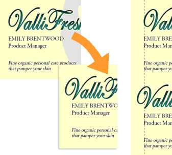
Optical alignmentFigure: In the first example, although the text is technically aligned, it does not 'look' it. In the second one, the "V" has been moved into the margin, but the optical alignment is now correct
Not only relevant in typography, optical alignment can also be used in forms and web.
Figure: Bad example - The fields are aligned to the radio buttons, but it doesn't "look" good enough
Figure: Good example - It seems neater, even though it is no longer technically aligned
Optical alignmentFigure: In the first example, although the text is technically aligned, it does not 'look' it. In the second one, the "V" has been moved into the margin, but the optical alignment is now correct
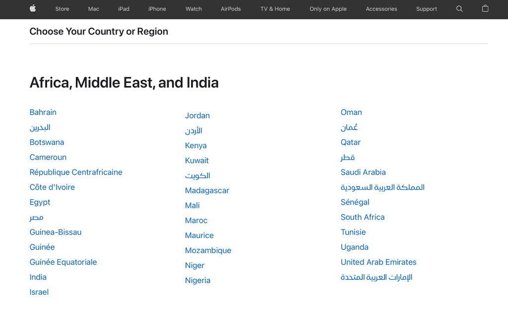
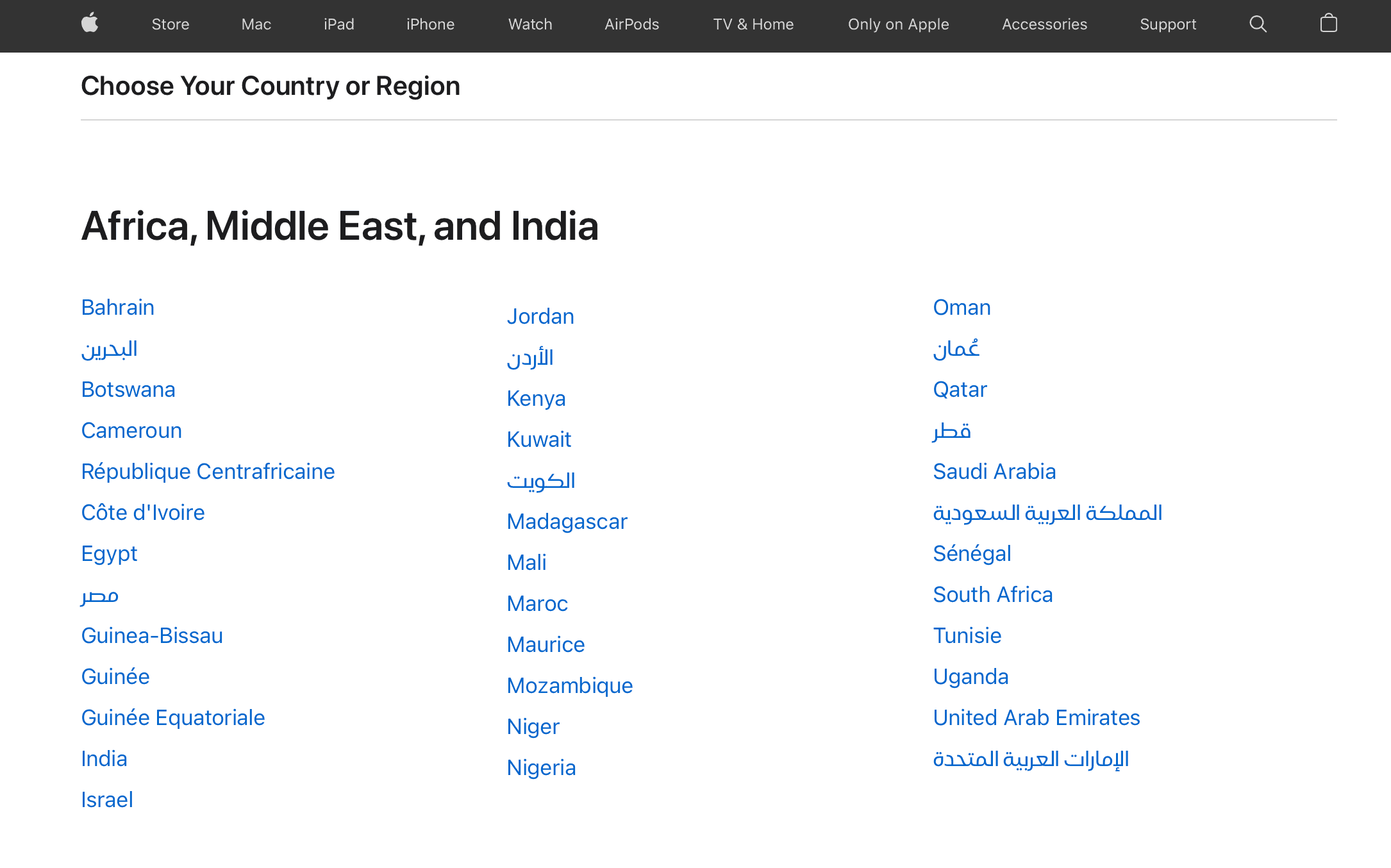
The search direction of a list should be obvious. When it comes to a multicolumn list, you should always head down instead of across for legibility.
Vertical lists are much easier to scan than horizontal lists, because all items are aligned to left, when you're looking for an item, you don't need to read the entire word, you can quickly scan the first letters and get directly to the item you look for.
Figure: Good example - Apple.com lists countries in columns vertically
The search direction of a list should be obvious. When it comes to a multicolumn list, you should always head down instead of across for legibility.
Vertical lists are much easier to scan than horizontal lists, because all items are aligned to left, when you're looking for an item, you don't need to read the entire word, you can quickly scan the first letters and get directly to the item you look for.
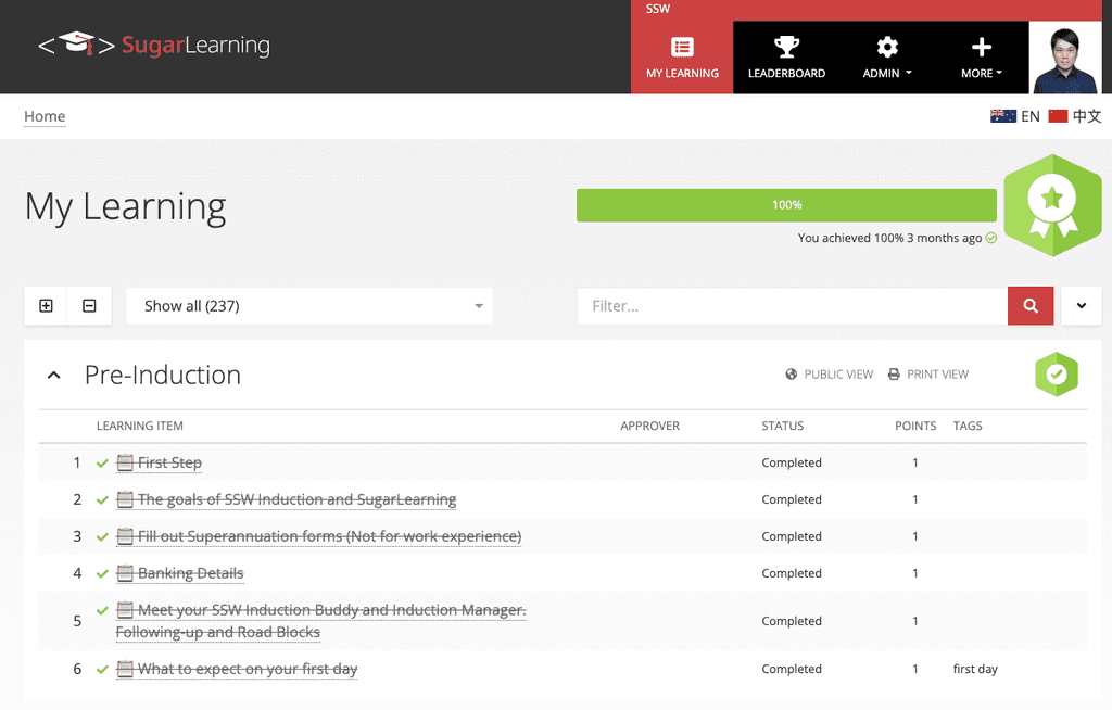
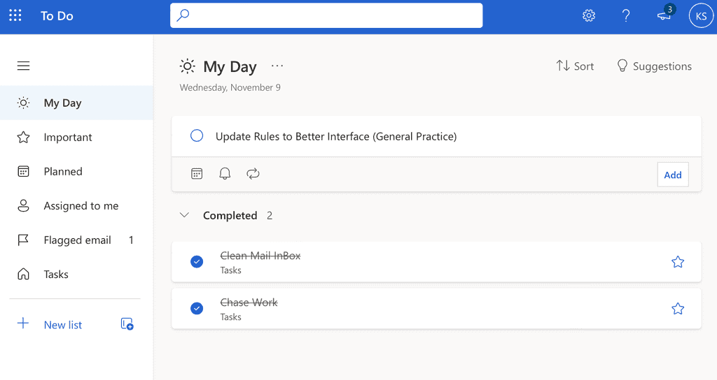
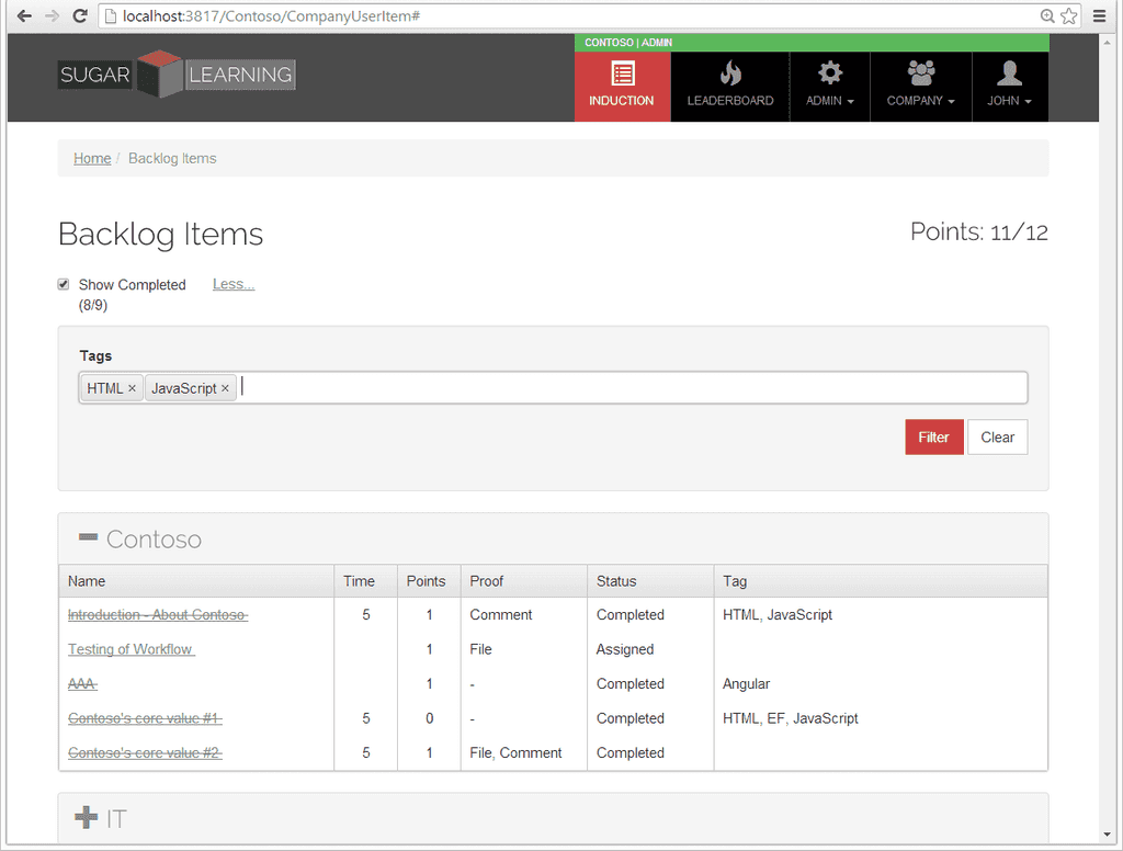
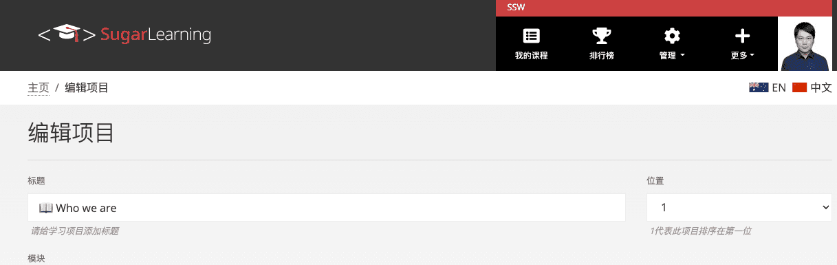
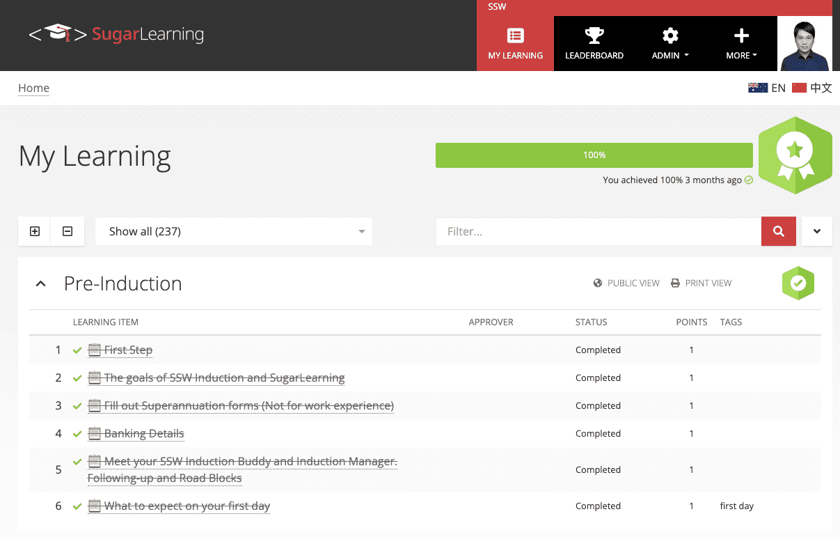
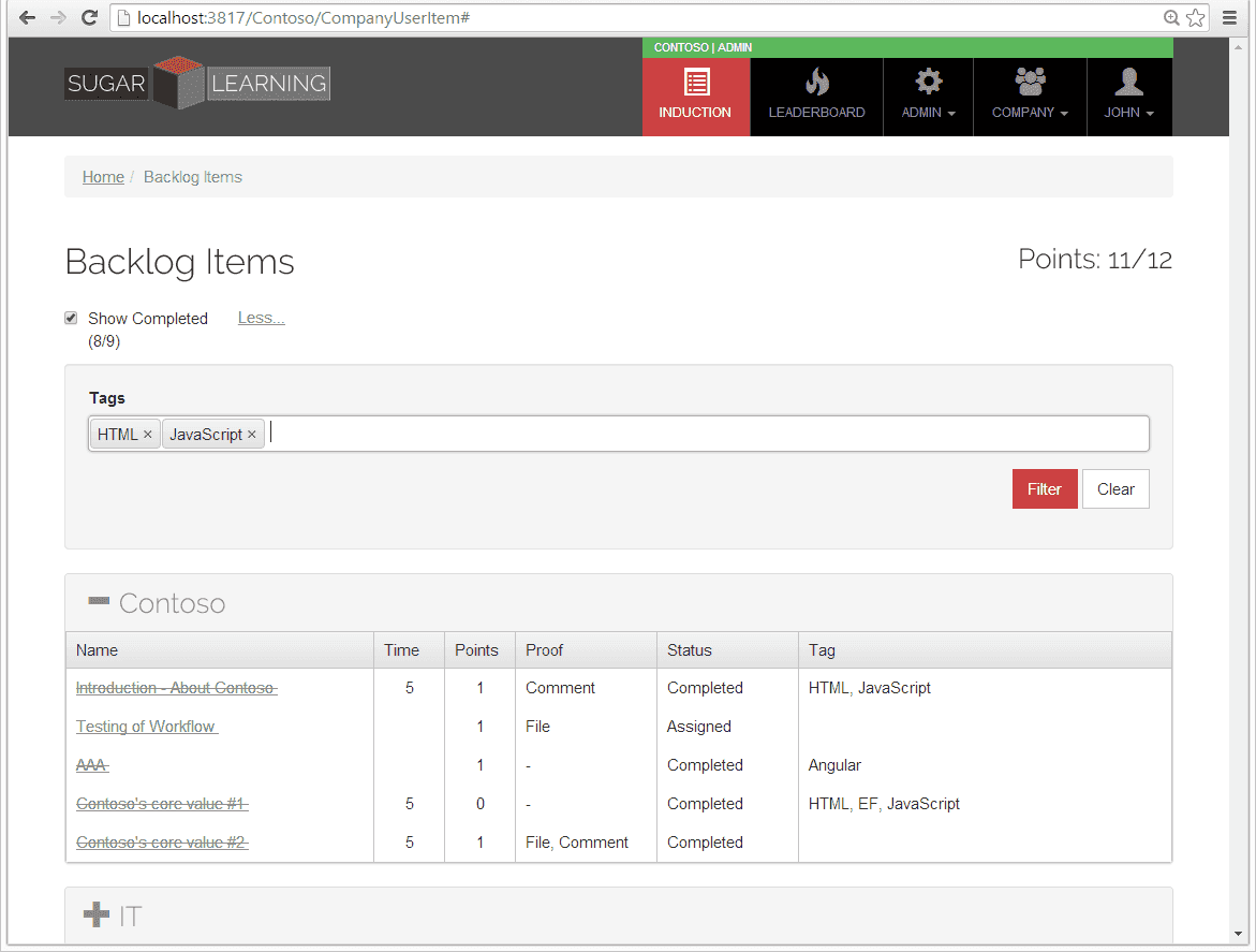
When you're giving an update on progress on a task list or a schedule, strike out the items that have been completed. Not only does it visually explain where you are, it also gives you a great sense of satisfaction...
Figure: Good example - SugarLearning's completed items are struck-through
Figure: Good example - Microsoft Outlook Todo's completed tasks are struck-through
When you're giving an update on progress on a task list or a schedule, strike out the items that have been completed. Not only does it visually explain where you are, it also gives you a great sense of satisfaction...
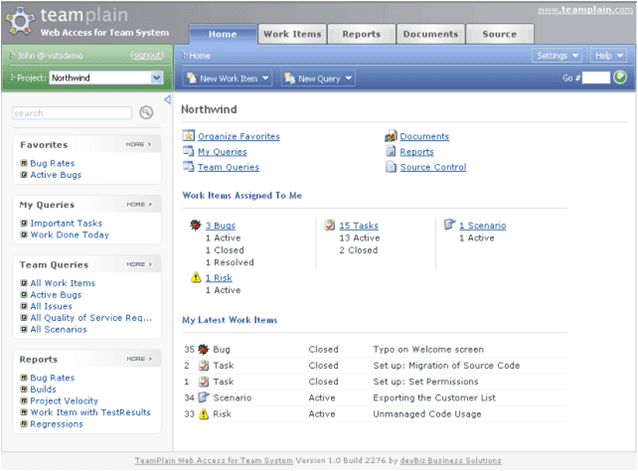
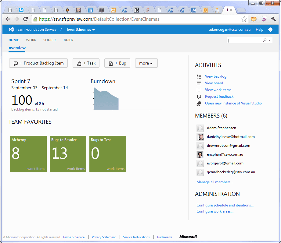
Make your data easily accessible by incorporating a "search box" that helps users find relevant information quickly.
Figure: Good example - A "search box" makes it easy to find data
Figure: Good example - The search bar in Windows 8 is now always in the same position, no matter what program or where you are searching for. You can activate Charms in Windows 8 by mousing to the top right corner
Figure: Good example - TFS Preview has an easy to find search box
Make your data easily accessible by incorporating a "search box" that helps users find relevant information quickly.
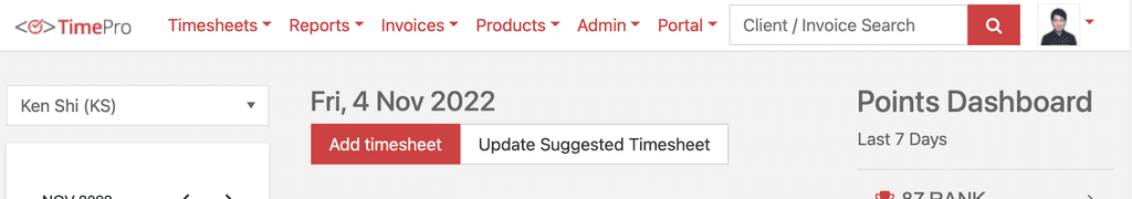
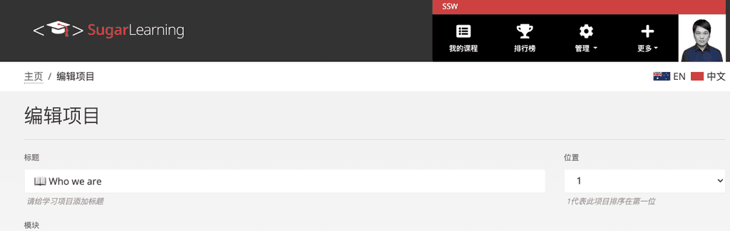
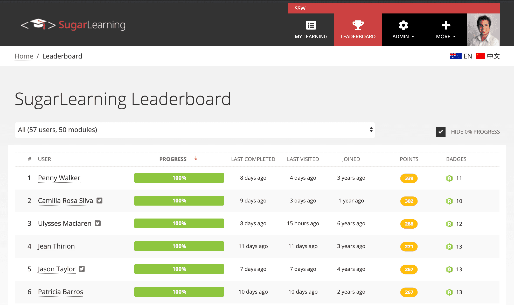
"Gamification" is a method of encouraging user participation. Usually, these are a set of incentives such as points or achievement badges that are linked to some other form of redeemable value.
It originated with Frequent Flyer programs and has crossed over into the software world with the success of Foursquare.
This concept is being utilized even in Visual Studio.
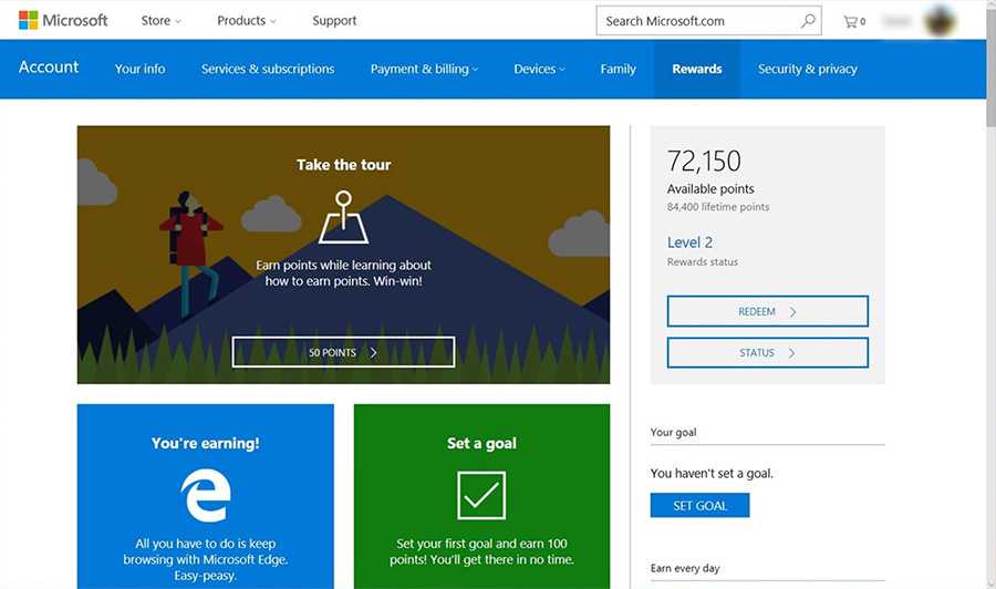
Figure: Good Example – Microsoft Rewards gives points when you search on Bing.com and buy things from the Microsoft Store online and in Windows 10
Figure: Good Example – Stack Overflow uses reputation points, awarded by how useful your answer to other user submitted questions were
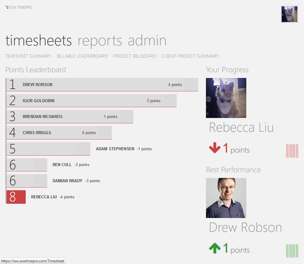
Figure: Good Example – TimePro uses gamification to encourage users to do their timesheets on time
Figure: Good Example – SugarLearning Leaderboard is another good example
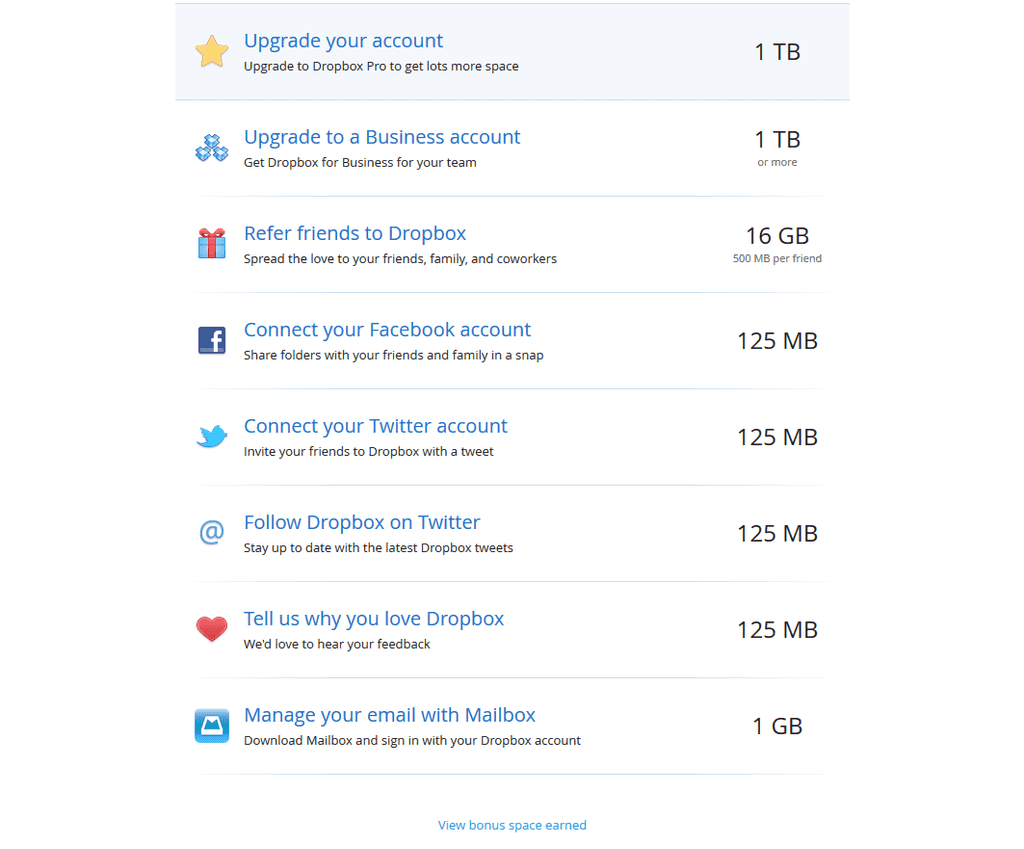
Figure: Good Example – Dropbox rewards its users with extra storage space instead of imaginary points. This is more interesting
"Gamification" is a method of encouraging user participation. Usually, these are a set of incentives such as points or achievement badges that are linked to some other form of redeemable value.
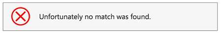
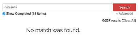
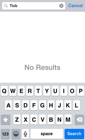
When a user looks at a search result, they expect to see a list of items to look into. If there are no results, don't give them noisy text because it can be taken as a search result. An icon also can be understood as a broken page. Your "no results" page should be clean.
Figure: Bad example - The list of "suggestions" is just noise and can confuse the user
Figure: Bad example - Having an icon implies that an error happened which is not the case
Figure: Good example - Plain and clean screen
Figure: Good example - Plain and clean screen on mobile
When a user looks at a search result, they expect to see a list of items to look into. If there are no results, don't give them noisy text because it can be taken as a search result. An icon also can be understood as a broken page. Your "no results" page should be clean.
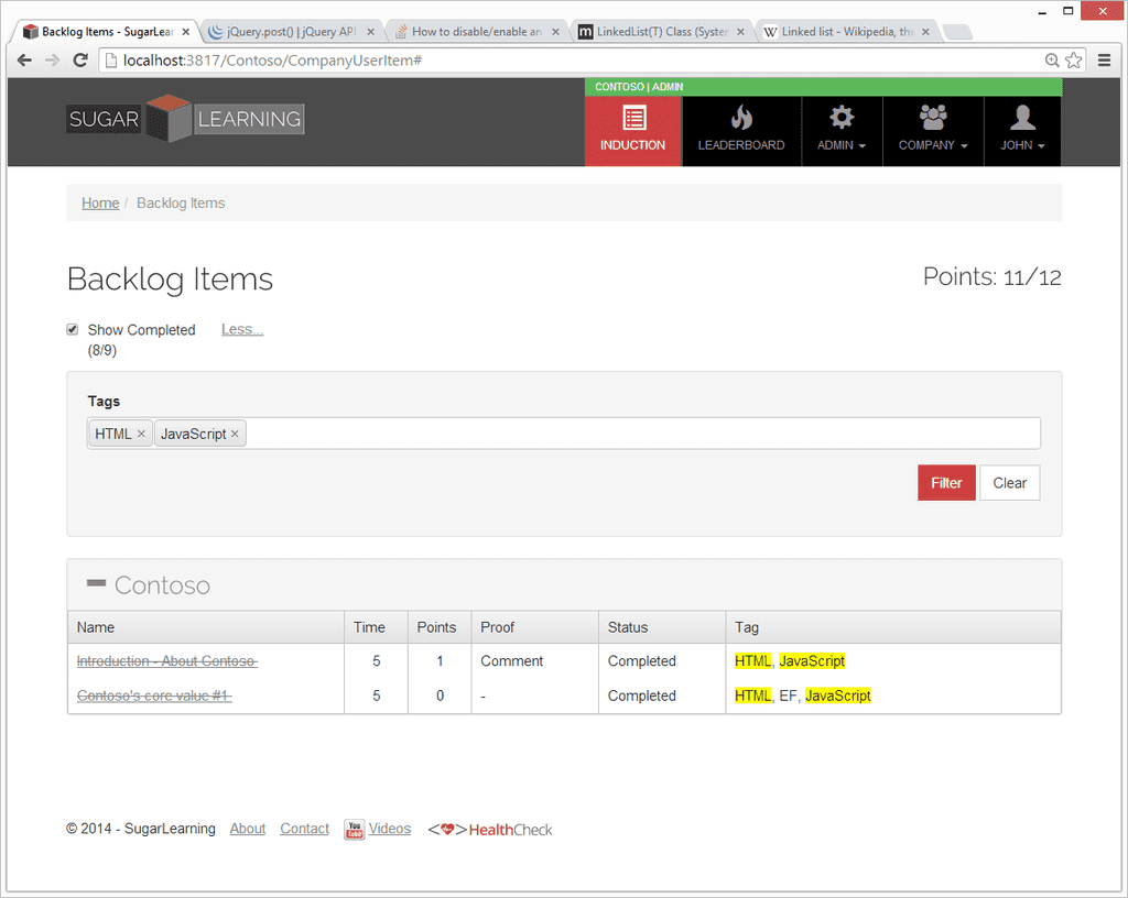
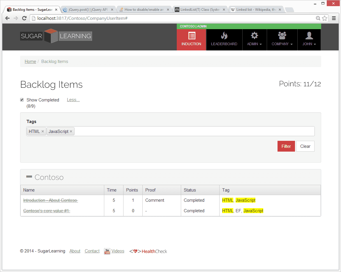
When implementing search on a website, do you know that it is best to highlight the search terms in the page body?
Search is a common feature in websites, and one you will most likely have to implement at some stage. When search returns a list of items, it is useful to highlight the search terms where they appear in the results.
Figure: Bad example - Search for items with these tags
Figure: Good example - Search results have their relevant tags highlighted
When implementing search on a website, do you know that it is best to highlight the search terms in the page body?
There is a clever, lightweight way to embed a YouTube video, which Google itself practices on their Google+ pages which reduce it to 15kbs.All you have to do is, whenever you need to embed a video to a page, add the below tag instead of the YouTube video embed code. (Remember to replace VIDEO_ID with actual ID of the YouTube video)
To avoid users accidentally cancelling an operation when they thought they where clicking the save button you should always make your cancel button less obvious.
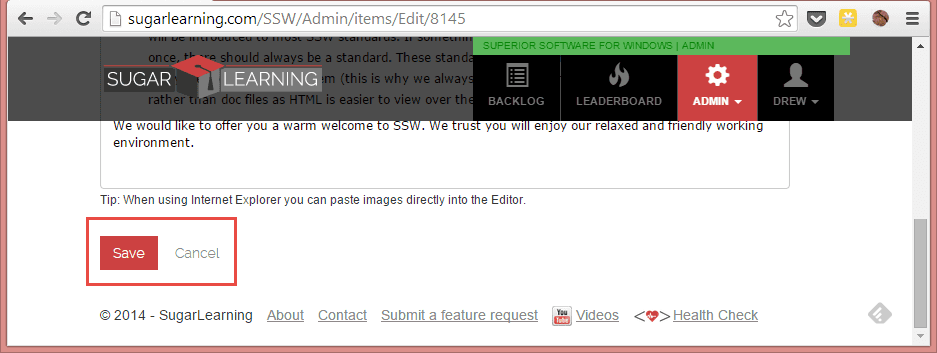
Bad example: Cancel button looks like a save button
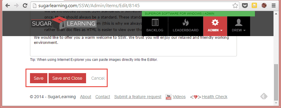
Good example: Cancel button is less obvious
Which side should the cancel button be on?
It depends which operating platform your program runs on:
Windows - On the right
Apple, iOS and Android - On the left
Web - Generally on the right
If you're designing a Web-based application, the decision is harder, but you should probably go with the platform preferred by most of your users. Your server logs will show you the percentage of Windows vs. Mac users for your specific website or intranet. Of course, Windows generally has many more users, so if you can't be bothered to check the logs, then the guideline that will apply to most situations is OK first, Cancel last.
What do you name your buttons?
It's often better to name a button to explain what it does, than to use a generic label like "OK". An explicit label serves as "just-in-time help," giving users more confidence in selecting the correct action.
Make the most commonly selected button the default and highlight it. Except if it's action is particularly dangerous; in those cases, you want users to explicitly select the button rather than accidentally activating it by hitting Enter.
Further Reading:
Nielsen Norman - The usability guru talking about ok and cancel buttons
To avoid users accidentally cancelling an operation when they thought they where clicking the save button you should always make your cancel button less obvious.