Rules to Better Interfaces (Mobile) - 5 Rules
With the internet moving so fast into the world of mobile devices, it's important to design for a variety of platforms. Many websites these days have a unique mobile optimized site which is great for usability.
Although mobile browsers are capable of rendering your normal website, some functionality does not carry across. Touch screens have no concept of "hover" so drop down menus must be activated on click. Screen estimate and the precision of the user is impaired on touch devices, so links and other clickable objects need to be rendered bigger.
The key thing to remember is that a mobile phone is a different device and have completely different use cases. EBay on a desktop can be used for a large variety of cases, including the creation of new bids, while EBay Mobile is primarily for checking activity while on the move. The focus of a mobile design for EBay centers on browsing, bidding and status updates for products - it doesn't need to cover all cases, just the right ones.
True mobile interface design focuses that which is used on mobile and simplifies the process.
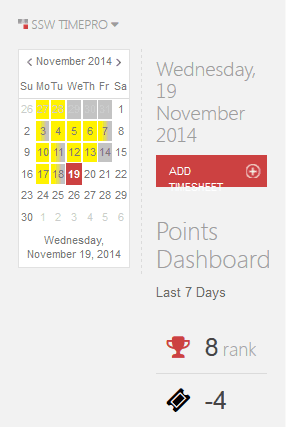
Figure: Bad Example - TimePro as it renders on mobile. It is near unusable! 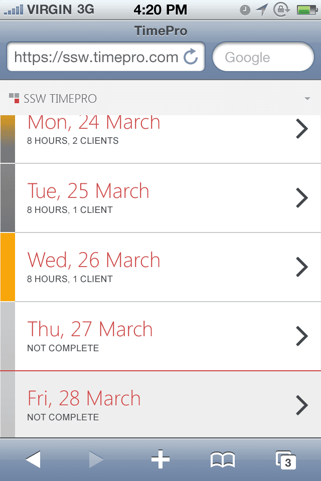
Figure: Good Example - TimePro designed for mobile. Hamburger menus are everywhere. They are popular and they declutter mobile UIs but the downside is that the menu items are less discoverable and require an extra click.
Video: Hamburger Menu Icon Update (3 min)When should you use a hamburger menu?
Use it only when screen space is tight (typically on mobile). Otherwise, always prefer showing navigation visibly.
Figure: Bad example – On desktop, navigation should be visible when screen space allows. Hiding it behind a hamburger reduces usability 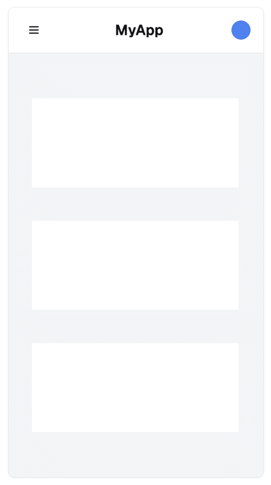
Figure: Good example – On mobile, screen space is limited, so hiding the nav behind a hamburger is appropriate ✅ Best practices
Users expect consistency in navigation — so make sure your hamburger menu behaves the way they expect.
-
Placement: The best location depends on your site’s purpose:
- For utility or web app pages, keep the hamburger menu in the top-left corner - this follows common patterns (see Microsoft example below)
- For marketing or brand-focused pages, prioritize logo visibility - in this case, place the hamburger menu on the top-right to give prominence to your logo
- Icon design: Use the standard three-line icon - don't reinvent it
- Toggle behavior: When opened, the hamburger icon should transform into a cross (X) to indicate it can be closed
- Branding: If your layout includes only a logo and menu, favor left alignment for improved visibility and brand recognition
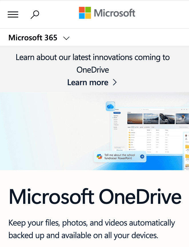
Figure: Good example – Microsoft keeps its hamburger menu in the top-left corner, following established UX patterns for consistency and familiarity Hamburger menus rock! Especially on mobile.
-
Mobile device usage has been on the rise for years, driven by the increasing popularity and capabilities of smartphones and tablets. It's safe to say that, in the past years, the majority of internet users globally were accessing websites through mobile devices.
Note: The exact percentage of mobile device users can vary based on geographic regions and demographics.
Therefore, it is very important to hyperlink your phone number to increase the rate of conversion and improve the mobile user experience. This enables click and call, and eliminates the need to copy and paste phone numbers.
Devices and computers that don’t have phone functionality will either open a phone app or add the number to a contact list.
<a href="tel:+61299533000">+61 2 9953 3000</a>Figure: Good example – To make a telephone number clickable, use add a link with "tel:" inside the href attribute
It depends on:
- Your Budget
- Usage of native API
- If you have an existing web app - in this case, it's easier to convert it to a web app by adding CSS
Note: An iPhone (or WP7) web app without a network connection, will not load the web page you were on previously.
Making a responsive website work well on a mobile is not easy but with the right tools you can save time and avoid bugs. You should use Chrome DevTools Device Mode to test different screen sizes.
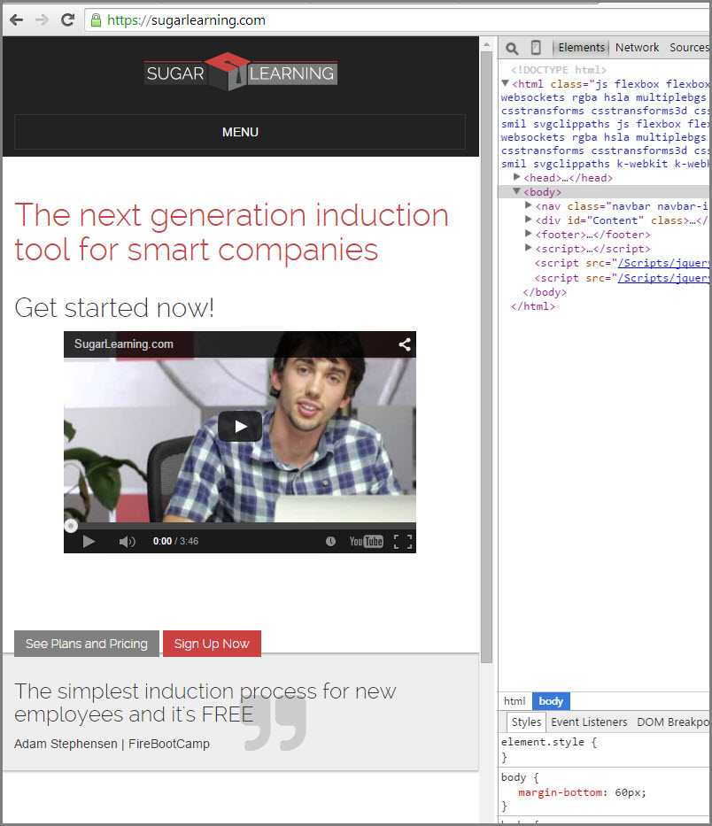
Figure: Bad example - Using your browser to test a responsive website layout 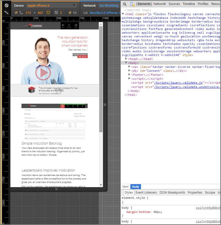
Figure: Good example - Using Device Mode & Mobile Emulation in Chrome How to test a responsive website with Chrome DevTools Device Mode
- Watch this video below
- Read the documentation on the Chrome Developer Website.
Additional resources: