Rules to Better Powerpoint Presentations - 32 Rules
Create impactful PowerPoint presentations with these essential rules. From using templates effectively to engaging your audience with interactive tools, these tips will help you deliver clear, professional, and visually appealing presentations.
Making your presentation over-complicated is a very easy trap to fall into. Many speakers make the mistake of giving away too much information.
In reality, giving a presentation is an entirely different genre from writing a technical report.
KISS - In its polite form, this stands for K eep I t S hort and S imple.
- In 20 minutes, you only have time for two major points
- In 30 minutes you might make three major points
- In 40-45 minutes you might be able to cover four major points, but three points and a longer time for questions would be a better alternative
Most experienced and talented TV presenters stick to making three points in half an hour - this is surely a lesson for anyone planning a presentation.
A strong visual speaks louder than words. Improve the way you present, teach and promote yourself adn your ideas with striking presentations. Make sure you get the right people to 'Test Pass' your presentations. Your content might be great - but if it is displayed poorly - it will be overshadowed by its flaws.
Even the most beautifully designed PowerPoint presentation can fall flat if the content isn't up to par. Ensuring accuracy, relevance, and clarity in your message is crucial for a successful delivery.
Have a Presentation Master to review the content of your slides to refine your message, validate information, and enhance engagement. Then get a Designer to make your presentation stand out.
- Do the best job you can on your presentation
- Get a senior developer to go through it
- ⭐️ Test Pass - From a Presentation Master
- ⭐️ Test Pass - From a Designer for better look and feel
- Show it to an audience to get feedback

Figure: Before and after... Designers can make anything look good So you have a shiny PowerPoint deck with heaps of great content, and you know what you want to say! Are you ready to present? No, not yet.
You need to practice it so that you know your stuff backwards as well as forwards.
Video: Good example - Practice your content forwards and backwards to be as good as Victor Borge
These 5 steps can improve the delivery of a speech immensely (inspired by Vinh Giang):
- Record the "Test Please"
-
Do an audio audit – play the recording, only listen to the audio (don’t look at the video)
- Are you speaking too fast/too slow?
- Are you pausing appropriately?
- Voice stressing/pausing on important points?
- Are you too loud/too soft?
-
Do a visual audit – play the recording, this time looking at the video only (turn down the volume to zero, so that you can’t hear the audio)
- How is your body language?
- Moving your hands less/more? (more hand movement means more distraction) Eye contact?
- Posture?
- Are you smiling or do you look stunned?
-
Use a transcript generator and get your speech printed on paper. (Include all the words)
- Cut off the unwanted words that do not add meaning
- Identify how many times you use "umms", "you know", and repetitive words that we all have a habit of using
- Practice by cutting out unnecessary repetition and filler words
PowerPoint's "Rehearse with Coach"
You can use PowerPoint's built-in AI "Rehearse with Coach" to get help with some of the above. It gives you instant feedback on how fast you are talking and what language you are using, so you can avoid unwanted words. In the video below Mike Tholfsen shows you how to use the feature and what feedback you get.
Video: How to use Presenter Coach in PowerPoint for the web (2 min)To get started you'll need a Microsoft PowerPoint presentation. Click the tab Slide Show | Rehearse with Coach | Start Rehearsing.

Figure: Starting a rehearsal 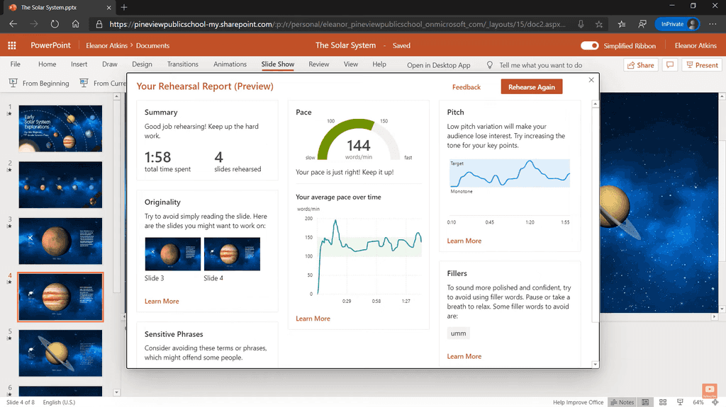
Figure: After rehearsal, you get a nice report with recommendations on what language you used and how you delivered it You can find more information on Microsoft's support page, Rehearse your slide show with Speaker Coach.
PowerPoint templates are designed to engage your audience visually and save you time. When you start creating a new presentation file, always make sure you use a template.
Pros of using a template are:
- Consistency of use for others at your company to work on it
- Consistency of look on intro and finish slides
- Consistency of look footer on each slide
- Consistency of general styling
- It helps with the process of getting a ‘Designer Test Pass’
Figure: Bad example - Not using the corporate template (in this case not SSW) 
Figure: Good example - That's a mighty fine looking template you got there How to pick the template: In newer versions of PowerPoint, it is necessary to add your custom template to: C:\Users<UserName>\Documents\Custom Office Templates\
They will then appear in the PowerPoint list when creating a new presentation. You can also find a more in-depth guide on how to create PowerPoint templates and how to use a personal template.
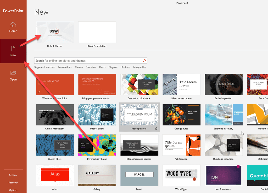
Figure: Good example - Your custom template appears in PowerPoint How to check if the template is being used?
There is no way to tell which template your presentation is using. The workaround is to add a hidden slide at the end with a list of the version changes E.g. version number, date, description, etc
Unfortunately, there is no easy solution to this. What we need is a 'version' field and an 'Update' button - See our Suggestions to Microsoft PowerPoint: Check for Updates
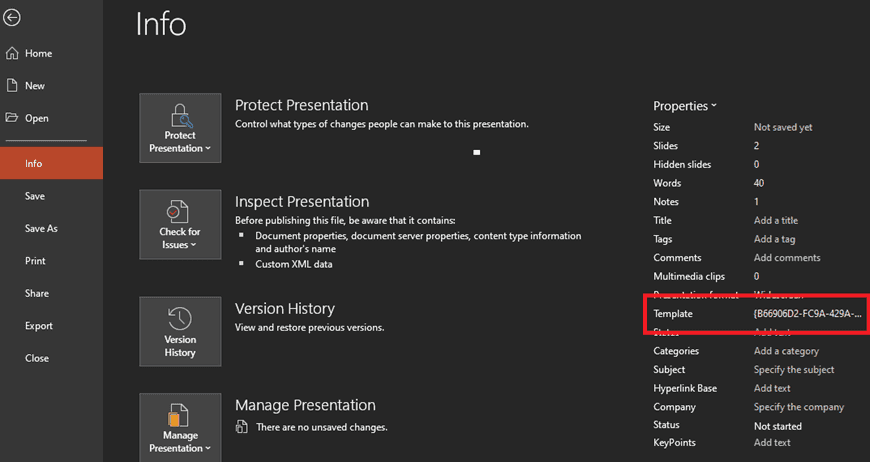
Figure: This feature is broken on PowerPoint - the template field could show as an uncomprehensive code We recommend to store the template version number on a slide on the PowerPoint template, which the presenter could remove.
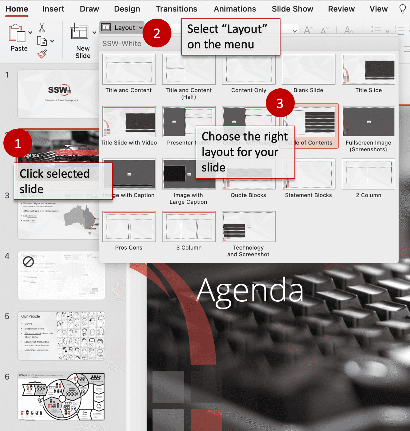
Figure: Version number is on the slide Different layouts have different purposes. While the default layout is nice, it's not the only option available. But remember to keep all things in moderation. You want the audience to focus on the content, not guessing what layout the next slide will use.

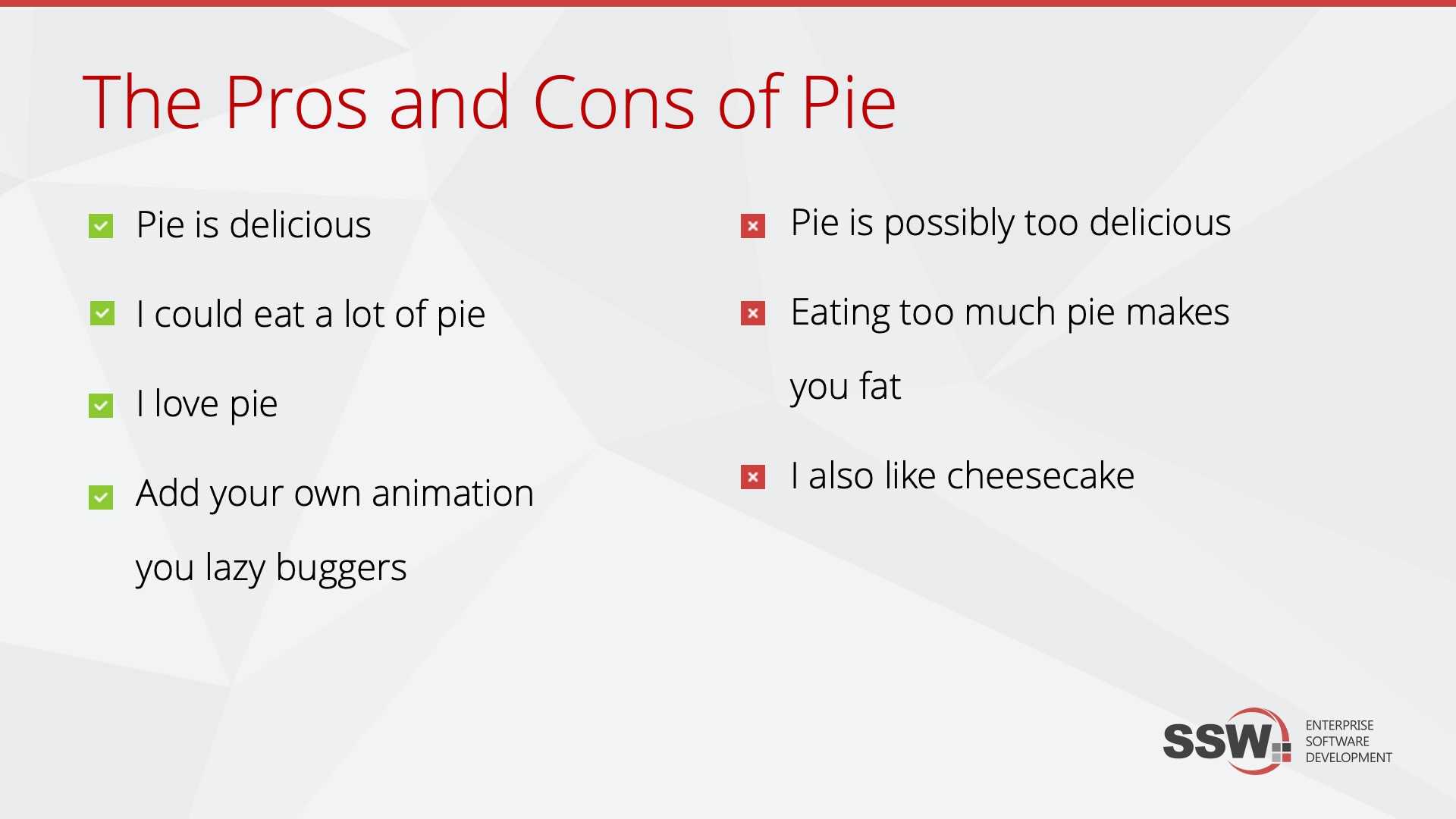
Figure: Don't use the same layout for all slides, instead choose the right 'layout' for the each slide (this is called the layout library) Make your positive and negative points a tick and cross.
Figure: Bad example - it's not clear which are good and bad points 
Figure: Good example - It's far more obvious which ones are the good points and which are the bad How to create these custom bullet points?
Read these instructions from Microsoft: Create custom bullets with pictures or symbols
Each font or style (italics or bold) should be used consistently throughout your presentation. While a different font face or color is a simple way of highlighting certain terms you want for focus, too much of it will do exactly the opposite and distract the audience.
-
Use one font and its variations in a presentation
- Steer clear of excessively bright colors or any flourished type face (both are hard to read)
- Keep the styles (eg. bold or color) consistent between slides, so it's easy to identify the hierarchy
Figure: Bad example - Different fonts and styles of a flourished type face used. Makes your slide hard to read for the audience 
Figure: Good example - Even though there are a lot of words, the important ones are clear because there is only one font used, with colors to emphasize -
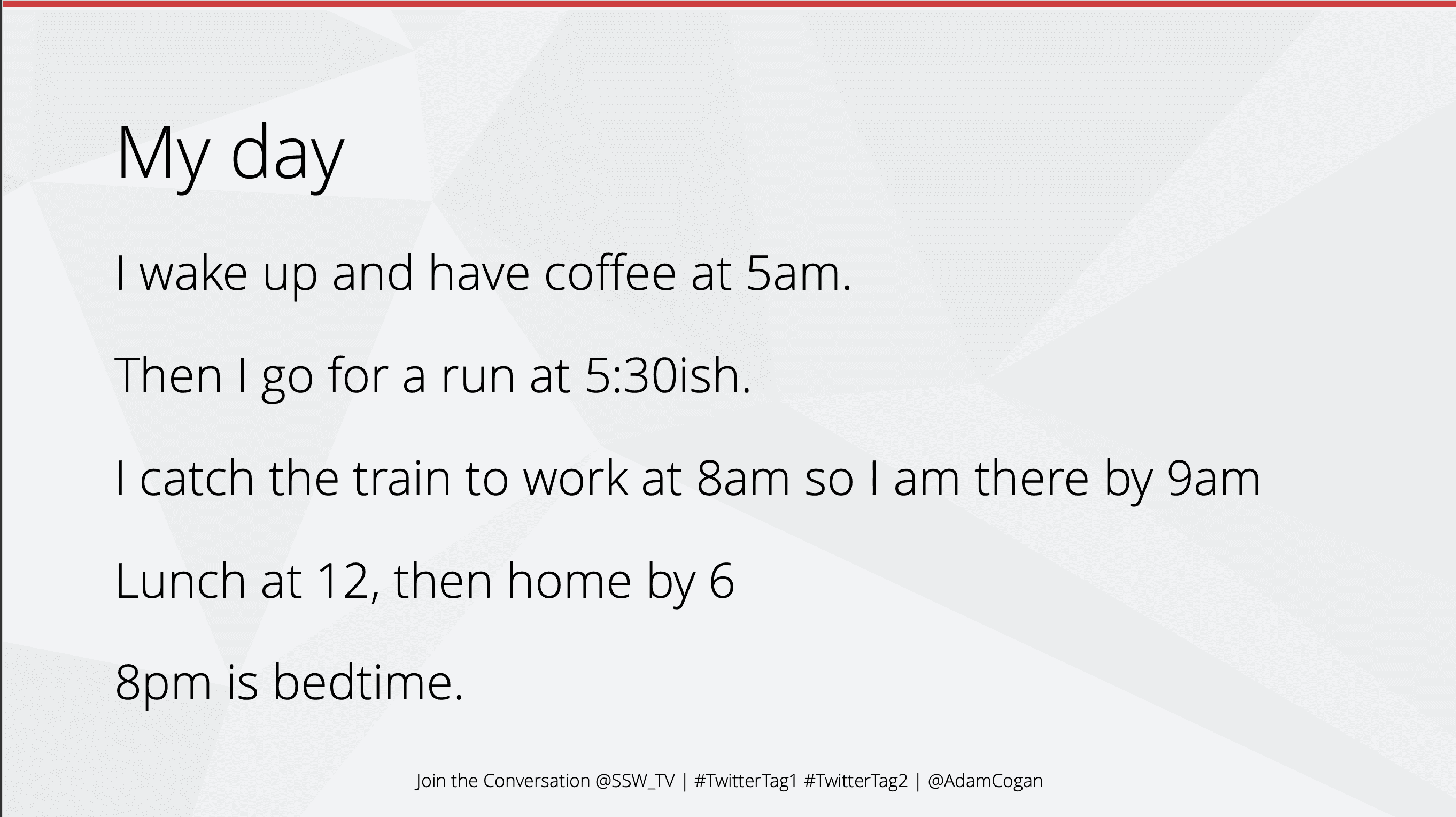
Presentations are hard to get right, it's easy to fall into the trap of putting too much text on your slides.
Science says people can't read and listen at the same time. If they are looking at your slides, they are not listening to you. If they are listening to you, they are not reading your slides.
Video: PowerPoint Sucks and Why It Shouldn't (5 min)Your slides should illustrate your point. They should not describe your point.
The slides are not there to convey all the information you plan to present, they are there to support the information you plan to present.
Figure: Bad example - Sentences on slides mean the audience isn't listening Now let's look at some strategies to present text nicely and make information more digestible.
Using the Microsoft 365 Designer
PowerPoint has a built in Designer tool that can help you make your slides look better. It suggests alternative layouts and even icons to make points more illustrative.
Figure: Good example - Use the designer to make slides more interesting See more info on the Designer.
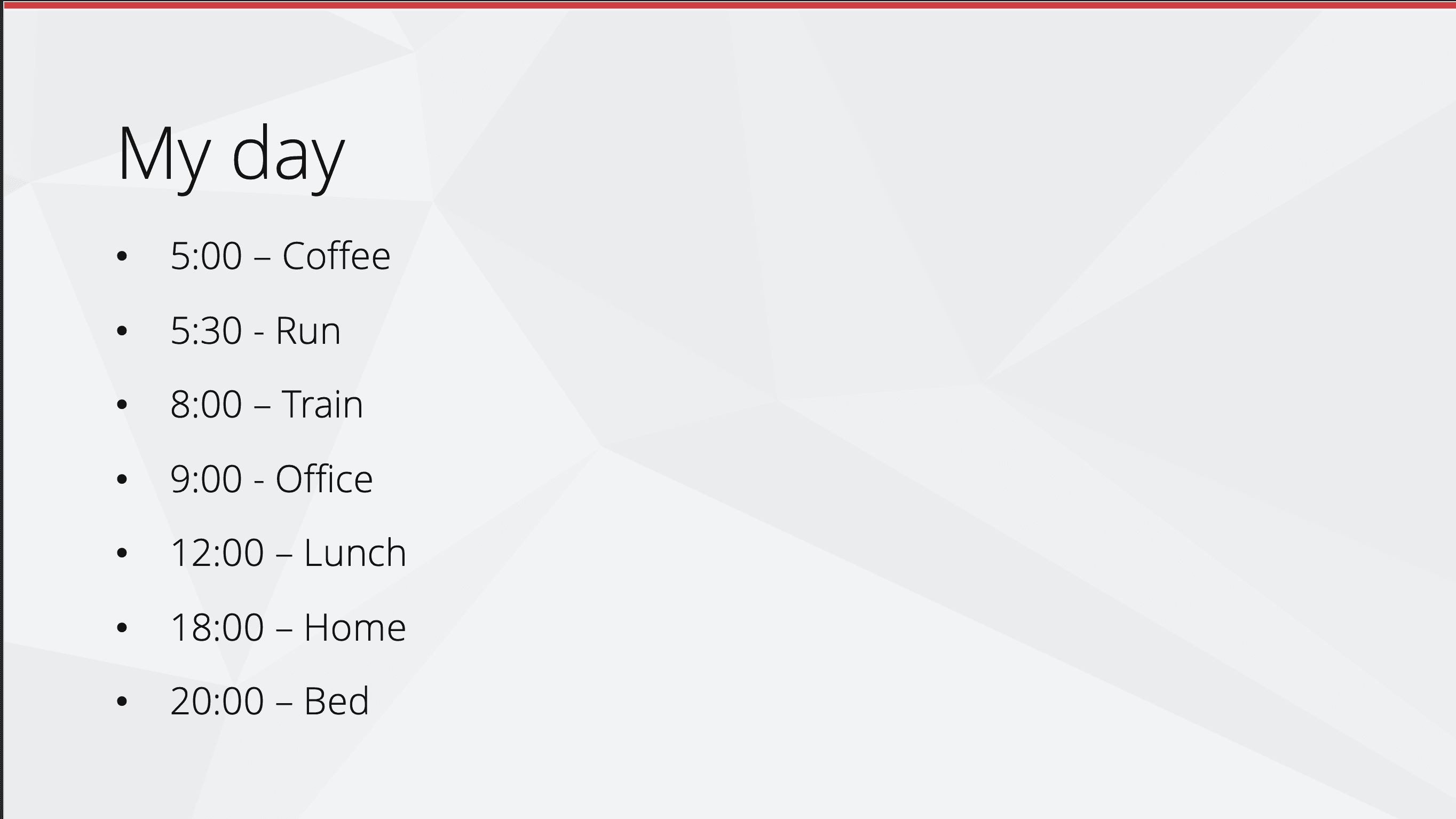
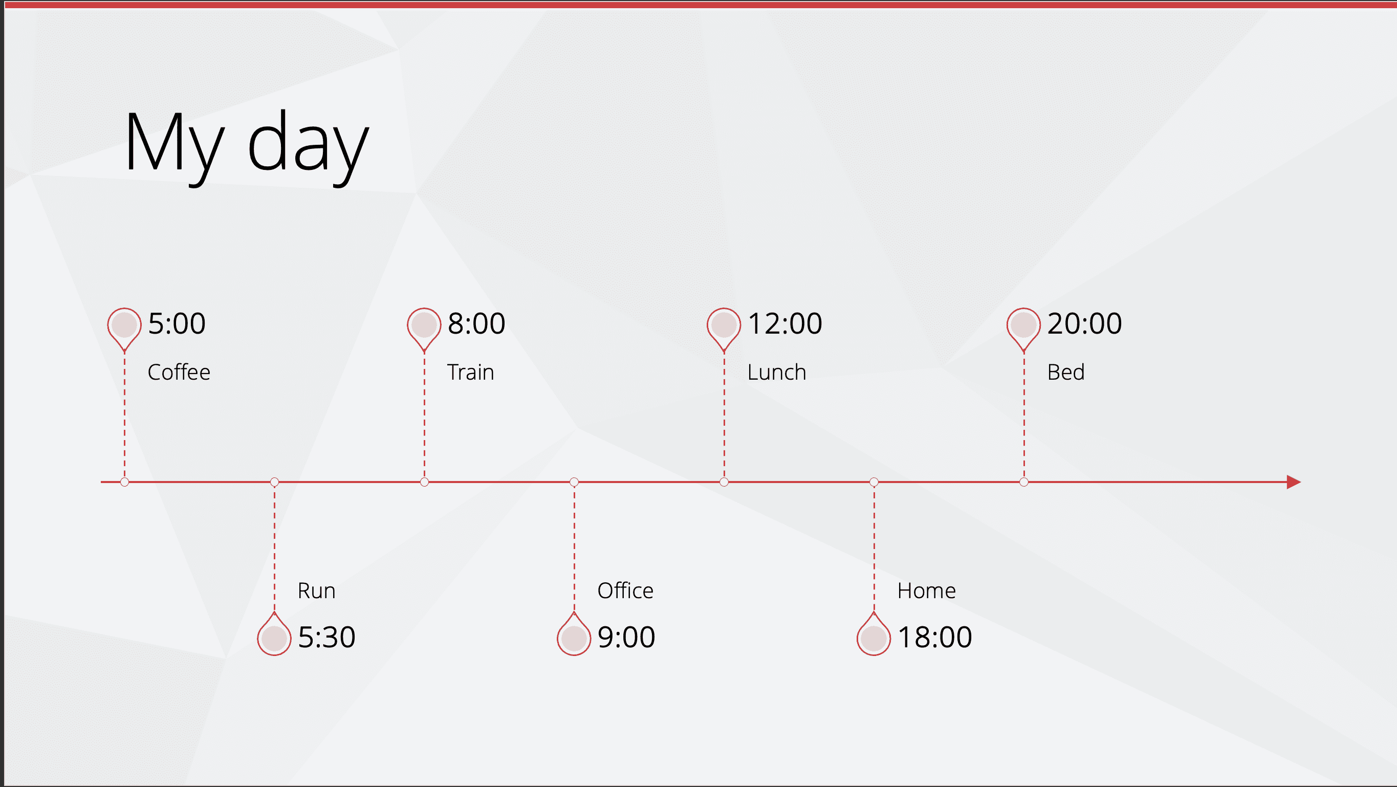
Using SmartArt
SmartArt is another tool that can help you present text in a more interesting way. It allows you to easily try different visuals to display your information. It even has a built-in icon library to make your content more beautiful.
Figure: Bad example - Bullet points make the intent unclear 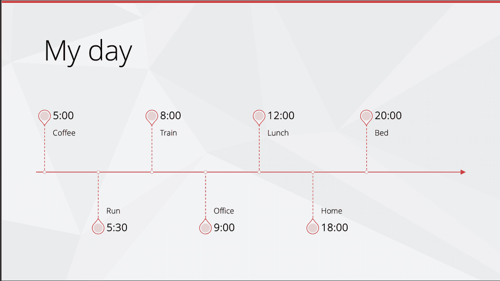
Figure: Good example - SmartArt easily converts bullets into a timeline Using animations
You can use animations to enhance your messaging, for example, reveal points one at a time to keep the audience focused and not reading ahead.
Animations help avoid a wall of text.
Figure: Good example - Animations Add your logo and tagline for branding purposes. The tagline concept is to use a catchphrase that will sum up the tone of a brand and to reinforce the audience's memory of your company/product.
Neither of these elements is intended to distract, so they are placed subtly in the footer of the slide. It is present, but the influence is tiny and your audience's focus will remain squarely on the content.
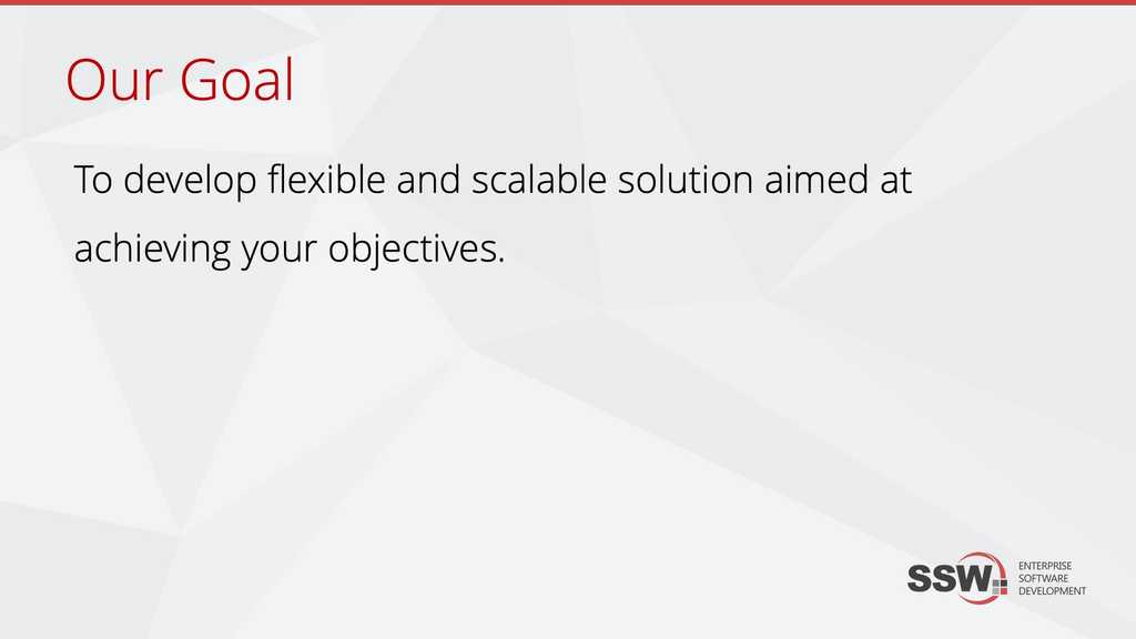
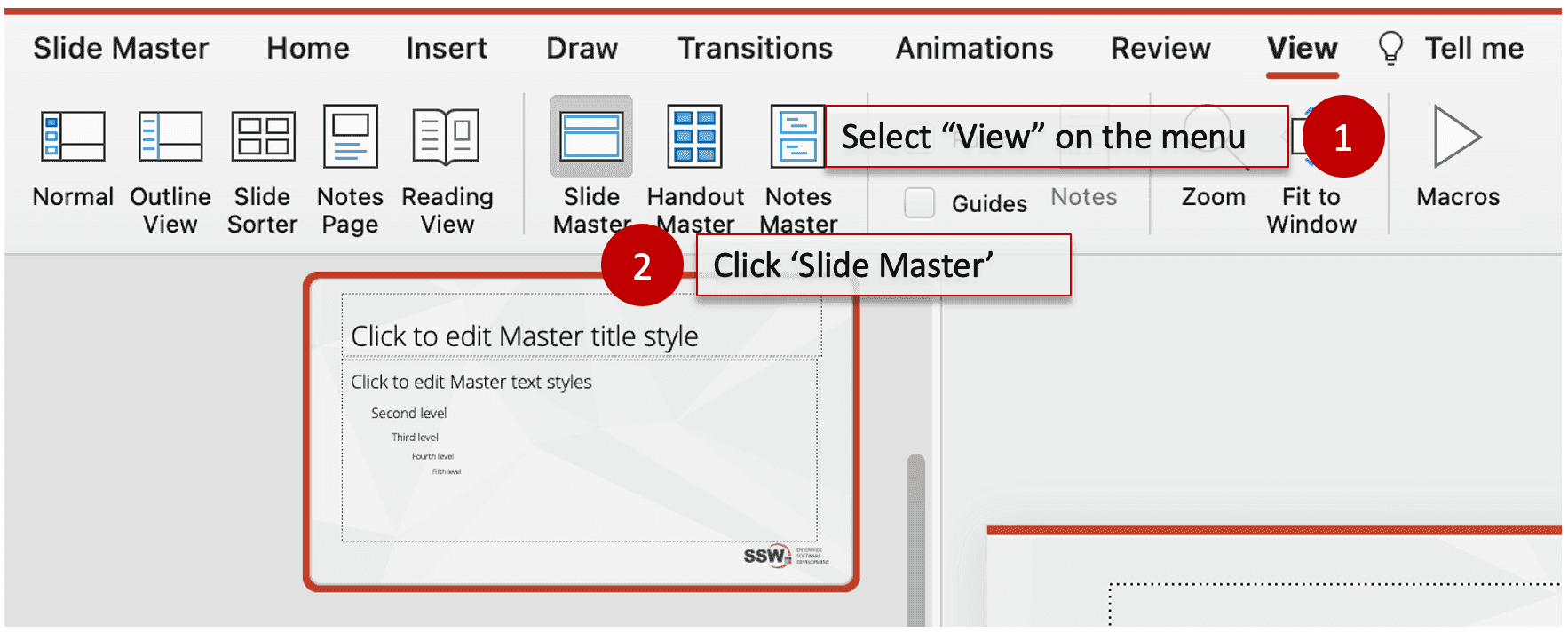
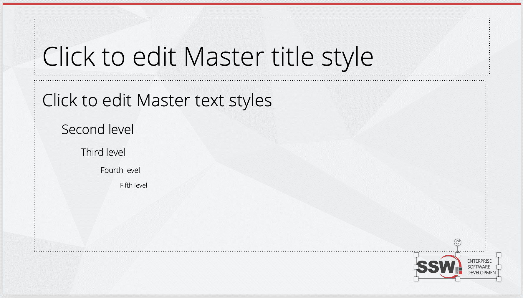
Figure: Include a logo and tagline at the bottom of the Slide Master for branding How to do it
Adding the tagline and logo in the Slide Master will replicate it automatically across all slides. The master will also dictate the size and font of text present on all slides. Once you've added your logo to the slide master and you're happy with the size and positioning, you can save your changes by clicking Slide Master | Close Master View in the navigation bar.
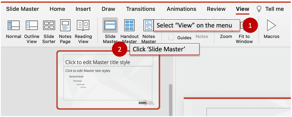
Figure: Step 1 - Click 'Slide Master' button on the 'View' ribbon 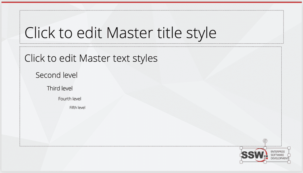
Figure: Step 2 - Add your logo and tagline at bottom of the slide You may be a natural-born public speaker, but you will not be able to 'wing' a presentation. Setting up a presentation takes time and practice. You want web pages already open, you want VMs ready and demos good to go.
So document the steps to undertake before starting and you will present in a snappier fashion and not need to say the lame statement "hope the demo gods are kind to me today".
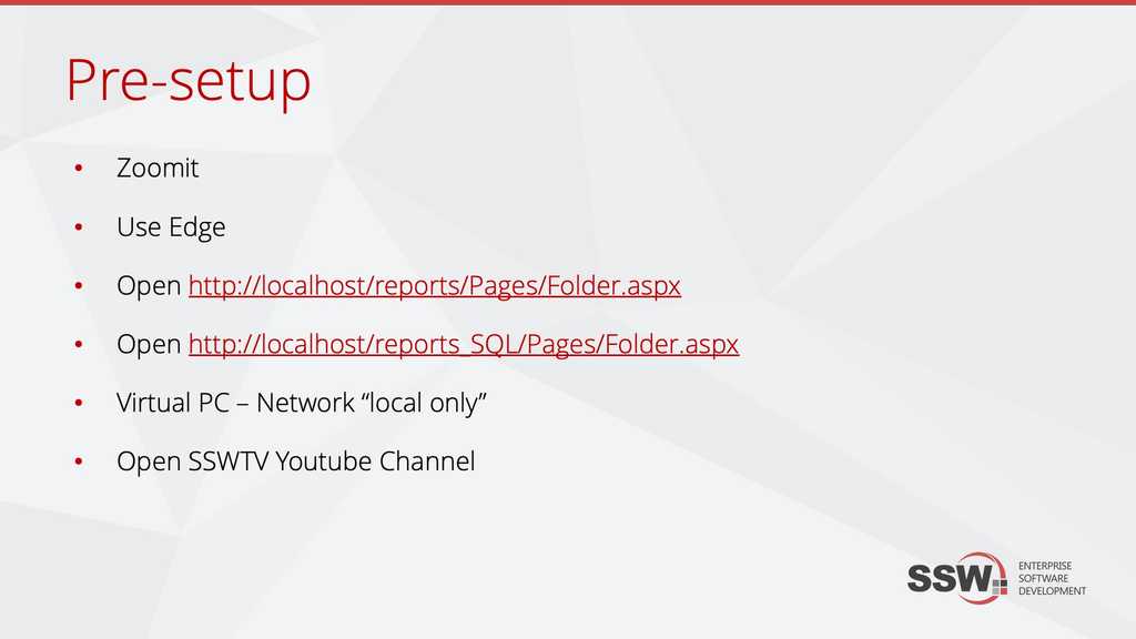
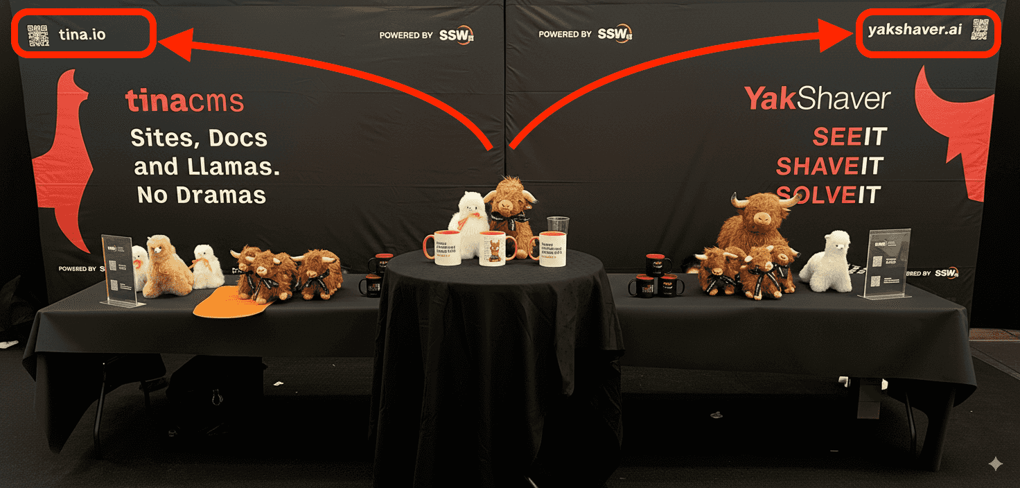
Figure: Use a Pre-setup slide prior to the presentation and your pace will be snappier Create a hashtag for your presentation prior to the presentation and display it in your slides! Twitter backchannels are valuable sources of feedback.
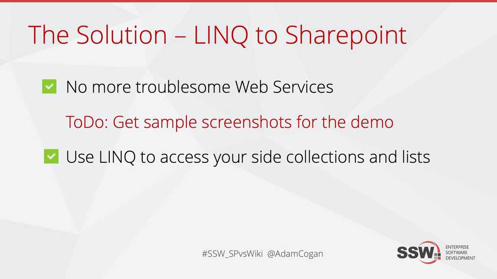
Figure: A Twitter hashtag allows the attendees to have a backchannel that can be used to talk about your presentation, during your presentation If you are presenting to people who you already know, then you have an enormous advantage over someone who is going to face an audience they have never previously met.
It is best to confirm who you are speaking to via a few slides. Then you can make subtle changes during your presentation so your audience gets:
- What is important for them
- Interesting to them
- Relevant to them

Figure: Ask "How many are developers here?" 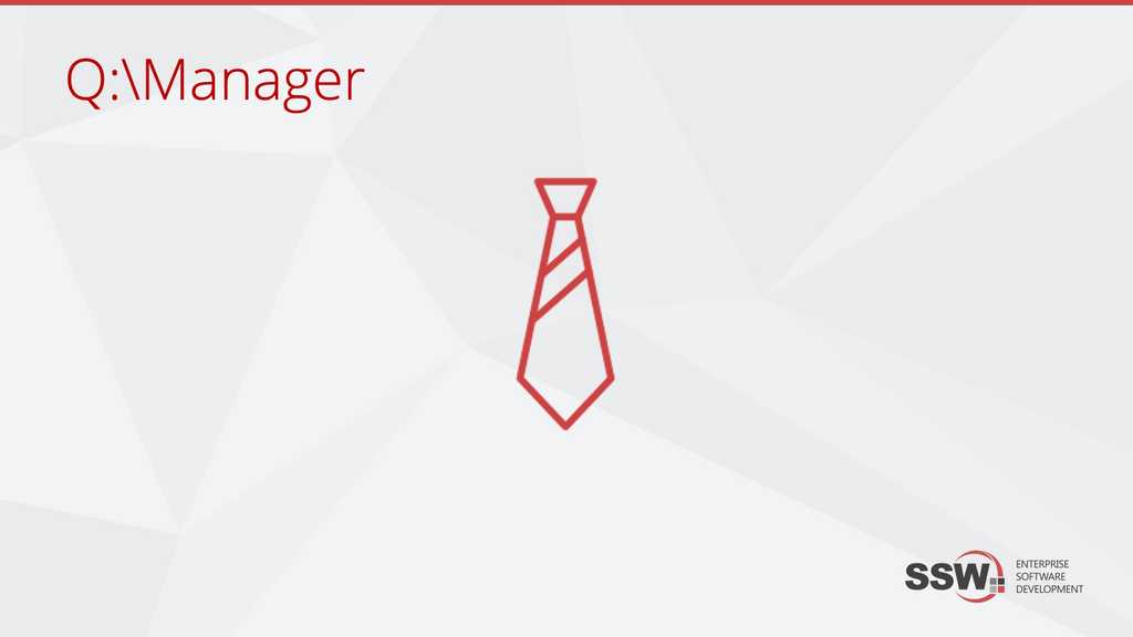
Figure: Ask "How many are managers here?" In a similar fashion to the Do you indicate 'demo' slides? rule, you can also add a visual cue (icon or simply text) for any audience participation you would like, such as questions or voting.

Figure: Use an "?" image to tell the presenter to ask a question Open a Word doc at the start of your presentation. It is a good idea to have some interaction with your audience in the form of Q&A. This will instill a lasting message long after your presentation is over.
By opening a word document on the screen or projector, everyone in the room will be clear about the questions being asked and the answers being given. This will also help you address any open issues after the presentation.
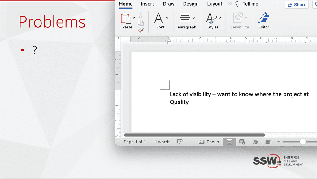
Figure: A nice presenting technique is to write any questions and answers from your audience (live on stage) Always introduce yourself to the audience. However, it is not great to bring up the 'About' slide too early, so you should do it *after* you have asked the audience who they are.
Don't be shy, tell them:
-
Who are you?
- Optional - include something personal
- What you do (your service or product)?
- What makes you qualified to speak on this topic?
Figure: Talk about yourself after you know the audience a little -
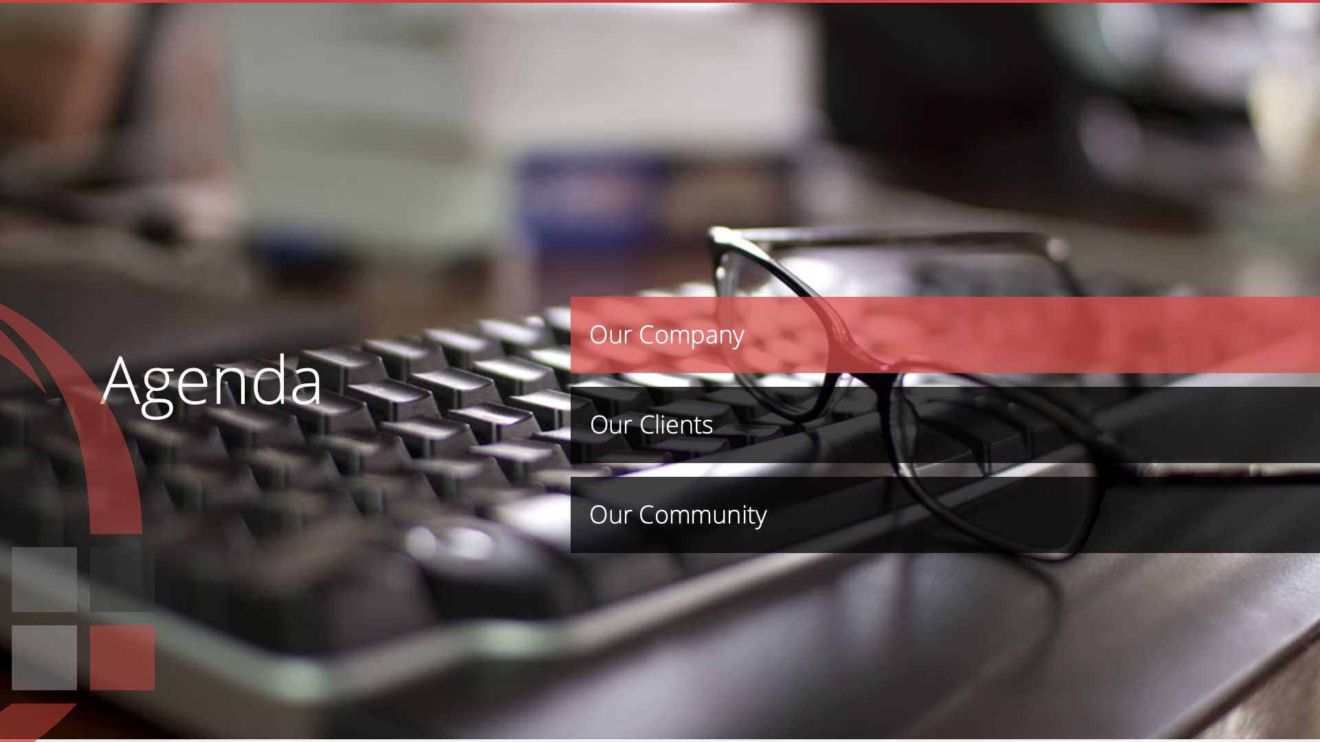
A presentation is a verbal essay and it follows a structure. Shown at the start of the presentation, the 'Agenda' slide sets the expectation.
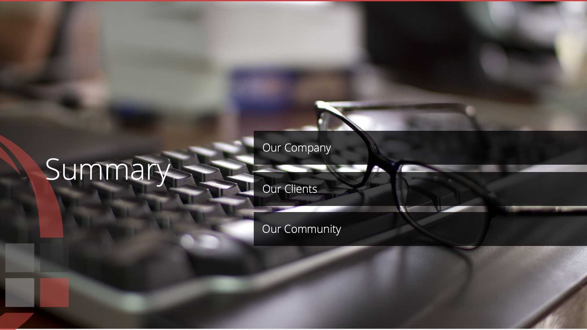
In the end, the 'Summary' slide should be identical, and summarize what you just spoke about.
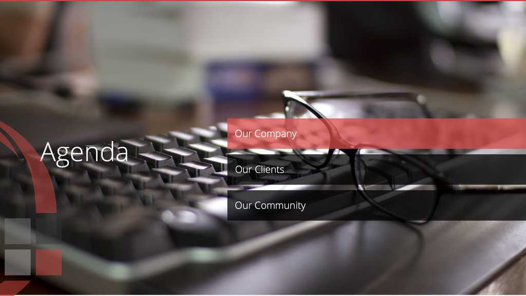
Figure: Slide for agenda 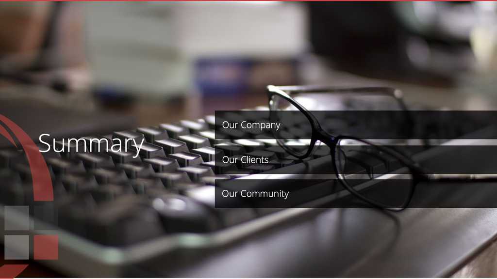
Figure: Slide for summary (is the same as agenda) You should have a good cover slide for each section of your presentation. They are called "section break" slides and are meant to visually divide the content structure. These slides should be consistent so they do not confuse the audience.
Figure: Good example - This is very clear that we are up to part 2 of the presentation By placing a little visual cue on your slide, you can remind yourself to show a demo to the audience. Avoid displaying the word 'demo', because when out of time, presenters say "Sorry, let's skip that demo since I am short of time" and leave the audience frustrated.
The icon allows you to skip it when running short on time, without upsetting the audience.
Figure: Bad example - Demo text shown in a slide 
Figure: Good example - Use a subtle icon to indicate a "demo time" Add key screenshots after 'Demo' slides
After your live demo slide, include the key screenshots that summarize the demo. This allows you to quickly revisit what was shown, and recap the message in under a minute.
Bonus: Screenshots act as your backup plan. If your demo fails due to something unexpected (e.g. not enough time, no internet, or a broken API), you can still quickly walk your audience through the flow using these images. This small addition can turn a potentially awkward moment into a confident recovery.
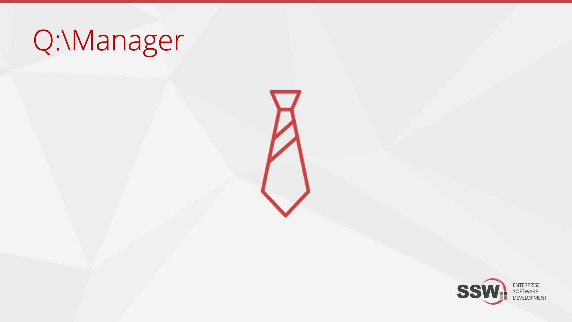
When sharing the presentation content between a few speakers, it might be hard to remember who is supposed to talk during each slide. You can help this by placing a little icon on your slide.
That way you can passively remind each other who is meant to be presenting at the moment. An extra tip is to avoid displaying the name of the person, because when that presenter is unavailable, the replacement presenter feels untrustworthy to the audience.
The icon allows you to determine whose turn it is to speak, without notifying the audience.
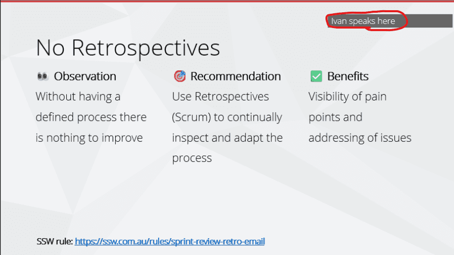
Figure: Bad example - Presenter name shown in a slide as a note 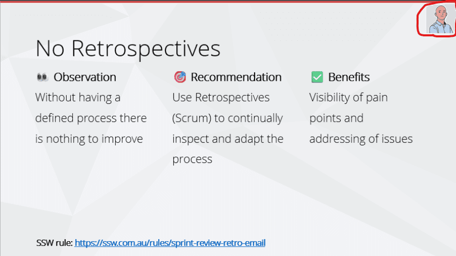
Figure: Good example - Use a subtle icon to indicate the presenter Tip: Put the person's icon in the top right corner of the slide. To make it easier to see at a glance who is meant to be speaking.
Slido is an online platform which provide the easiest way to collect questions for your Q&A sessions, it also run interactive presentations with a top-rated live polling tool.
You can ask your audience to scan QR code to send questions, the audience also can see and upvote the best questions on their mobile devices. You can approve and display the best questions on the presentation screen and highlight the ones that are being answered. All questions are automatically saved for export and analysis.

Figure: Slido live Q&A's participant view and host view Live polls are a great way to collect thoughts and engage with audience. You can do all different types of polls with Slido, such as multiple choice, rating and open text. You can display the poll on the presentation screen with the results updated in realtime.

Figure: Slido live polls' participant view and host view The quality of your images is a subconscious message to your audience.
Using high-quality images on a website is essential for creating a visually appealing and engaging user experience. High-resolution images enhance the site’s aesthetics, build credibility, and improve user engagement. If you use low quality pictures, then you unintentionally suggest the same message about your product.
However, it's important to balance image quality with performance, ensuring fast loading times without sacrificing clarity.
For this reason, we encourage you to choose only high quality photos and to avoid unprofessional cartoons and clip-arts.
Every time you add an image to your content, make sure it:
- Is readable if it has any text on it
- Has been optimized
- Looks consistent with others on the same page
- Has at least 800px width (except for logos, icons, and profile images)
- (optional) Is not in dark-mode - Light background images look better most of the times
Warning: Never stretch small, low-resolution photos to make it fill up the space. This degrades the resolution and the image will appear very coarse and granular on the projection screen.
Figure: Bad example - Low quality image 
Figure: Good example - High quality image You can get in trouble for using copyright images in PowerPoint presentations. Images like this are OK to use as long as the source is attributed.
If you don't have licenses for images, you should replace them with Creative Commons.
You can get them from several website, such as:
Small images are hard to see. Remember your audience sitting at the back of the room. Especially for screenshots displaying important text, use all your real estate.
Figure: Bad example - the image doesn't cover the whole slide 
Figure: Good example - Cover the whole slide with your image to make it easier for people to see from the back row Always end your presentation with a 'Thank You' slide. More than being polite, it makes clear that this is the last slide and presentation is over. You can also take the opportunity to inform the audience of your contact details.
Even better; if you did a good job, you might get a clap (or in Adam's case, a cough).

Figure: Always finish with a 'Thank You' slide Most companies keep their presentations on an internal resource (e.g. SharePoint, or these days more likely "Teams | Files") and there is still a place for that (especially if you don't want to share it).
The best place for presentations (PPT) and other resources such as PDFs or a bunch of URLs is in a public location. The best public location is GitHub.
Did you know that if you keep your PowerPoint presentations in a public location, it makes it easier for your attendees to access later?
There are a few ways to do this:
- Option 1: GitHub (E.g. github.com/sswconsulting/presentations) Recommended! ⭐️
- Option 2: Slideshare
SlideShare is an online service for uploading files privately or publicly in PowerPoint, Word, PDF files. Content can then be viewed on web and mobile devices or embedded on other sites. - Option 3: Notist
A design & video collaboration, prototyping & workflow app for creative teams. - Option 4: Sharing a OneDrive link (⚠️ They expire!)
- Option 5: Google Slides
A Google powered service which can create, present, and collaborate on online presentations in real-time and from any device. - Option 6: Tencent Doc
A famous free online document platform that allows for multi-person collaboration of Word, Excel, and PPT documents. Recommended for user from China️!🇨🇳
Figure: Good example - Storing your presentations on GitHub Unfortunately, when you “Send As Email” it doesn’t compress the file; this is how to compress a PowerPoint for emailing.
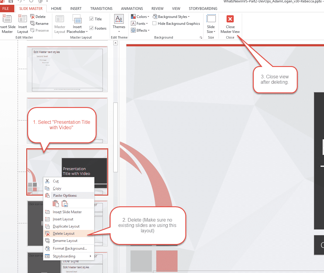
Remove the video from the master slide.
This has been done in the 3.8 release of the template, but for old templates you may have to do this manually.
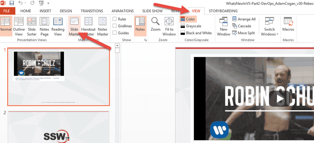
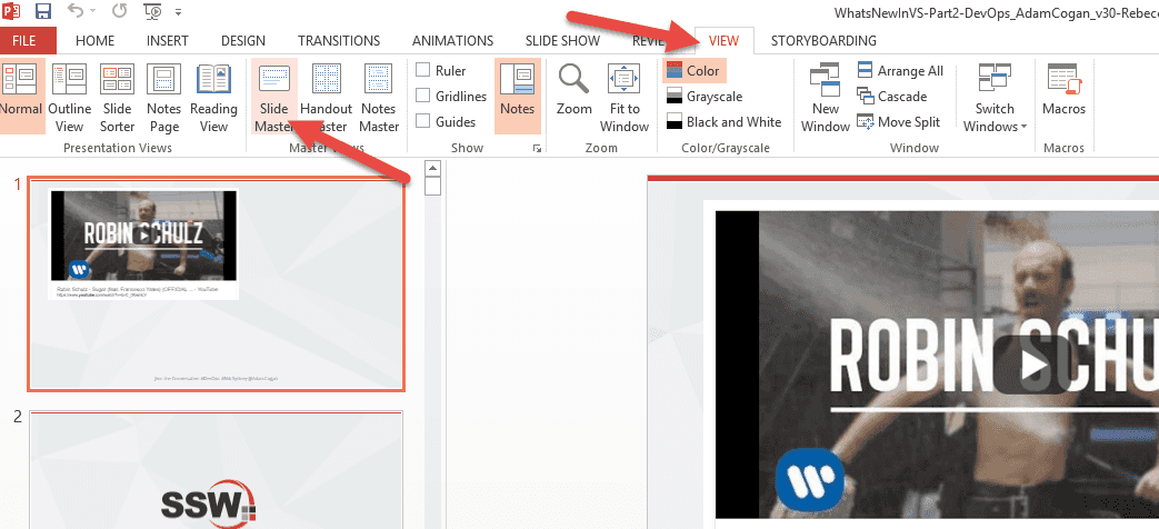
Figure: Go to the slide master 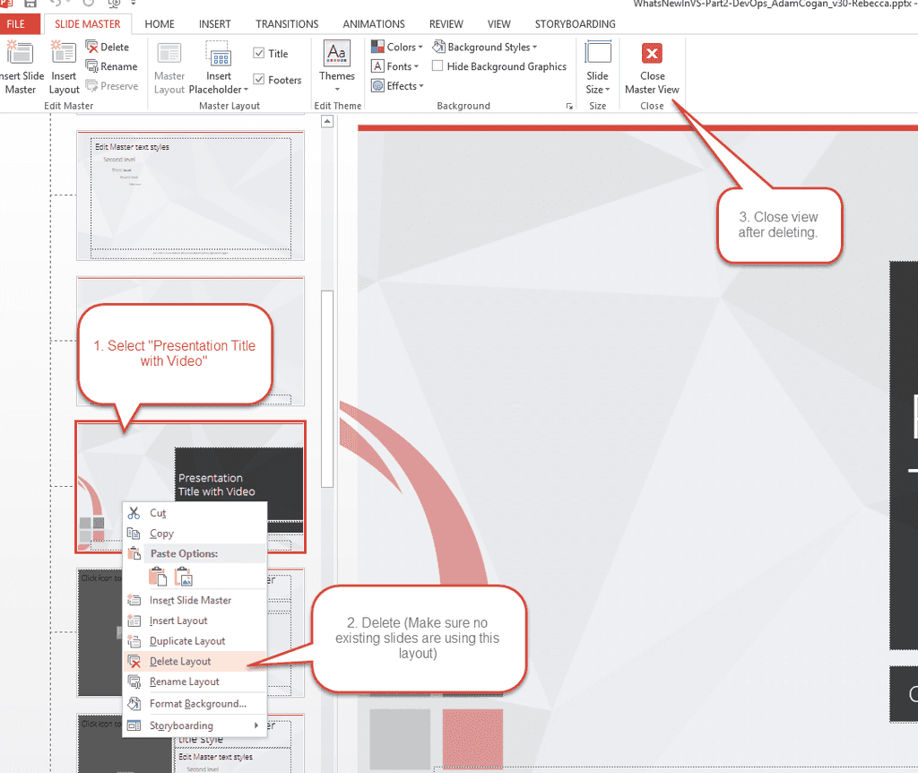
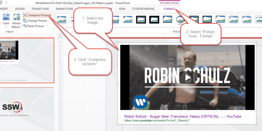
Figure: Find the slide layout "Presentation with Title and Video" and delete it Compress ALL your images
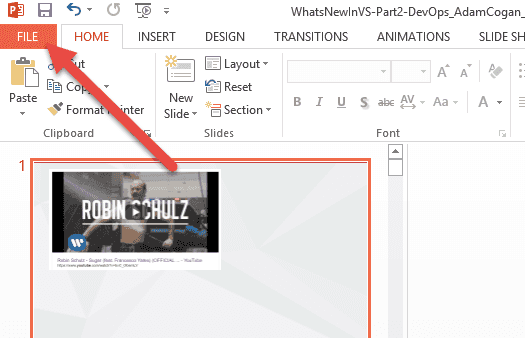
Figure: Go to the File menu 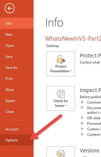
Figure: Select Options 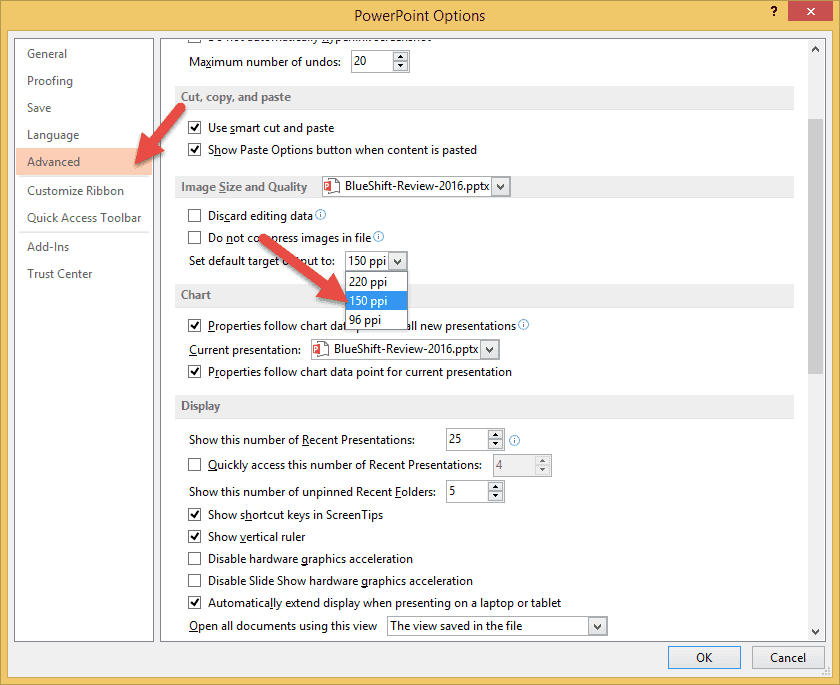
Figure: Apply settings. You may compress this further down to 96ppi if you must Compress individual images (not recommended)

Figure: Find the Image Compression option 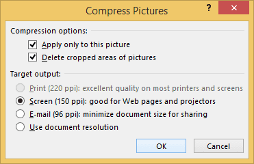
Figure: Apply these settings and go for a coffee break. This may take a long time, depending on how many slides you have Compress font - ONLY DO THIS WHEN YOU ARE FINISHED EDITING
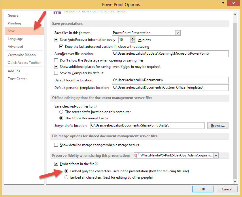
Figure: Apply these settings. Once you remove the font, you’re more likely to get missing font bugs when editing the file, so only do this step when you are done Save as "YourFileName_compressed.pptx."
Do not override your original. You should always keep a high-res master of any media document.
If you find your files are still rather big after compression, you can export the PowerPoint to determine which particular slide is taking up all that space. http://www.addictivetips.com/windows-tips/find-which-slide-in-your-powerpoint-presentation-is-the-largest-in-size/
The result
Your own mileage may vary.
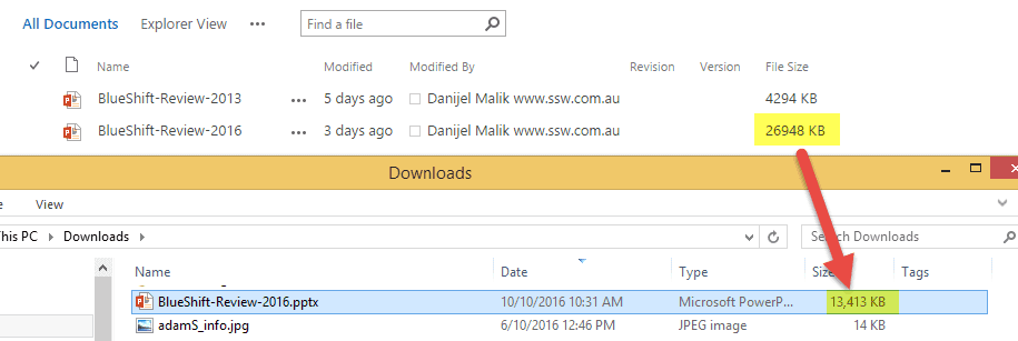
Figure: We've compressed this particular file down by 50%! When you show all of your content on a slide when it first loads many people will read ahead of what you are saying.
The summary slide is very important. It's your chance to re-iterate what you have covered in the talk, and remind the audience of your key points.
You want them listening to you, not reading ahead.
Animating the items on your Summary slide ensures they are listening to you, not reading ahead.
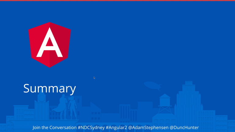
Good Example: Animate the points on your Summary slide When you’re sending emails, or pinging someone in Teams, your URLs should be as clean as possible. Having no extra noise ensures that they are easy to read, and it is more aesthetically pleasing.
Note: URLs have become increasingly cluttered with the introduction of CampaignIDs (used to track customer activities and other information). When you're sharing the URLs, it is better to make them as clean and readable as possible... so delete everything after the question mark (including the CampaignID suffix).
Tip #1 - Break a line before URLs
It is also a good idea to break a line before an URL, improving its readability.
To: Bob Subject: Purchase please - New hand dryer Hi Bob
Here is the link to the new hand dryer that you wanted to see:
Vortex Hand Dryer, Super Quiet motor, 3 Years Warranty - $184 (no electrical installation required – plugs in – for the men's bathroom upstairs) https://www.ozwashroom.com.au/hand-dryer-285?campaignid=1683143023&adgroupid=62945164502&keyword=&device=c&gclid=Cj0KCQjw--GFBhDeARIsACH_kdbAtHf_smGug0NCviYbZvW_9uGLXLT1LjheMQ-bpBOOtqcD5ln3Uz0aAjS6EALw_wcB
Best, Dave
Figure: Bad example - Dirty URL with superfluous information
To: Bob Subject: Purchase please - New hand dryer Hi Bob
Here is the link to the new hand dryer that you wanted to see:
Vortex Hand Dryer, Super Quiet motor, 3 Years Warranty - $184 (no electrical installation required – plugs in – for the men's bathroom upstairs) ozwashroom.com.au/hand-dryer-285
Best, Dave
Figure: Good example – Clean URL on a new line is easy to read and looks much better
Note: Make sure to place the URL on a new line to reduce clutter and improve readability.
Tip #2 - Remove
https://andwwwFor presentations and videos (i.e. (lower thirds](/video-editing-terms/#3-lower-third)), it's especially important to keep URLs cleaner. Remember to always remove
https://www.from links. It keeps the slides cleaner and more readable.
Figure: Bad example - Showing unnecessary extra noise "https://www." 
Figure: Good example - Clean links in a presentation Have you ever watched an awesome presentation? The presenter promises to share some resources. You’re excited to see what they recommend. But then they start racing through their slides. The URLs flash past before you can even write them down. Frustrating, right? Don’t do that to your audience.
Video: What’s the difference between QR and barcode? (2 min)
Use QR codes in marketing materials
You should put QR codes in all your marketing material, wherever there is a URL.This reduces friction for interested people trying to view your website!

Figure: Good example - We use QR codes in our banners in conference, making attendees more likely to open the website on their phones Use QR codes in presentations
Sometimes you need to show URLs on a slide. For example, you might be talking about the URLs themselves. But when you’re sharing resources, your audience struggles to write them down. The URLs slip past before they’re ready. And if you linger on the slide just so people can copy them, it breaks your flow.
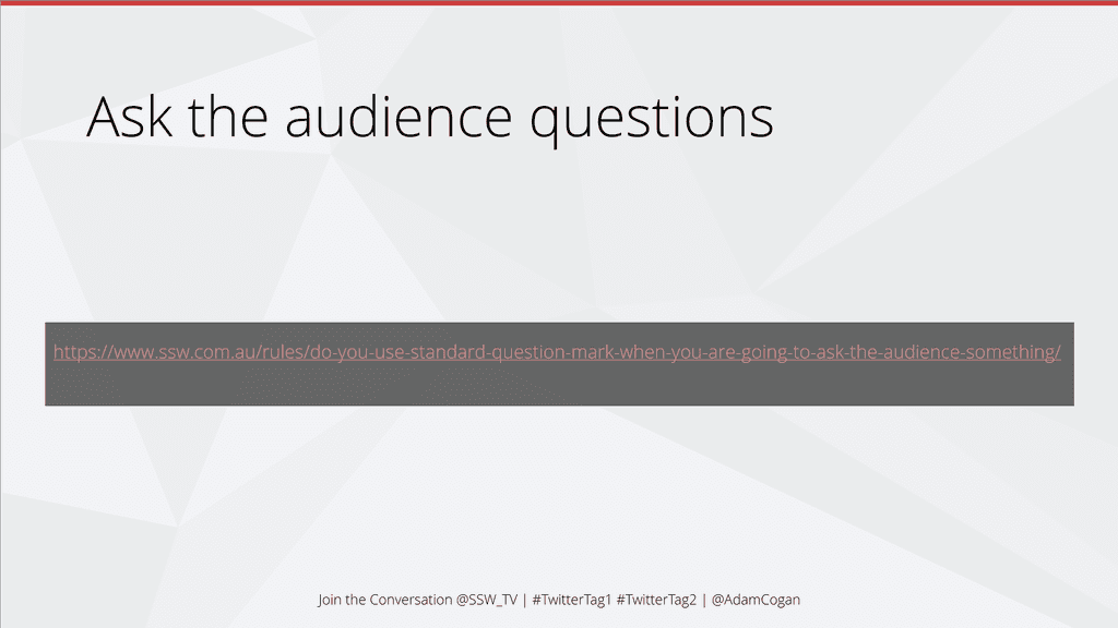
Figure: Bad example - A long URL is impossible to note down A better approach is to use QR codes in your slides. Your audience scans the code in a second. They can bookmark the resource right away, without becoming stressed.
Figure: Good example - A QR code is easier for the audience to quickly scan during a talk
Tip: You can use an Office add-in called QR4Office to directly generate these QR codes for slides within PowerPoint.
Check out this video:
Video: How to create QR code in PowerPoint (2 min)
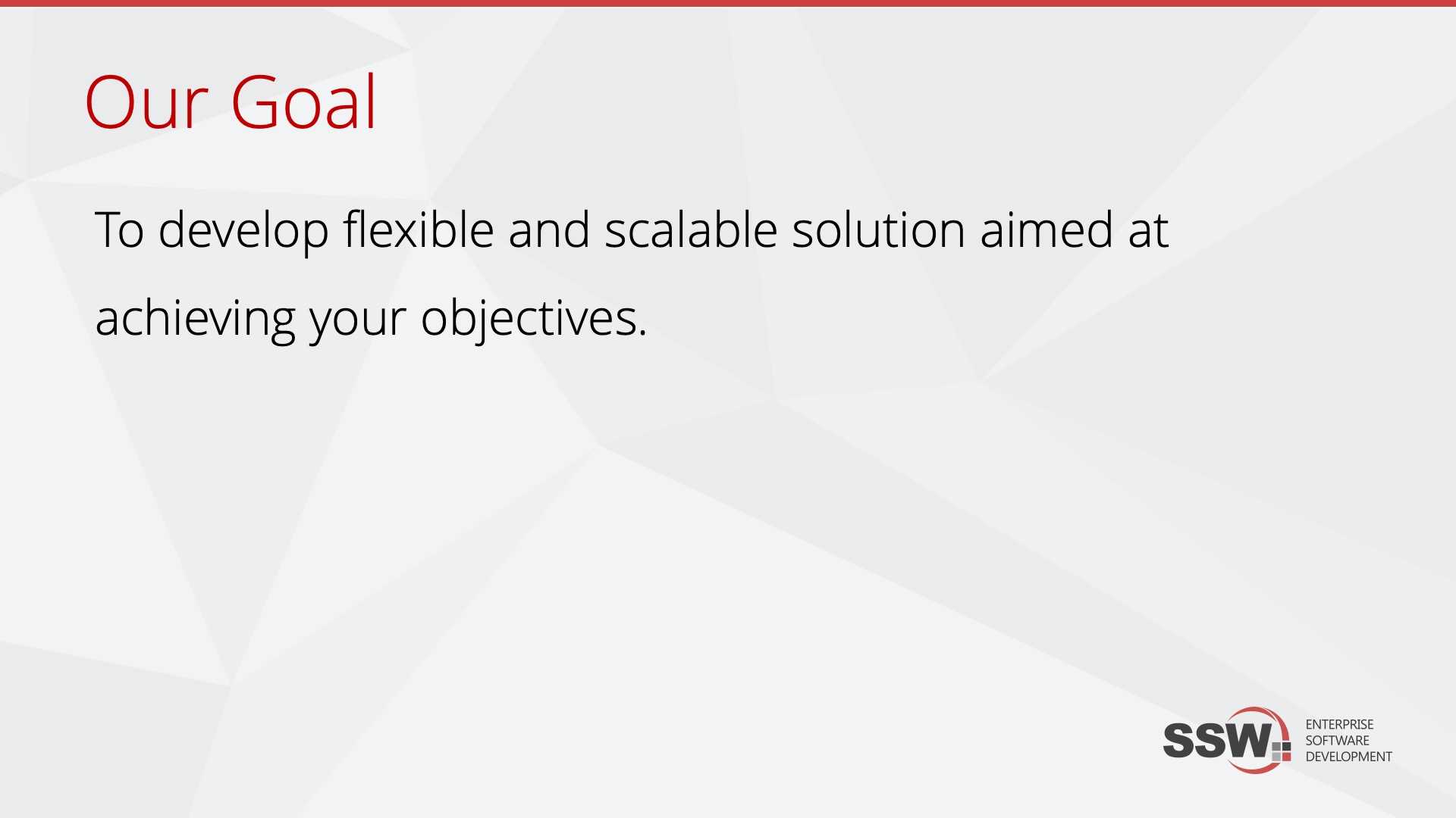
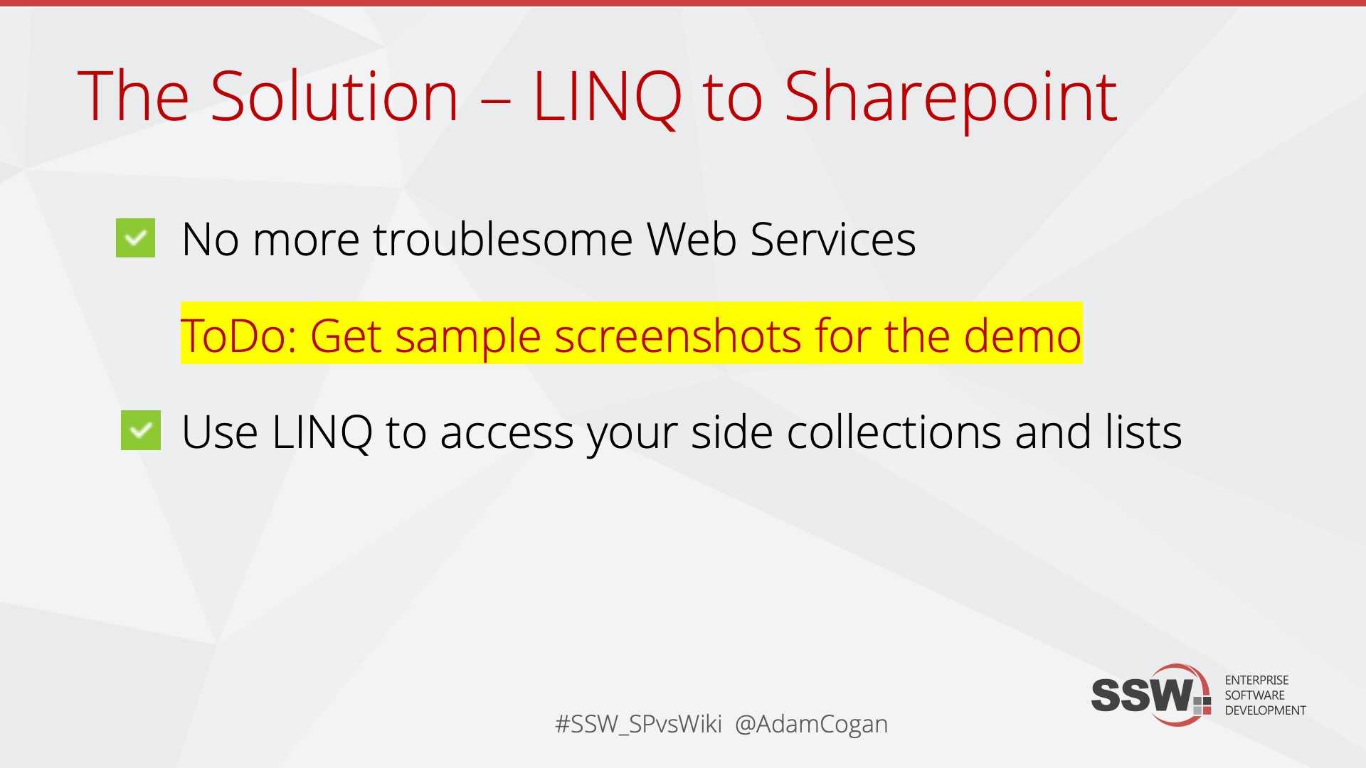
You might have plenty of ideas when you are preparing your presentation. Add these in your TODO items - utilize them to attract your attention later in case you run out of time.
Note: You should keep them consistent with VS.NET. E.g. “TODO: xxx”

Figure: Put your working "TODO:" notes in red and highlighted Imagine you've just finished a draft of your PowerPoint presentation and you send it off to your colleagues for feedback. You receive it back with a mix of emails, separate documents, and verbal comments - a nightmare to consolidate and action.
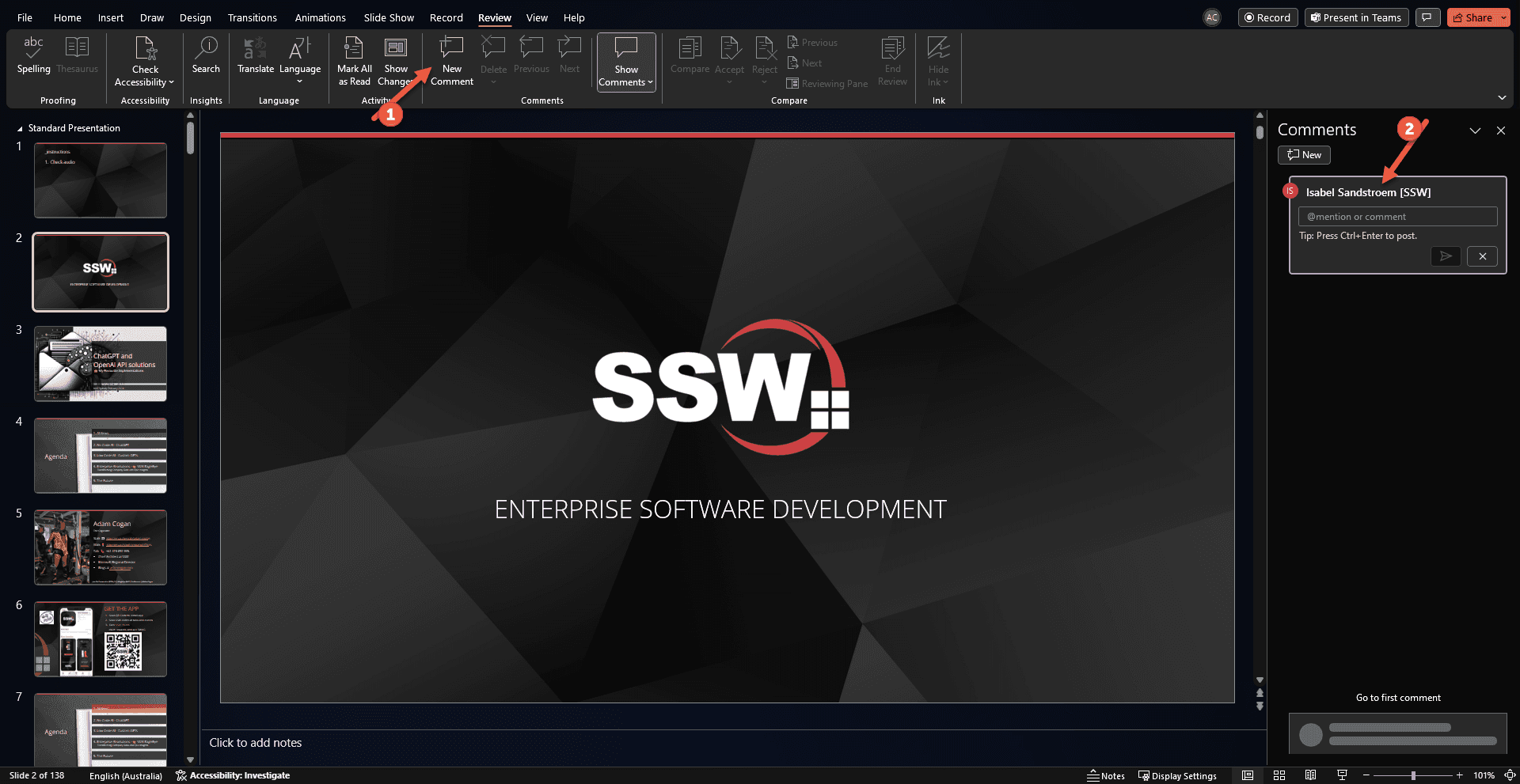
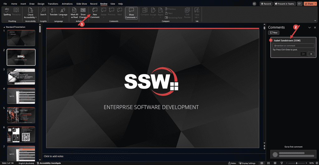
The power of PowerPoint comments
This is where PowerPoint comments come into play, providing an effective workflow for gathering and acting on feedback.PowerPoint comments allow you to add notes directly on the slides, offering a simple and integrated way to give and receive feedback. This method keeps all the feedback in one place, making it easier to review and act upon.
How to use comments effectively
- Adding comments: Go to the specific slide you want to add a comment. Go to 'Review' tab | 'New Comment' or right-click on the slide and select 'New Comment'. In 'Comments' pane on the right hand side , type your feedback or suggestion directly into the comment box.
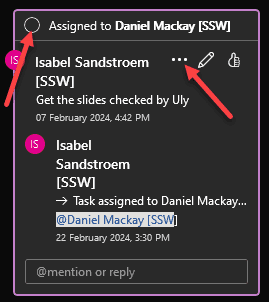
- Replying to comments: If you're responding to feedback, use the 'Reply' feature within the comment to maintain a threaded conversation. This keeps the discussion organized and easy to follow.
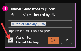
- Convert comments to tasks: When reviewing comments, identify action items and assign them to team members by tagging them in the reply and ticking off the 'Assign to:' box.
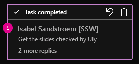
- Resolving Comments: Once you've addressed a comment or task, mark it as 'Resolved' by either ticking off the circle in the top left corner or clicking the three elipses | 'Resolve task'. This helps in tracking which feedback has been actioned and keeps the slide uncluttered.
- Reviewing Comments: Regularly review comments to ensure that all feedback is addressed. It's easy to overlook comments, so make a habit of checking them.
Conclusion
Using PowerPoint comments for feedback and task assignment offers a cohesive, efficient, and trackable way to improve your presentations. It streamlines the feedback process, reduces miscommunication, and ensures that everyone on the team is on the same page.