Data Layout - Do you use expressions to show the correct scale on charts?
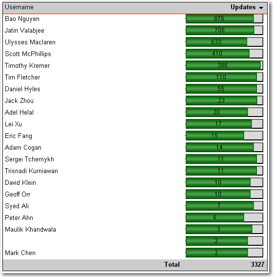
Last updated by Jeoffrey Fischer [SSW] over 1 year ago.See historyIn Reporting Services 2005 you can use an expression to specify the scale of your charts. If you do not specify a maximum value for your y axis, the bar charts become inaccurate, as you can see in this figure.

Here's how to set the scale.
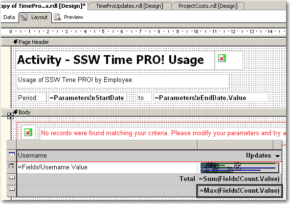
- In Layout view, add a new row to the bottom of the table
- At the bottom of the column with the chart, set the textbox value to =Max(Fields!MyTotal.Value), where "MyTotal" is the Data field you're using in the chart.

- Set the textbox's Name property to MaxMyTotal (e.g. MaxCount)
- Set the new row's Visibility/Hidden property to true - you don't want to show it in the report
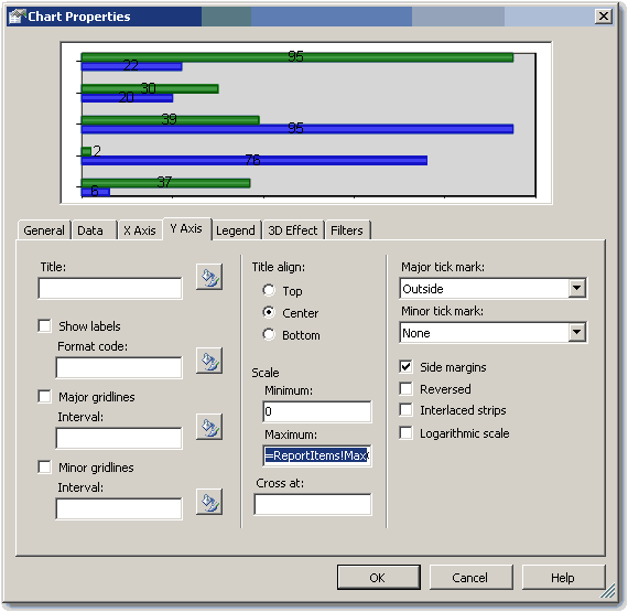
- Open the Chart properties and select the "Y Axis" tab
- Set the Maximum value to the value of the textbox, i.e. "=ReportItems!MaxMyTotal.Value"

- If you expect to have negative values in the chart (e.g. when comparing 2 values), set the Minimum to -1 multiplied by the max value, i.e. "=-1 * ReportItems!MaxMyTotal.Value". Otherwise set it to 0 (zero).
- If you expect to have negative values in the chart, select the chart value in the Data tab and click "Edit..." . Go to Appearance->Series Style->Fill and enter the following expression:
=iif(Fields!Change.Value > 0, "Green", "Red")Where "Change" is the name of your data field. This sets the color of the bar to green if it is positive, and red if it is negative
- Click OK and preview the report. The chart will now be using the maximum value across all the charts.

This way is tedious and a "hack". We think that the scale should be automatically set with an option to customize it via an expression. See our suggestion about this on Microsoft SQL Reporting Services Suggestions.
Updated - fixed by Microsoft, see https://learn.microsoft.com/en-us/sql/reporting-services/report-design/set-a-minimum-or-maximum-on-a-gauge-report-builder-and-ssrs?view=sql-server-ver16&WT.mc_id=DP-MVP-33518
