Rules to Better Interfaces (Wizards) - 9 Rules
Since 1990, SSW has supported the developer community by publishing all our best practices and rules for everyone to see.
If you still need help, visit Website Design and User Experience and book in a consultant.
A brief introduction will give some idea about what will happen on this process and it may save user's time and effort. So, if you expect that not all users will be totally clear on what the settings do, add an introduction with a screen.
- Add screen shot with red circle at the top of the screen
- Put a description next to it
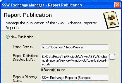
Figure: Bad Example - This screen has no product introduction... The user is thinking ‘What is this going to do?’ 
Figure: Good Example - This screen has product information before the settings... With a screen capture of where it ends up Irrelevant of the type of application, "Close" should never be used in any wizard or form. 'Cancel' has a much clearer definition and should always be used to exit a process without starting it, saving it or changing it.
See our rule Do you label your form buttons consistently? on this.
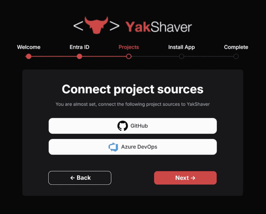
When building multi-step wizards (e.g. forms, onboarding flows, or setup processes), always provide a "Back" button, unless there's a very good reason not to.
A "Back" button gives users confidence that they can safely navigate through the steps without fear of losing progress. It helps reduce frustration and increases completion rates, especially when users need to review or correct something in earlier steps.
Implementation tips
- Place the "Back" button to the left of the "Next" or "Submit" button
- Use consistent labels (don't use “Previous" or other variations)
- Use icons to enforce the action meaning
According to Design Specifications and Guidelines - User Assistance, the commands for navigating through a wizard should be "< Back" and "Next >".
Exception
Disabling or hiding the Back button is OK when:
- The previous step doesn’t exist (e.g. it's the first step)
- It's a single-step flow with no navigation needed
The user's last settings should be saved and should be selected as the Default the next time a form is opened in many instances. For example:
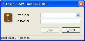
- Login forms - the last login name should be the Default selected and the cursor should be in the password box.
- Report criteria forms - e.g. date start and date end fields should be automatically populated
How do I store the settings?
- .NET: Use the Configuration Block to store the settings.
- Access: Use a local table called 'Control' with one record.
Though all software should be intuitive there are still times when users need extra guidance. Wizards are ideal especially for stepping through more complicated steps or when an application isn't going to be used regularly. E.g. SSW Code Auditor may only run once a month, during which time the user may forget all the steps involved. You can see an example of all the relevant steps at Code Auditor User Guide.
Most importantly when a first time a user tries your program, they should be able to step through the setting up process. A wizard helps to show how your application flows from beginning to end.
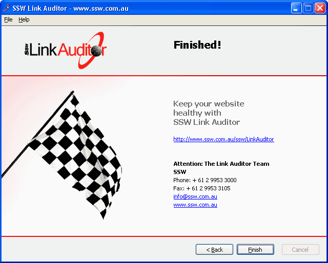
To ensure a consistent user experience, make sure to include these visual elements:
- Page name. It is important for the user to know which page they are currently on.
- Page description. You should provide a short description of the task to be performed on the page.
- Instructions. Not required for every page, this is a short description requesting the user to perform a task, for example, entering some values into a text field.
- Company logo. This helps promote branding, however it should be inconspicuous and should not move visual focus away from the body of your application.
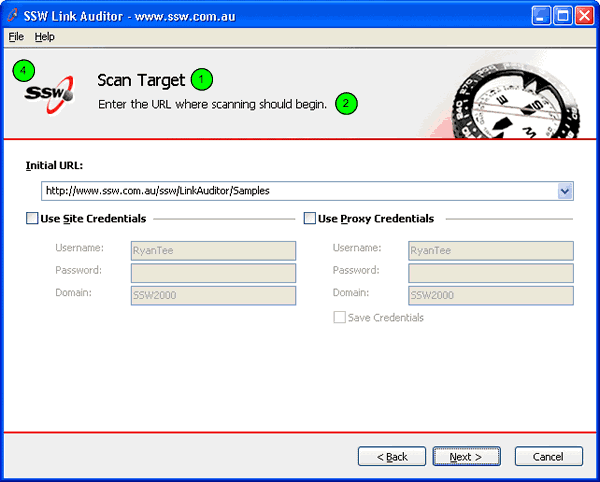
Figure: Good Example - SSW Link Auditor Wizard's better flow of information Technical Note: To ensure visual consistency across applications, create a base form then set the properties in that form (application icon, menu structure, button names etc.) Add any logic in for switching pages with the "Next" and "Back" buttons. Then for all projects, add a reference to that one and inherit the customized form.
In the forms in your application, instead of inheriting from System.Windows.Forms.Form (the Default), inherit from your new base form class.
public class MyForm : System.Windows.Form.FormFigure: Default code in a Windows Form
public class MyForm : Company.Framework.BaseCustomFormFigure: Change the form so that it inherits from your new base form classThe "finish" button denotes the end of the Wizard; by clicking on it, the user closes the Wizard.
For longer processes, the Wizard should implement "Start" and "Skip" features to guide the user through from start to finish.
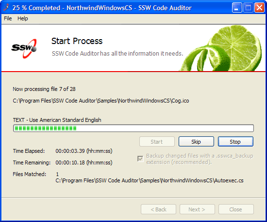
Figure: Good Example - SSW Code Auditor Wizard featuring "Start" and "Skip" options Here's some more information on the Microsoft Standard for Wizard Welcome and Completion Page art and Interior Page art.
Many applications have a lot of content on each form. If this is the case there needs to be some way to separate certain sections. To achieve this separation Microsoft (and therefore most developers) uses separating lines, but this UI is not perfect because:
- It creates additional visual clutter
- It is hard to maintain
We recommend using bold instead of dividing lines because:
- Bold stands out
- Indentation is more important
-
Developers are not good at keeping the lines aligned - you could create a .NET custom control to do this - but Microsoft do not provide one
- The dividing lines create additional visual clutter (ever so slight)
- Each line creates additional performance implications (ever so slight)

Figure: Bad Example - This is the Tools - Options from Internet Explorer and it groups each section in a groupbox - busy UI. 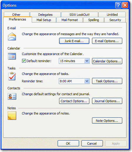
Figure: Bad Example - This is the Tools - Options from Outlook and it uses dividing lines for each section. 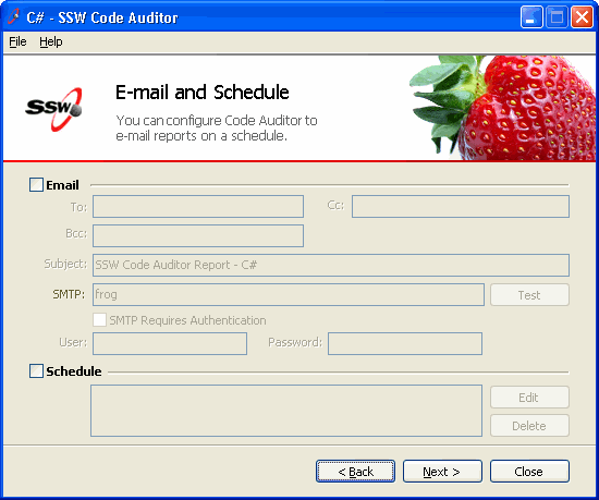
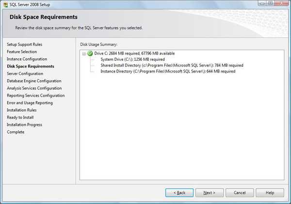
Figure: Bad Example - This is an old screen from Code Auditor - the dividing lines are not required. In a wizard, a visual indication about the progress should be provided so users know where they are up to. It should also let the user know which steps have been completed and how far to go.
A good way to do this is use a left navigation bar with bold on the step they are currently at.
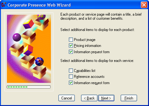
Figure: Bad Example - The progress bar does not indicate completed nor next steps When a user reaches the last page of a wizard, a visual indication should be provided so that they know that the process has finished. We use a finish flag to do this.

Figure: Bad Example - This is the last page of the wizard but it is not obvious because the finish flag is small and the "Next" button still enabled How you present the product information depends on the sort of application you are developing.
- If the application is wizard application:The first page of the utility should introduce the user to the application. Because the first two paragraphs of this screen and the first few paragraphs of the application's website often contain virtually identical information (i.e., describing the product) it may be a good idea to make both the same. The first two paragraphs of the screen can be copied from portions of the website. A "More" hyperlink can also be added at the bottom of the screen, which will direct the user to the website where they can read further information about the application.

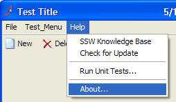
Figure: Good Example - This wizard has an information screen as the first screen - If the application is not a wizard application The main menu of the application should have a Help - About... menu item. When clicked, a new form should open up containing similar information as the page in the wizard application described above.

