Rules to Better UI (Bootstrap) - 6 Rules
In the video Twitter Bootstrap & ASP.NET MVC - Intro / Quickstart, Ben Cull walks us through Bootstrap, how it impacts your development experience and how to get the most out of it to produce functional and visually pleasing solutions.
Note: There's been syntax changes in Bootstrap versions from when this was recorded. Example: In the video what was written: col-md-offset ...is currently written offset-col-md (according to the Bootstrap 5 docs).
Writing CSS is easy. Writing a lot of CSS can become unwieldy and unmanageable. Using CSS pre-processors like LESS or SCSS helps you segment and organize your CSS logically and compiles down to regular CSS so there are extra steps to get up and running.
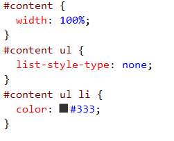
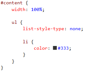
The key advantage of using CSS pre-processors is nested selectors. Instead line after line of specific CSS selectors you can nest them and they will compile down for you. Check out this example:
The pre-processed CSS then compiles to the regular CSS shown above.
We recommend using SCSS for its slightly more robust language scripting, however, the differences between LESS and SCSS are minor.
Efficient programmers do not re-invent the wheel. That's why we use the best Web UI libraries.
Bootstrap is a NuGet Package that provides a jump-start for HTML-based projects. It includes the HTML, CSS and JavaScript framework used to build the Twitter site.
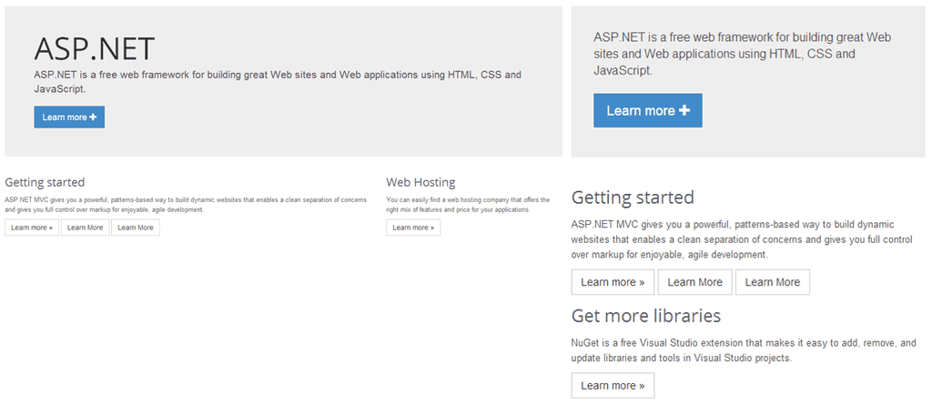
Building your site on top of Bootstrap makes it much easier to have your website look great on devices of all sizes, across many different browsers.
Read our Rules to Better UI (Bootstrap).
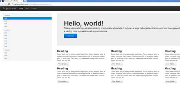
Figure: This website template, along with many others is available as a starting point for building Bootstrap-based sites 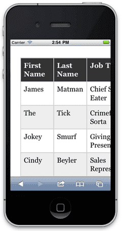
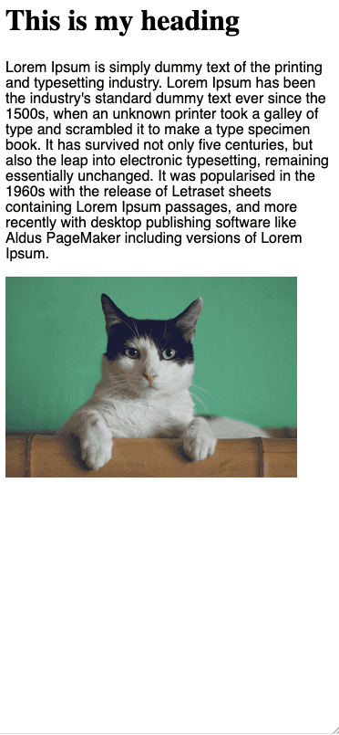
Figure: Bad example - Many websites built by using tables for positioning would render poorly on smaller devices, and be hard to use 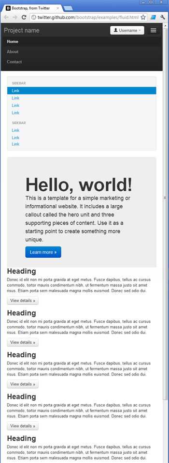
Figure: Good example - Bootstrap uses many techniques to help make your site look great on different browsers, on all devices Documentation
Framework integrations
One of the benefits of using Bootstrap over a library such as Shadcn is that it's widely supported across a large number of frontend frameworks. Take a look at the following Bootstrap integrations for example:
While you can use Bootstrap without any framework-specific integrations, using one of the libraries can save you a lot of time managing your CSS classes and writing boilerplate code while building your interface. The frontend frameworks listed above are ultimately just wrappers for using Bootstrap, which is little more than a CSS library. This means that you can use Bootstrap with any frontend framework of your choosing. You can even use it for static HTML pages provided that you include links to the required JavaScript and CSS files in your pages. This can be achieved by adding a link to Bootstrap's CDN in your pages.
Tailwind
TailwindCSS is also recommended. Out of the box, Tailwind is lightweight and will get the job done simply; you can build a website without ever having to look at CSS.
Note: The difference between Tailwind and Bootstrap often comes down to how comfortable you are with writing CSS. Tailwind gives you full control with utility classes, while Bootstrap provides ready-made components that require less custom styling. Read more about these differences.
Upgrading Tailwind (v3 → v4)
If you are considering an upgrade to Tailwind 4, plan ahead. The jump from version 3 to 4 is substantial, and requires careful manual QA due to breaking changes in utilities, defaults, and stricter browser support.
✅ Pros of v4
- Faster builds �– Up to 5× faster full builds and 100× faster incremental builds
- Simpler setup – Fewer dependencies, one CSS import, zero config for most apps
- Auto content detection – No need for a content array; use
@sourcewhen needed - CSS-first config – Tokens defined via
@theme, exposed as CSS variables for runtime theming - New core APIs – Container queries, 3D transforms, expanded gradients,
not-*,@starting-style - Better DX – Dynamic utility values (
grid-cols-15,w-17), first-party Vite plugin
❌ Migration cons and risks
- Breaking changes – Shadows, radius, blur scales, spacing, ring defaults, and removal of
@tailwinddirectives - Stricter browser support – Safari ≥16.4, Chrome ≥111, Firefox ≥128. Stay on v3.4 for older browsers
- Preprocessors unsupported – Sass, Less, Stylus are no longer supported
- Config changes – No default
tailwind.config.js, use@config; some options dropped - Real-world friction – Some teams reported dark-mode surprises and missing parity during migration
Upgrade notes
Use the official upgrade tool:
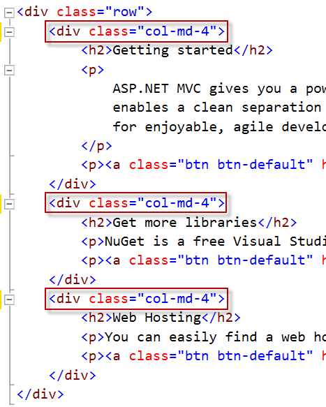
npx @tailwindcss/upgradeBootstrap provides a powerful, responsive layout with its rows and columns.
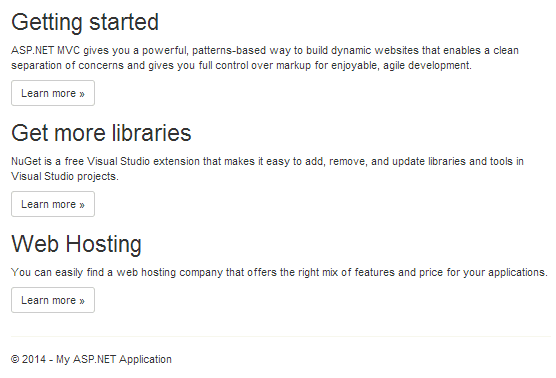
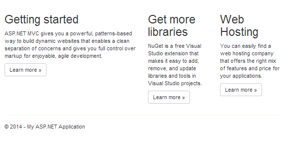
The common way to use Bootstrap's layout system is to create a basic grid which will appear as horizontal columns on the desktop but then stack on a smaller screen such as mobiles. This is done with a single set of .col-md-* classes.
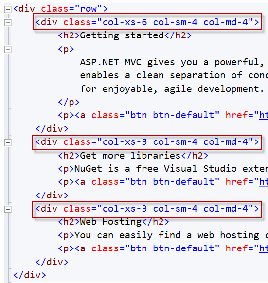
Did you know you can have more control over the responsive layout by including multiple column classes? The ability to control the layout across multiple screen sizes is a powerful tool within Bootstrap. For example, if you don't want your columns to stack on smaller devices, use the smaller grid classes by adding additional column classes (e.g. .col-xs-* .col-sm-*) to the respective <div>s.
Creating a responsive website? It's important to make sure the browser renders your content correctly on any screen size. Define the proper viewport meta tag to inform web browsers they need to behave responsively.
<meta name="viewport" content="width=device-width" />Your website's viewport should be the same width as any given device's screen. Specify this with the content attribute
_device-width_.Resize Text
The viewport meta tag should not set
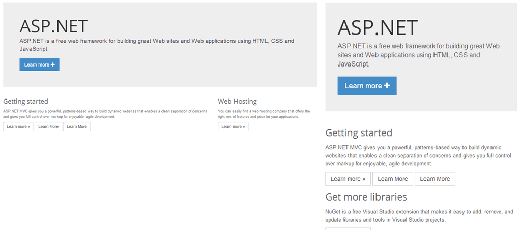
_user-scaling=no_or a_maximum-scaling_value less than 2. This allows us to meet accessibility standards for scalable content. See WCAG 1.4.4.When designing responsive websites, it's important to consider what content is appropriate for each screen size. Desktops might have large navigation areas and extra content in a sidebar, whereas the phone might focus on other content.
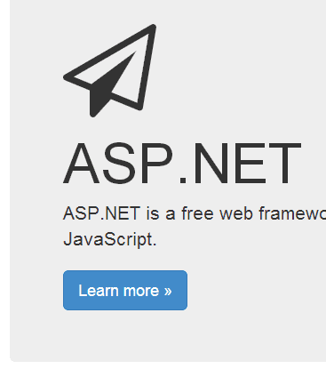
By default, Bootstrap will wrap the columns and make them full width on phones. If you want to hide content rather than let it wrap you can use the
.d-noneclass or one of the.d-{sm,md,lg,xl}-noneclasses for any responsive screen variation.More information on Display property - Quickly and responsively toggle the display value of components and more with our display utilities.
Remove the title by adding the
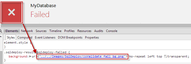
.hidden-xsclass.<h1 class="d-xl-none">ASP.NET</h1>When building a web application, you may eventually need icons somewhere in the UI. In the past this was done with images (e.g. png, jpg) which can create a lot of resource management, inconsistency, and other pain. Instead, you should use an icon font that provides scalable and adaptable iconography.
Awesome icon libraries
- Bootstrap icons are quick and easy to use with or without using Bootstrap itself. Many consider this icon library timeless, but there is another popular icon library to challenge it...
- Font Awesome provides scalable vector icons that can be fully customized with CSS and many are completely free for commercial use. This library is especially great if you need a wide selection of generic icons in a hurry. You can also purchase a pro license to access an extended collection of variations like thin, sharp, and duotone icons.
- Google material icons and symbols are huge sets of variable icons. These icons can be customized right down to their line weight and roundness or sharpness.
- The Azure icon collection is an awesome set of icons if you are using Azure. Instead of browsing individually, you can also download the entire up-to-date set from the Azure Architecture Center.
- Check out Fluent iconography if you need Microsoft flavoured icons.
- There are many more awesome icon libraries, including open-source community projects like Lucide.
Why you should use icons, not images
- Scalability: Icon fonts are vector-based, which means they can be scaled up or down in size without losing quality. This is particularly important for responsive web design, where icons need to adapt to different screen sizes and resolutions. Image files, however, become pixelated and lose quality when scaled.
- Adaptability: The customization of icon color, size, and other properties is quick and easy using simple CSS. This removes any need to create new image files for icon variants or states.
- Consistency: Using a single icon library makes it effortless to maintain a consistent design language across your website or product.
- Cross-browser compatibility: Complete support across all modern browsers means icon fonts are reliable and render in a predictable, consistent way across different platforms and devices.
- Accessibility: Icons can be made accessible to screen readers by using ARIA roles and labels. Doing so ensures that users with disabilities can understand their meaning.
- SEO: Search engines can index text-based content more effectively than images. Using icons with proper semantic HTML can improve the SEO of your website, as search engines can understand and index that content.
- Faster loading: Icon fonts reduce the number of HTTP requests to the server. Fewer requests means faster load timing. In addition, even a small collection of image files can take a large amount of space. Icon font files are much smaller and make icon load times almost a non-issue.
If you absolutely must use images for icons (e.g. complex custom icons) use svg files. These vector-based images function closer to an icon font, being similar in scalability, adaptability, and customization.
