Rules to Better Designers - 18 Rules
Longing for remarkable design impact? Check SSW's User Interface & User Experience Design showcase and consulting page.
We live in a complicated world with too many distractions, where information overload is commonplace. “Less is more” is all about keeping things simple and achieving a design with the least number of elements required to deliver a message effectively.
Video: Less is more (5 min)Keep it simple
"Just because we can does not mean we should"
It is common to include design elements, features, or product enhancements solely because we think we should. This approach can unnecessarily complicate a design and overwhelm a user.
Applying "Less is more"
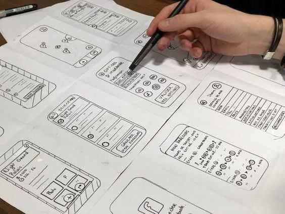
Thumbnail designs
By keeping things simple, we reduce complexity and avoid cognitive overload for our users. Making simple changes like using shorter, more descriptive language or minimising the overall number of design elements will make the overall message of a design much clearer to understand.
UI interface
Stage background
Office layout
So next time you think about designing something, try to keep it simple and remember... “less is more”.
Many people confuse graphic design with UI/UX design, thinking they serve the same purpose. In fact, these are entirely different areas of expertise, each requiring specialized skills. Confusing the disciplines can lead to design inefficiencies or poor user experiences, as each field brings distinct value to a project.
- Graphic design is about how things look and ensuring they capture attention and evoke emotion
- UI design focuses on the interactive elements users engage with, aiming to create an intuitive and efficient user interface
- UX design considers the entire experience a user has with a product, ensuring it is smooth and satisfying
UI and UX are combined since they work together to create a cohesive experience that is both visually appealing and easy to use, ensuring the design not only attracts users but also guides them through intuitive interactions.
Graphic design - focus on visual appeal
Graphic design emphasizes the visual aspects of a product or communication. It is concerned with creating print-ready or digital assets that are aesthetically pleasing and convey the brand's message effectively. A graphic designer has expertise in areas such as typography, color theory, and layout. They are also skilled in creating print-ready files and ensuring that designs are suitable for various formats, whether for digital screens or physical prints.
Examples of graphic design tasks:
- Creating a logo and visual identity for a brand
- Designing a business card or brochure, ensuring print specifications like color profiles and bleed margins are correct
- Crafting digital advertisements or social media graphics
- Choosing typography and creating cohesive color palettes
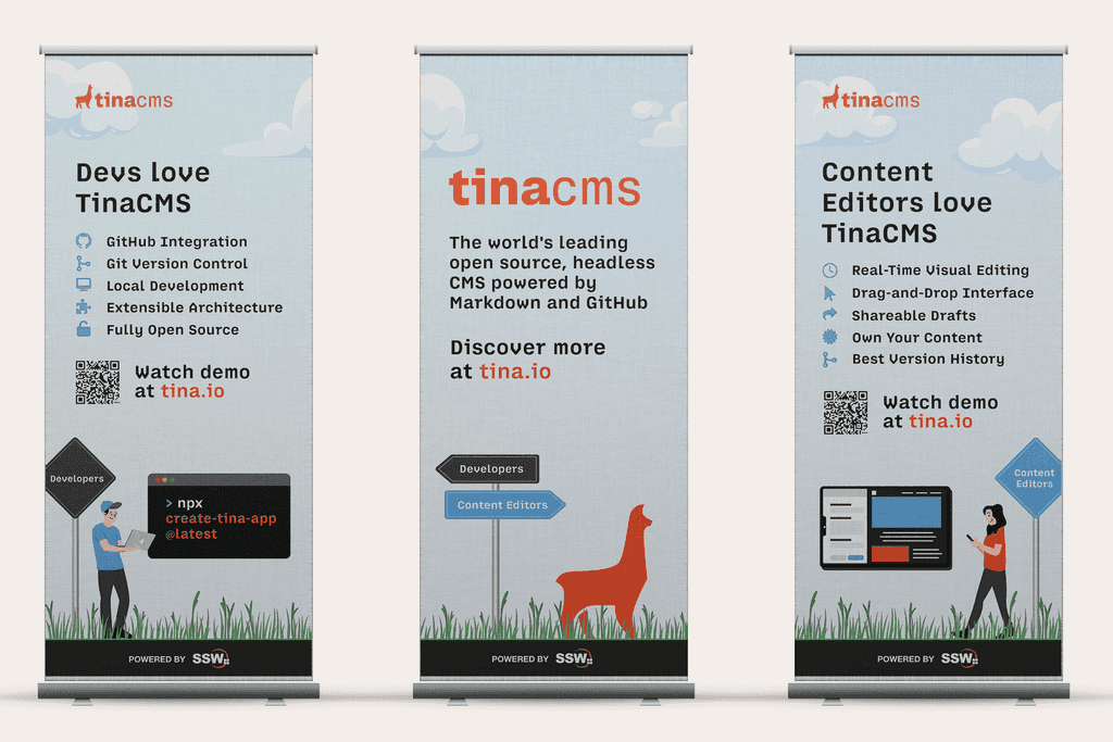
Figure: TinaCMS pull up banner design (graphic) UI/UX design - focus on user interaction and experience
UI/UX design focuses on how users interact with a product, balancing form and function. User Interface (UI) design ensures that the product’s interface is visually consistent and intuitive, while User Experience (UX) design ensures that the product is functional, easy to navigate, and aligned with user needs.
A UI/UX designer often has knowledge of user-centered design principles, wireframing, and prototyping. They may even conduct usability testing to gather user feedback or collaborate with developers to implement designs in code.
Some UI/UX designers are capable of writing front-end code themselves, further blurring the line between design and development.
Examples of UI/UX design tasks:
- Conducting usability testing to identify user pain points and refine the product’s functionality (UX)
- Designing a website or app interface, ensuring that interactive elements like buttons and menus are easy to use and visually cohesive (UI)
- Creating wireframes and interactive prototypes to map out user flows (UX/UI)
- Writing HTML/CSS code to ensure design integrity during implementation (UI)
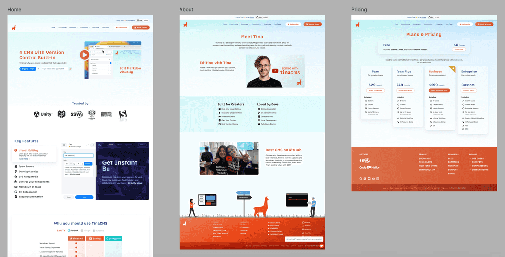
Figure: TinaCMS website mockups (UI/UX) Key differences
Understanding these key differences ensures that each role contributes its expertise at the right stage of the project, resulting in a product that is both visually appealing and highly functional.
Graphic design UI/UX design Expertise Visual storytelling, branding, typography, layout, and composition. Strong skills in print and digital asset creation User research, wireframing, prototyping, interaction design, usability testing, and accessibility Focus Aesthetics and visual communication to create engaging visuals for print and digital media Enhancing user experience and functionality to ensure intuitive and accessible interactions Tools Adobe Creative Suite (Photoshop, Illustrator and InDesign) Figma, Sketch, or Adobe XD for interactive design, wireframes, and prototypes Process Concept development → Design execution → Finalizing assets for print or digital use User research → Wireframing → Prototyping → User testing → Refinement → Implementation While graphic designers aim to create visually appealing designs, UI/UX designers prioritize how users interact with those designs, ensuring functionality and ease of use. Understanding these differences is crucial for creating effective digital products that are both visually engaging and user-friendly.
Have you ever found yourself on a project and wondered if you require a UX designer? Especially one who can create interactive prototypes with tools like Figma?
If you are asking yourself that question, you probably need a UX designer. Here are 7 situations where you could benefit from a UX designer.
- Specification Reviews: A UX designer can help develop low fidelity non-interactive wireframes using Figma that can be verified with the client. This wireframe can be used to estimate project costs and will often become the starting point of a more elaborate interactive prototype.
- Application or Web Development: If you're building a new Product, Service, Website or Application, a UX designer can be invaluable. They can conduct user research, create user personas, design user flows and wireframes, and ensure that the end product provides a positive and intuitive user experience.
- Redesign or Improvement Projects: When you already have an existing product or service but want to enhance its user experience, a UX designer can assess the current design, identify pain points and areas for improvement, and propose design solutions to optimize the user experience.
- Usability Issues: If you're receiving feedback from users indicating usability issues or facing high bounce rates, a UX designer can conduct usability testing, analyze user behaviour, and recommend design modifications to address those issues.
- Complex Systems or Workflows: A UX designer can simplify the user interface, streamline the user journey, and make the overall experience more efficient and user-friendly, especially when considering complex applications or online services.
- User Research and Analysis: To gain a deeper understanding of your target audience, their needs, and preferences, a UX designer can conduct user research, interviews, and surveys to gather insights that inform the design process.
- Accessibility and Inclusive Design: A UX designer can help ensure your product or service is accessible to people with disabilities by incorporating inclusive design principles and following accessibility guidelines.
Remember, the specific need for a UX designer may vary depending on the nature of your project, but their primary goal is to create meaningful and enjoyable experiences for the user.
Waiting for a designer to approve every UI change can block progress. But letting devs make visual tweaks unchecked often leads to messy, inconsistent designs.
Create a “Design Masters” list – a small group of trusted designers and design-literate developers who can approve UI/UX changes when needed.
Why it helps
- Speeds up decisions on small, non-controversial UI tweaks
- Reduces design debt
- Maintains visual consistency
How to do it
- Designers are always the first choice
-
Add developers who understand design and have done basic training
E.g. They should meet the following minimum criteria:- Achieve at least a bronze rating on Can't Unsee
- Have read or used these resources:
- NNG – 10 Usability Heuristics
- Who Can Use – Accessibility Contrast Checker
- Realtime Colors – Color system visualisation
- Laws of UX
- Define what changes can be approved (e.g. padding, alignment) and what can’t (e.g. new components). The developer should understand their approval limitations and know when to escalate to a designer
- Create Employee Responsibilities for each Design Master
- Share the list in the Intranet | Designers
- Include this link in the Induction process so the whole company is aware and knows how to proceed on design changes

Figure: Good example – A developer who gets a bronze result on cantunsee.space has a good eye for design and may approve basic design changes Keep it tight, clear, and maintained – so you stay fast without sacrificing design quality.
The Double Diamond design process is a structured framework developed by the British Design Council, aimed at fostering creativity, collaboration, and clarity in problem-solving. It is divided into two main phases, each consisting of two key stages.
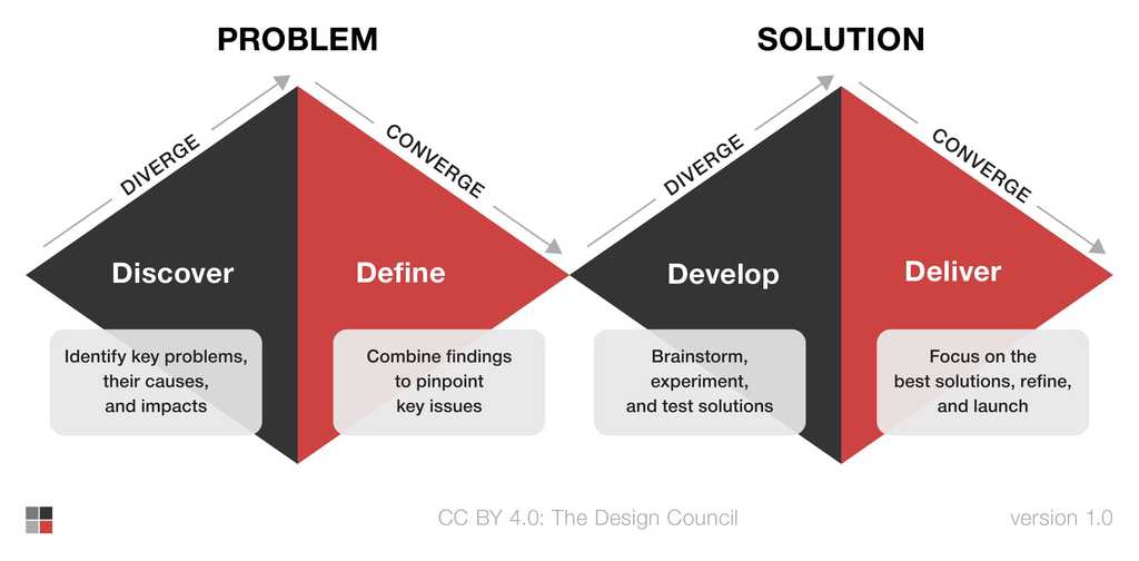
Figure: The Double Diamond design process model Phase 1: Problem exploration
Discover
This stage focuses on understanding the problem by gathering insights from users, stakeholders, and the environment. Methods such as user research, interviews, and observations are essential for uncovering real needs and behaviors.
Define
After collecting data, the next step is to synthesize findings into clear problem statements or design challenges. This helps ensure the right problem is being addressed before moving forward.
Phase 2: Solution development
Develop
In this stage, teams brainstorm, prototype, and explore multiple potential solutions. Rapid iteration, sketching, and usability testing help identify the most viable options.
Deliver
The final step is about refining the chosen solution, conducting user tests, and preparing for launch. Feedback from users ensures the solution is both functional and user-friendly.
The Double Diamond process has a significant impact on User Experience (UX) Design by emphasizing user-centered thinking and iterative improvement. It ensures that design teams:
- Understand real user needs - The Discover and Define stages prevent assumptions by grounding the process in user research and data, ensuring the final design is meaningful and relevant
- Encourage exploration and creativity - By diverging to explore a wide range of ideas before converging on the best solutions, designers can innovate while remaining focused on solving the right problem
- Deliver usable and delightful solutions - The iterative nature of the Develop and Deliver phases ensures continuous testing and feedback, leading to products that provide a seamless, intuitive, and enjoyable user experience
The Double Diamond process helps UX designers move from ambiguity to clarity, ensuring that the end result not only meets user needs but also enhances satisfaction and engagement.
There are a few options when it comes to the best software for UI/UX design (the creation of mockups and prototypes in particular). The most popular are:
- V0.dev (recommended)
- Figma (recommended)
- Adobe XD
- Sketch (MacOS only)
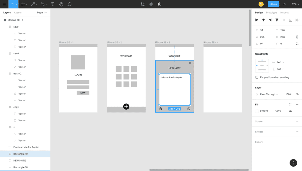
The goal of any designer is to develop the best UI and develop the best user experience possible, and you want the best tool to help achieve this. Figma is the ideal design tool - highly collaborative, accessible cross-platform, and cloud-based. In addition to these features it comes with a huge suite of unique design tools. The auto-layout feature, for example, helps designers craft highly responsive products in a way that reflects actual CSS properties like grids and flexbox which serves to ease the transition between design and development.
Figure: Figma helps designers bring ideas to life in a wireframe or prototype.
Why Figma?
- No need for installation or updates (browser-based)
- Unlimited view-only collaborators on every project
- Unlimited version history with version control (30-day history for free users)
- Unlimited files and cloud storage
- Auto-save
- Collaboration and handover is streamlined with a shared workspace and exportable assets
- Libraries of reusable components, text, colour and layer styles
- FigJam is a built-in whiteboard tool for mapping and discovery
- A huge and highly engaged community
Note: One tool doesn't always replace the others! Figma does not include the print design and photo editing features of Adobe Photoshop and other software also used by designers. Photoshop is the industry standard in raster (pixel-based) graphics editing, photography and digital art. Adobe Illustrator, on the other hand, is the standard vector-based design tool used for print design, logos, icons and more. All of these tools have a place on a designer's belt!
Relying on the same user research method like only running 1-on-1 interviews leads to blind spots. Interviews are great for depth, but they don’t reveal group dynamics, cross-team dependencies, or patterns that emerge at scale.
To design experiences that scale, you need insights that are qualitative and quantitative, attitudinal and behavioural, and drawn from both individuals and teams.
Different research methods
Attitudinal vs behavioral
Attitudinal research captures what users say — their opinions, preferences, and perceptions. E.g. User surveys saying a feature is confusing.
Behavioral research focuses on what users actually do during real interactions. E.g. Usability testing shows users skip the feature entirely.
Qualitative vs quantitative
Qualitative research helps you understand why something is happening by exploring deeper motivations and thought processes. E.g. Open-ended interviews reveal frustration with a checkout step.
Quantitative research measures how often something occurs through numbers and patterns. E.g. Analytics show a 60% drop-off rate on the same step.
Context of use
The way users are studied can vary by how closely it reflects real-world use. E.g. A team conducts in-person usability testing with real customers performing typical tasks in a production app (natural + scripted context).
- Natural use observes users in their actual environment. E.g. Field study
- Scripted tasks have users perform specific actions. E.g. Usability tests
- Abstracted activities use remote or synthetic scenarios E.g. card sorting, A/B tests
Why mix research methods?
According to Nielsen Norman Group, no single method uncovers all UX insights. A mix of approaches leads to better understanding and fewer blind spots.
✅ Mixing research methods helps you:
- Understand both individual workflows and systemic issues
- Avoid designing for edge cases or only the loudest voices
- Uncover hidden workarounds and friction between teams
- Generate more reliable, well-rounded insights
Read the full article: When to Use Which User-Experience Research Methods.
Video: When to Use Which UX Research Method (5 min)What methods should I combine?
Method Use it to 1-on-1 interviews Explore personal workflows and uncover pain points Group workshops / focus groups Reveal shared behaviors and team-level challenges Observation / shadowing Catch things users don’t say (but still do) Surveys Quantify trends or confirm emerging patterns across users You don’t need to use every method on every project, but most projects benefit from using at least two.
Practical example
A UX designer begins by interviewing three Admins to understand how they use the system. Based on those findings, she runs a 60-minute group workshop with Admins and Technicians to map shared issues and uncover workflow gaps between teams.
Figure: Good example – Combines depth from interviews with breadth from group insight
Only interviewing one user and assuming their experience applies to everyone. Skipping group validation and relying on stakeholder assumptions.
Figure: Bad example – Designs based on limited or biased input
Bonus tip: Mix user roles, not just methods
Group sessions are a great way to bring in users from different teams, departments, or levels of experience. Doing so can help you uncover:
- Gaps in communication
- Conflicting priorities
- “Unofficial” workarounds users rely on
These types of issues rarely come up in 1-on-1 interviews alone.
Leveraging AI tools across different stages of the UX process can speed up decision-making and free up time for critical thinking and creative problem solving.
Here are some common (and powerful) ways to use AI across the entire UX lifecycle:
UX research
AI can analyze data faster and surface patterns that might take hours (or days) to uncover manually.
- Dovetail – Automatically generates highlights, clusters insights, and summarises findings from interviews, surveys, and usability tests using AI
- UserTesting – Uses AI to analyse user video sessions, surfacing key patterns, pain points, and actionable insights with minimal manual effort
- Maze – AI-enhanced usability testing tool that provides instant reports and auto-summarised insights from user interactions and feedback
Ideation & prototyping
Quickly move from idea to UI with tools that generate design assets or entire screens from simple inputs.
- Magician (Figma plugin) – An AI-powered design assistant in Figma that helps generate copy, icons, and design ideas from text prompts
- UIzard – Transforms hand-drawn sketches or text descriptions into functional wireframes and high-fidelity UI mockups
- Stitch (formerly Galileo) – Converts natural language prompts into clean, production-quality UI mockups
- v0 – Translates natural language prompts into fully functional React + Tailwind components, allowing designers and developers to instantly generate editable, production-ready UIs
Content design
AI helps create consistent and clear copyfaster.
- Writer – An enterprise-grade AI writing assistant that ensures consistent UX copy across products by enforcing style guides, improving readability, and adapting to your brand voice
- ChatGPT / Claude – Great for writing microcopy, generating ideas, summarising research findings, and drafting early content – all from simple prompts
Accessibility & QA
Catch compliance issues early with AI-powered checkers.
- Stark (Figma plugin) – An accessibility checker for Figma, Sketch, and web that uses AI to detect colour contrast issues, missing alt text, and WCAG compliance gaps
✅ Best practices when using AI for UX
- Validate output – AI can hallucinate. Always review and test anything before going live
- Use as a collaborator, not a crutch – AI should support your creativity, not replace your judgment
- Prompt wisely – The better your input, the better the output. Be specific and provide context
- Respect privacy – Avoid feeding sensitive data into AI tools that don't guarantee security
AI won't replace good UX. But used properly, it can dramatically increase your output and quality. Think of it as an intelligent assistant that's always ready to help – just don't hand it the steering wheel.
When every button looks a little different, spacing feels off, and handoffs between designer and dev are painful, you know something's wrong.
A design system can fix all of that, aligning everyone around a shared language and providing the tools to build faster and better. It avoids inconsistent UI, longer review cycles, and time spent debating minor visual tweaks.
Video: Welcome to Design Systems – Lesson 1: Introduction to Design Systems (15 min)Key components
A solid design system should include:
- Style guide, design tokens – Brand guidelines, color variables, typography, iconography, spacing grids, and accessibility guidance
- Component library – Reusable UI elements like buttons or inputs, built in your design tool with variants and usage guidance. May include page templates and broader patterns
- Documentation – Guidelines for component usage, dos and don’ts, examples and demos
- Design system governance – Clear ownership of the design system, a contribution process, tools for dev handover, and semantic versioning to manage updates
Design tokens are small, reusable design decisions that make up a design system's visual style.
Why it works
-
One source of truth – Everyone (designers, developers, POs, QA) works from the same playbook, avoiding continuous rework and reducing inconsistency.
- Changes are made in one place which scales across projects *The design system can span across multiple projects, it is up to the implementer to decide
- Faster build time – Shared components and patterns boost delivery speed
- Accessibility guidelines – Standards like contrast, keyboard navigation, and screen-reader support come by default
Signs you’re due for a Design System
- Spacing, fonts, or colors shift between screens for no reason
- Handoffs and review meetings are dominated by nitpicking visual issues
- Design doesn’t match production
- Style guides are outdated, scattered, or missing entirely
Real-world examples
- Atlassian Design System
Includes tokens, patterns, tone of voice, and code. - Google Material Design
Theming, deep docs, and ready-to-use code. - IBM Carbon
Enterprise-level, open source, and WCAG-compliant. - Shadcn
Headless components + Tailwind, great for custom styling and modern UIs. - Shopify Polaris
Design, content, and accessibility all-in-one. - Wise Design
Multi-brand theming, shared tokens, and flexible components.
Design System maturity: From Library to Ecosystem
Design systems don’t need to be fully built from day one. There are different levels of implementation depending on the maturity of the team/product.
Most teams don't start with a full design system — they start small with just a few shared components and evolve over time.
Since “design system” is often used loosely, this table helps clarify where your team sits and what to aim for next:
Stage Description 1. Design Library A shared file (e.g. Figma, Sketch, Adobe XD) with consistent styles and reusable components like buttons and inputs. 2. Documented System Adds usage guidelines, naming conventions, dos and don'ts, accessibility considerations, and basic governance (who owns updates). 3. Design–Dev Alignment Design tokens are mapped to code, creating a shared language between design and development for color, spacing, and other foundational styles. 4. Coded Components Components exist in code (e.g. Storybook) and match the Design Library. 5. Scalable Ecosystem Includes formal governance processes, versioning, contribution model, changelogs, multi-product usage. Often has its own site or portal. Start small in 7 steps
- Audit your UI – Look for visual and structural inconsistencies
- Define tokens – Start with color, spacing, and typography
- Build your first components – Focus on core UI elements (i.e. header, footer, buttons, input fields)
- Integrate tokens – Start with simple design tokens in your design tool, then explore code integration tools like [Style Dictionary(https://styledictionary.com/) as your system matures
- Document as you go – Add usage rules, visual examples, and versioning
- Share internally – Use demos and changelogs to get buy-in
- Govern wisely – Assign owners, plan updates, and gradually layer in code
Quick-start tip: Kick off with a shared library (e.g. Figma, Sketch, Adobe XD) and key components to provide value, then expand.
It’s tempting to fix small UI issues on the fly - change a button size, adjust some spacing, or tweak a color. But those “quick wins” often turn into long-term losses, leading to a messy, inconsistent UI that confuses users and slows development.
Design debt is like technical debt: shortcuts that seem efficient in the moment create chaos down the line. Without a shared system, visual inconsistencies multiply, developers second-guess design intent, and user experience suffers.
What causes design debt?
It usually starts with innocent intentions:
- "Just added a quick icon"
- "Tightened the padding a bit"
- "Didn't want to bother design - it's small"
We’ve all done it. But enough of these add up fast. Before you know it, the product starts to feel inconsistent, design is out of sync, and developers redo work they thought was already done.
Why design debt matters
🚨 Why it happens
- Rushed timelines or MVP mindset ("we'll fix it later")
- No shared design system
- Designers and developers working in silos
- Unclear product direction or pivots
📉 Why it’s a problem
- Hurts user trust and usability
- Makes the product feel messy or inconsistent
- Slows future development and design
- Causes rework and team friction
🧹 How to manage it
- Run regular UX audits and design reviews
- Maintain a living design system or component library
- Include UI refactoring in your roadmap
- Document design decisions with clear rationale
How to prevent design debt
Before you code, ask yourself:
-
Will users see this change?
- No → You can proceed without design input
- Yes → Go to Step 2
-
Is this UI component or pattern already in the design system?
- Yes → Great! Use the existing pattern. You’re done — go ahead and code
- No → This is a new or modified UI — proceed to Step 3
-
How large is the visual or UX impact?
-
Large changes (e.g. new modal, major layout, navigation shift) → Create a PBI for a designer to action in the future
Tip: Tag the PBI as
needs-designorminor-UIdepending on impact. - Small changes (e.g. padding, color tweak, icon alignment) → You can get a test pass from someone on the Design Masters list
-
More ways to prevent design debt
- Screenshot your change and post it in the PBI before merging
- Ask for a quick "test please" from a designer 👀 on spacing, alignment, and component use
- Loop in design early on bigger stuff (e.g. layout or feature changes)
- After merge, let design know if you created something reusable
Example – Picking a pretty colour

Figure: Bad example – The "Open" badge uses a light green background that is not part of the design system. This results in low contrast, negatively impacting accessibility More info on Do you use enough color contrast?

Figure: Good example – The issue was flagged with a designer, who resolved it by using an accessible color and updating the design system to include the missing component More info on Do you have a Design System?
Treat design like code
Every visual tweak changes the product - just like changing a line of code. So follow process, get the right people involved, and respect the system. 🤖
A User Journey Map (aka Customer Journey) is a visual aid that allows the clear communication of user needs.
These artifacts should be used at the beginning of a project during the early stages of research and design. This allows user requirements to properly inform design decisions made during development, and can help teams build a strong common understanding of a project.
Capturing feedback in a Journey Map during or even after development, can provide high value as well. Pain points discovered in this way can reveal opportunities or areas for immediate improvement.
Video: What is User Journey Mapping? (7 min)What is a User Journey Map
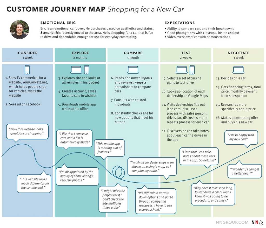
Figure: Observe the user's experience and pain User Journey Maps are used to understand how a customer interacts with your product or services. There are many ways of presenting this information. Take a look at Smaply's example Journey Maps.
The key things captured in a User Journey Map are what steps/stages the customer goes through and also some indication of user sentiment at the time. Often the user journey will be mapped out and then research done to gauge user sentiment at each point in the journey.
This can be done using wireframes or mockups rather than going through the entire build of the software. This way any potential pain-points for users can be identified and improved before going through the costly exercise of developing software.
They are also used in follow up research to identify problems in existing software and systems. This is especially true in sales processes, where it is very easy to identify where user drop off occurs.
Service Blueprints
Sometimes the coding starts too early and, on some projects, the Product Owner needs more help to visualize what's being proposed. A great way to get in sync is to use Service Blueprints.
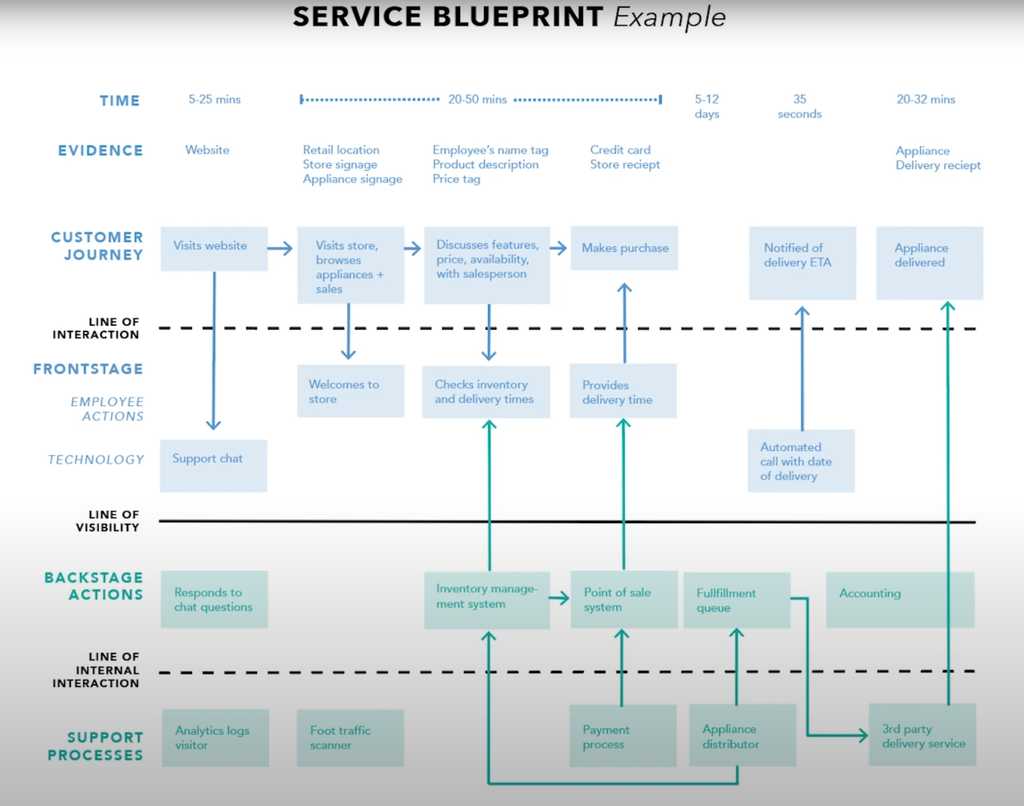
Figure: See all the flows through the application A Service Blueprint is a more detailed and process oriented document. This covers the steps from the User Journey Map and clearly details where and how the user journey will interact with the system being built. It also captures the various processes required inside the software. Often it will allow almost all API interactions to be captured, making it much easier for the developers to understand exactly what the various parts of the system are intended to do and what the user might be doing when they are called.
When to use them
Both these types of diagrams provide excellent documentation that is easily digestible, even by non technical people. They are especially valuable to verify with the Product Owner and to help the team understand the product vision. Because the Product Owner can easily understand what is happening, they can provide much better feedback than if they were simply provided UI wireframes or traditional documentation.
The team should produce these artifacts, typically not the Product Owner - this ensures what was in the Product Owner's head has made it to the team.
User journey mapping tools
Canva is an intuitive online tool for creating images and crafty digital designs and is particularly effective for designing engaging social media memes.
While Canva is a valuable design tool, it may not be suitable for every design requirement. It is essential to complement Canva with advanced design tools and occasionally integrate AI image generators for a comprehensive design approach.
Don't use Canva for complex designs
For intricate and complex designs requiring advanced editing or branding designers, professional software like Figma, Adobe Photoshop, or Illustrator is more appropriate.
Do not use AI-generated images for social media content, as the current quality is difficult to match professional style.
Note: This may be updated as AI imaging technology evolves.Use Canva for simple memes on social media
Canva is great for creating memes due to its vast library of images, icons, and easy-to-use text overlay features. When crafting memes for social media, Canva’s templates can be a quick and effective starting point.
Adobe Photoshop’s AI-powered and prompt-based generative tool can turn a simple picture into anything you imagine.
Video: Generative Fill for Beginners (4 min)Generative Fill is easy to use
- Select an object or area with any selection tool (lasso, marquee, magic wand, etc)
- Enter a prompt into the contextual taskbar that appears after your selection
- Click generate!
- Use the arrows in the taskbar to see some alternate variations, or press generate again until you see a result you like.
Tips and tricks
- Leave the prompt blank and Generative Fill will use the area surrounding your selection to mask it away. Removing unwanted objects is that easy.
- Be intentional with the size and shape of the selections you make. The tool will use this as extra information to interpret your prompts.
- Generative Fill will create a new generative layer with the same name as your prompt. You can come back and alter the generated content at any time by selecting that layer.
Although there are still discussions around AI images and copyright, Generative Fill is powered by Adobe Firefly and designed for commercial use.
Note: Some people might use the term storyboarding when they are actually talking about mockups or prototypes. For information on storyboarding, check The Storyboarding Rule
Mockups and prototypes are both design artifacts used in the software development process, but they serve different purposes and have different levels of fidelity. Many user requirements can be best encapsulated in visual mockups/prototypes.
A design mockup is typically created early in the design process to provide a rough visual overview of the user interface. They are static and do not include interactive elements or functionalities.
Mockups can become interactive and functional representation, also know as design prototype over time. They are more advanced and closer to the final product, allowing for user testing, feedback, and iteration.
There are 3 types of mockup or prototype, use depends on the specific goals and the stage of the project:
- Low-fidelity Mockups (aka Wireframes)
- High-fidelity Mockups
- Interactive Prototypes
Often it's best to start with a low-fidelity mockup to get across a concept or rough storyboard. Then complete a high-fidelity mockup to communicate the look and feel, and if time permits create an interactive prototype.
Low-fidelity Mockups
Creating a low-fidelity design mockup can be achieved through various methods including wireframes, paper prototypes, and other similar techniques. It can be valuable to have the Product Owner on call when creating a low-fidelity mockup to get immediate feedback and direction.
Start by identifying the key features and functionality that the product should have. This will help you focus your efforts and ensure that your mockup accurately represents your intended product.
Then create a basic wireframe of your design. A wireframe is a visual representation of the layout and structure of your website or app. You can create digital wireframes using a variety of tools (see list below). Alternatively, you can use paper and pencil to sketch out a rough wireframe by hand. Add details to your wireframe by adding boxes and labels for different features and elements (e.g. buttons, input fields, and images).
Once your low-fidelity design mockup has been approved, you can use it as a reference point for creating a high-fidelity mockup.
High-fidelity Mockups
A high-fidelity mockup is a more detailed version of a design that includes visual design elements such as typography, colors, and images. It is created using specialized design tools and takes more time to create than a low-fidelity mockup.
Warning: Don't go down the track of giving a customer a few concepts (on some projects we gave 2 or 3 completely different concepts by different designers). This leads to too much mixing and matching when they see them.
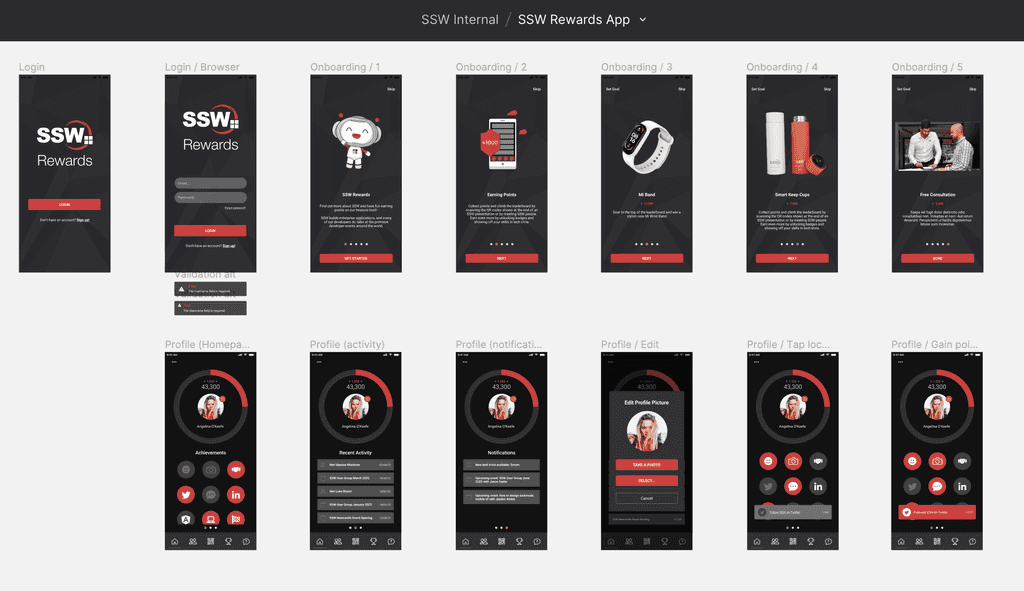
Figure: Good example – High fidelity mockup for SSW Rewards App - recommended as quick to update when changes are requested Use a design tool such as Figma to create high-fidelity mockups of a website or app's interface. This should include more consideration of UX and detailed UI elements such as buttons, forms, icons, and typography.
Incorporate branding: It's important to incorporate the brand's visual identity into the design of a product! This should include the brand's given color scheme, typography, and logo at a minimum.
Interactive Prototypes
To make a mockup more realistic and accurate to the end product, add interactivity to it. This includes consideration of how different elements will respond to user input, such as on-hover effects or the styling of visited links.
What are the best tools?
- Excalidraw (Recommended for low-fidelity mockups)
- Figma (Recommended for high-fidelity mockups)
- V0 (Recommended for speed eg. on a call with a client)
- Sketch (Mac Only and for UX designers)
- Moqups (HTML5 based App)
- Balsamiq
- UXPin (more sophisticated, helps you create responsive designs)
Tips
Here are some more hot tips on using mockups for specification analysis:
- It is best to have a designer, developer, and customer work together
- Mock-ups should follow interface rules
- Get the mockups physically initialed, especially if you are performing a fixed-price contract. Yes, paperless is great - but not in this case
- If you can't get mockups initialed, then page by page approval over email is the 2nd best option
- Write the related business rules at the bottom of each screen - to be turned into unit tests
One of the many reasons Figma is the most recommended software for user experience design is that it makes the design process (handover and feedback) more open and inclusive. By enabling more people to contribute and share feedback, teams can create more creative and comprehensive solutions that reflect a wider range of perspectives.
Sharing a Figma file is as easy as sharing a link.
Figma is a multifaceted tool that provides designers with a shared project space where they can publish their work and allow the entire team to collaborate on a project. Editors can manage permissions and should invite viewers or collaborators to a project as needed. Interactive prototypes are treated as a separate file and can be shared using their own specific links too.
Validate with the design team first
Before involving developers, clients, or other collaborators, ensure the design has been reviewed and tested by a designer. This internal check helps catch UX issues, inconsistencies, and unnecessary complexity early - while it’s still fast and easy to adjust.
A quick round of feedback within the design team ensures alignment, saves time, and avoids sending incomplete or confusing work to others.
Share design work with collaborators
Developers, clients, or any other collaborators can use Figma to view mockups with selectable elements and interactive prototypes. The inspect tab allows viewers to access size or spacing measurements plus code snippets generated from the designs - for iOS, Android, and CSS - that can be copied right into a project. Developers can also take advantage of a project's components and styles to dive into all the reusable elements or variables that have been created. Anyone with access to a Figma file can easily export not only whole frames, but any symbols and assets a designer has crafted or included in the file.
Video: Figma For Beginners: Prepare for Handoff (5 min) - Figma helps developers deliver on the promise of a design
Get feedback for your design work
Team members can easily add and reply to comments on files and prototypes using the browser or Figma desktop and even on Figma mobile app. Figma also allows you to pin your comment to a selected location on the canvas. You can also mention collaborators in your messages.

Figure: Good example - Feedback pinned to a location, mentioned a designer and using change from X to Y rule When you've reached an agreement or solved an issue, remember to resolve the comment. Figma will remove the comment icon from the prototype to keep your canvas clean and tidy.
Note: Resolved comments can be turned back on by showing resolved comments on the prototype.
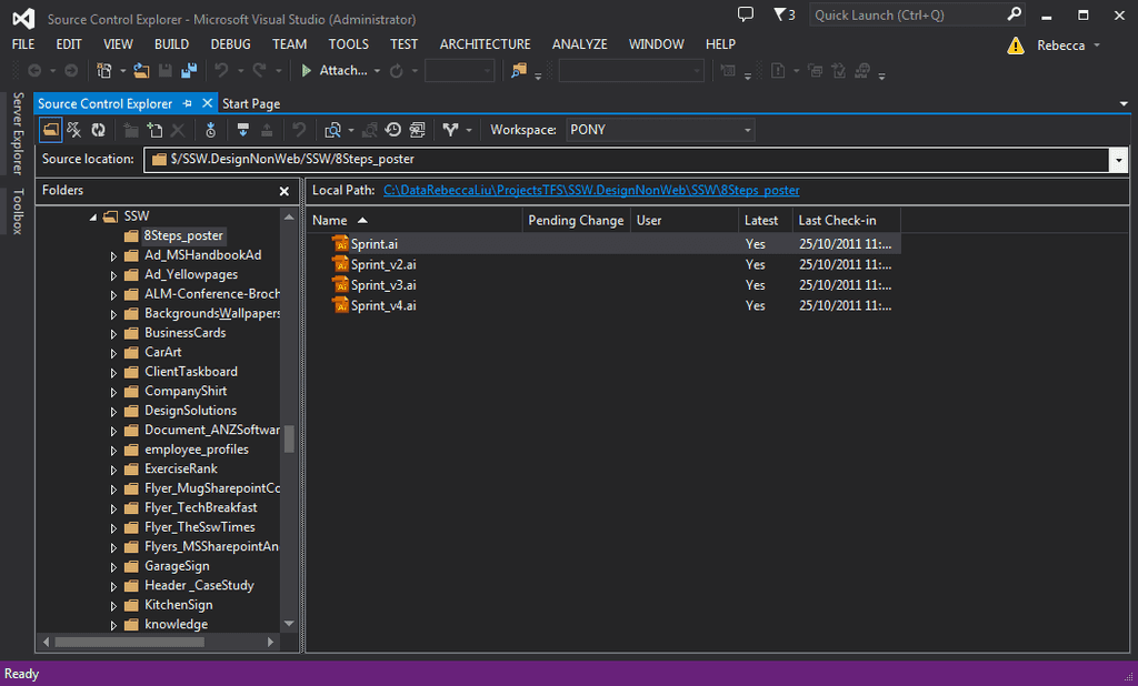
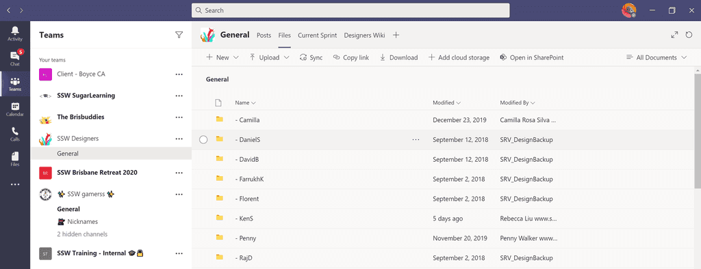
Design files should never be stored in Azure DevOps (was VSTS/TFS) or any other development file system.
Google Drive and Dropbox don’t work in China, so SSW prefers to use OneDrive.
For developers, see Do you know where to keep your files?
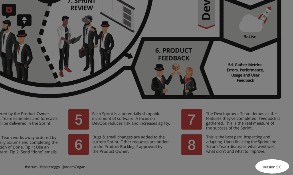
It is very important to have your Word, PowerPoint, PDFs, and design documents up-to-date. You should also make it easy for anyone to identify which version they are looking at. The most effective way to achieve this is by placing the version number on the right-hand side of the footer.
See how you increase the version number:
- Major 1.0 - Rarely change - only with major upgrades. E.g. Complete redesign
- Minor 1.1 - New features / release (customer facing) E.g. Add/remove a heading or a section
- Revision 1.11 - Emergency maintenance, spelling fixes
Add major version numbers in internal file names
For internal use, it is also good practice to include the major version number in the name of the files. This helps navigating through the old and the new versions, and makes it easy to roll back any changes and use an older version. For public files you should not include version numbers.
Warning: This should only be changed on major versions and only on internal documents.
codeauditor\file.pdf codeauditor\new\file.pdf codeauditor\file_latest.pdf
Figure: Bad example - Internal file names do not show any version information
codeauditor\filev1.pdf codeauditor\filev2.pdf codeauditor\file_v3.pdf
Figure: Good example - Internal file names show the version information
Designers often struggle to explain small UI tweaks to developers using just words or screenshots. A request like "make the button pop" or "this feels off" can be interpreted in many ways. Without clear direction, developers are forced to guess, which leads to delays, frustration, and wasted effort on both sides.
Sharing short recordings of you live-editing a website in the browser’s DevTools significantly reduces design–dev iteration time.
Show, don't tell
Instead of describing your design tweaks, demonstrate them. Use your browser's DevTools (e.g. Chrome or Edge) to live-edit the UI.
You can adjust paddings, margins, font sizes, colors, and layout styles directly in the browser. While doing this, record your screen and voice so others can see exactly what you changed and why.
This method gives the developer precise information in context, reducing ambiguity and miscommunication.
Tip: Emails are suitable for small content changes. Learn more on Do you ask for small content changes using from X to Y?
To: Chloe Cc: SSW YakShaver Team Subject: ✨ Navigation and Header Layout Adjustment Figure: Bad example – Vague request with no specific guidance. The developer is left guessing what the designer means
Video: Good example - The designer demonstrates and explains the change, giving the dev everything they need to implement it
When to use DevTools recordings
This technique is best for small, visual changes like:
- Adjusting padding/margins
- Tweaking text, colors, or spacing
- Changing alignment or hierarchy
- Proposing alternate layout ideas
Why this technique works
- Clarity – The dev sees the exact change in place, eliminating guesswork
- Efficiency – Avoids multiple rounds of clarification
- Precision – CSS values and HTML structure are visible – no ambiguity
- Collaboration – You're making the dev's life easier (and your own)
Tips to record
- Narrate your intent – Speak while recording: “I’m increasing the font-size from 24px to 32px to improve readability.”
- Keep recordings short – Aim for 1–3 minutes. Focus on one issue per video
- Speak their language – Editing in DevTools doesn’t require deep coding knowledge, but learning the basics helps a lot
- Be direct – Developers love it when designers provide specific, actionable feedback
Tools for smooth recordings
- Browser DevTools (F12) – Use the "Elements" and "Styles" panels to adjust HTML and CSS on the fly
- YakShaver – An AI tool that records your screen and voice (e.g. using Microsoft Teams), and generates a task automatically. Super useful for quick handovers
- Loom / Zoom / OBS – Any screen recorder works if you just need the recording file
What about complex changes?
If your changes are significant (e.g. new components or complex interactions), consider instead:
- Creating a wireframe in Figma and handing over mockups to developers
- Prototyping the functionality with AI-assisted code


